Golden Cheetah is a highly detailed (and free) piece of software to analyse your data to the Nth level of detail. Actually, that’s not true. Like all good cycling rules it will analyse it to the N+1th degree – where N is a very large number. ie a lot of analysis (Did I say it was free 🙂 )
It probably has too much for most of us to use as our standard tool but it has all that a super-keen data-monger would ever need. Even if it’s not for you to use 100% of the time it would be GREAT to use alongside Garmin Connect or SportTracks for times when you want to analyse YOU a bit more.
One of the most useful analyses is the CP Plot – the Critical Power Plot. Essentially this lumps together ALL your best ever rides over a given time period and shows your all your best performances as a single curve of ‘best watts held for each time duration’. for the statisticians amongst you it is derived from mean-max data from your rides.
Something like these 3 charts for 3 different athletes, in fact.

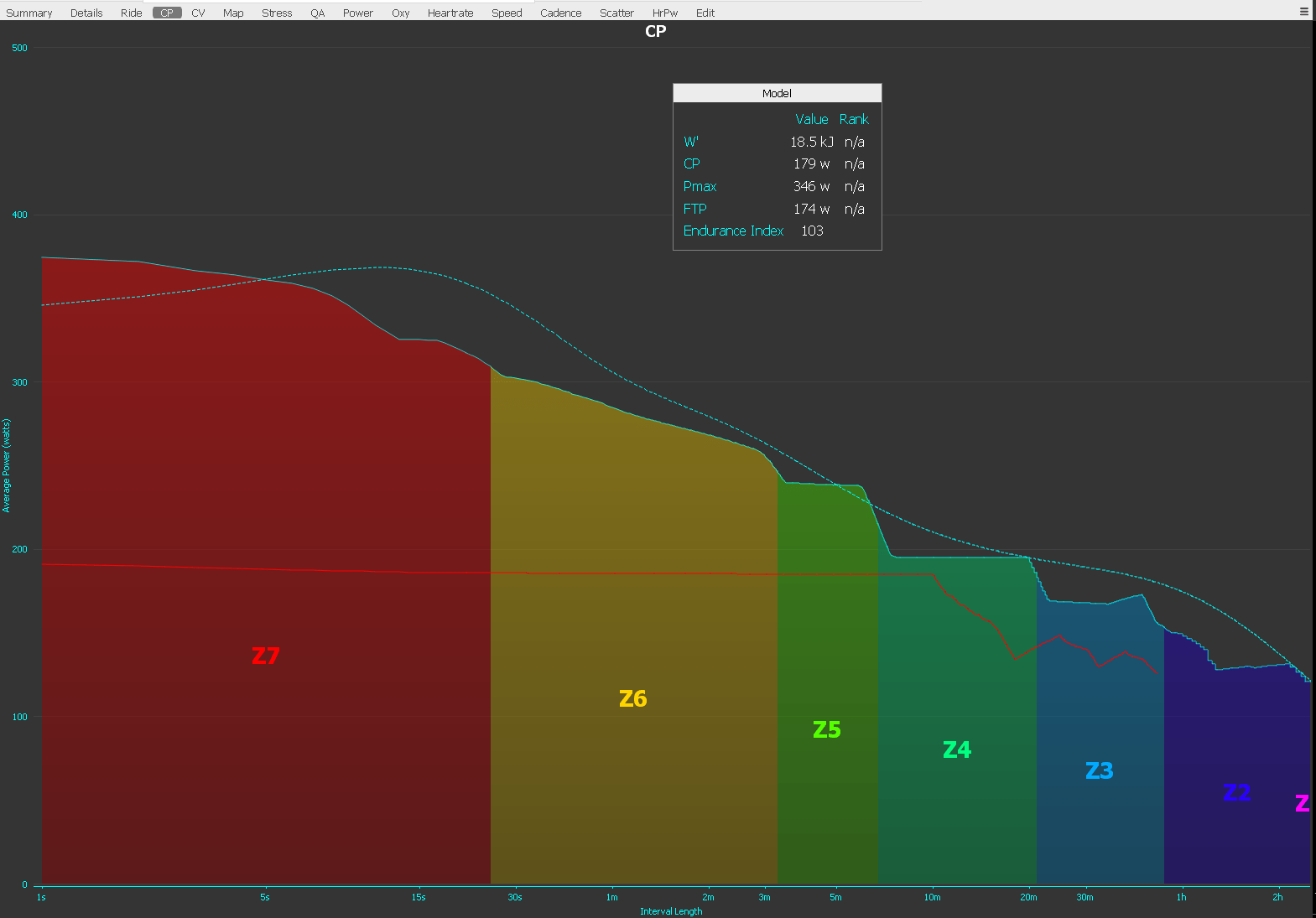
Chart 1: Shows the ‘basic’ chart! so for this athlete
- The Z6/Z7 boundary is 309w for 25secs.
- If we extended the boundary of those two zones upwards until it met the dotted blue line then we would find that the dotted blue line would predict that she could, in fact, achieve something more like 350w for the same duration.
- But JUST for the current session, the horizontalish red line, shows that she was working more in Zones 3 &4 – well at least not in Zones 5 and above.
So what? Well there is a predictive element to all of this. You might know that your favourite hill is 105 seconds long. You could look at the blue line and try to limit your power to the power that the blue line predicts you can hold for 105 seconds or maybe 100 seconds as you’ll be going faster and it won’t take 105 seconds, right? The same would apply on the flat. Set your cycling computer to beep at 406watts (or whatever it is) and off you go. Ideal for you QOM/KOM hunters on STRAVA.
OR
You could look at the gaps between the CP curve and the blue line and train to fill those gaps. Those are power-durations that you don’t train at. It doesn’t say that you SHOULD train at those power-durations but I generally follow the rule that differing stimuli in training are good.
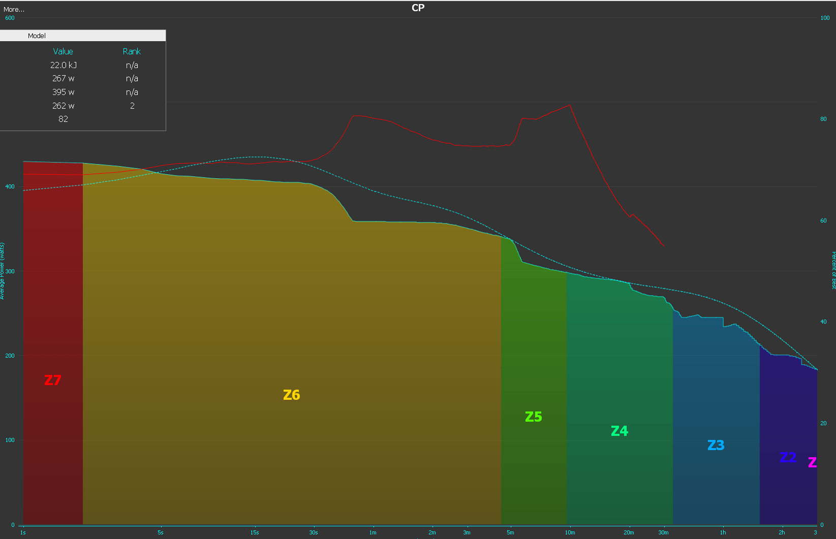
Well that’s the basic version of the chart. Here’s another addition where the current session is looked at in terms of the %age of best

Here this athlete achieved about 83% of his best power output for the 10 minute duration and about 80% for his 50 second duration. Perhaps this session was a few 10 minute intervals with some slightly slacked off 1 minute efforts as a teaser?
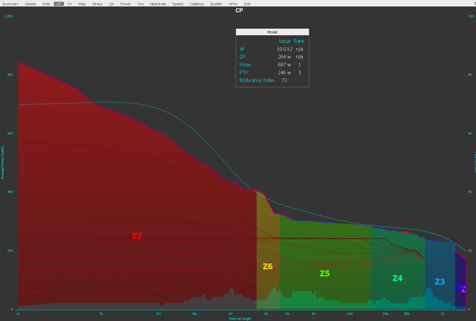
This final chart shows some more juicy detail. Here the RIDE-CENTILE analysis is turned on. So her 90% of ride-best, 80% of ride best, 70% of ride-best (and so on)power curve are shown as dotted lines. If, for example, you performed a well-executed series of 5 minute intervals at the same power you would expect to see the centiles close together.

Chart 3 also has the ‘heat curve’ turned on – the smaller lightly coloured ‘peaky’ curve at the bottom. This shows the number of activities at each power-duration. In this case she has had 7 sessions at the one minute mark. Although these 1 minuters could possibly have been warm up efforts. She only had 2-3 activities between 10 and 20 minute durations, maybe this area could be worked on? Or maybe not as over that same power-duration the actual curve touches the potential max curve.
There’s MUCH more than that on this one chart AND there are lots of other analyses too. Not something you’d look at every day perhaps but certainly very INSIGHTFUL.
Last Updated on 26 November 2021 by the5krunner

tfk is the founder and author of the5krunner, an independent endurance sports technology publication. With 20 years of hands-on testing of GPS watches and wearables, and competing in triathlons at an international age-group level, tfk provides in-depth expert analysis of fitness technology for serious athletes and endurance sport competitors.
It’s a grrreat tool. Love it. I use it for three power based activities. For general purpose tracking I still use SportTracks.
You know what they say, if it seems too good to be true, it probably is! LOL. Thank you so much for introducing Golden Cheetah to us, because I would have had no idea it was even out there. Once I figure it all out, it will definitely be a useful tool when coaching!
look at W’ and W’bal as well (different analyses in Cheetah). Tells you how much your athletes were slacking during interval workouts !!
Did you mean the dotted blue line is the predictive (so you can target that power)? The solid blue line looks like actuals. Sorry if this is a silly question. I’m new to the power game…
yes the dotted line is the modelled max critical power for each duration.
Always ask silly questions. Far better than making silly assumptions 😉
in my experience its accurate sub-HM or sub CP120 for cycling. above that it is less predictive. but then again i don’t train that much for that long…go figure 😉
Is there a possibility to see the zone ranges of the CP in numbers? Like
Z1: 153-178
Z2: 179-201
Z3
Z4
Z5
Z6
Z7
???
(without hovering the mouse over each zone in the cp curve)?
if you find it please let me know!
you can set the zones manually but i assume you don’t mean there.