 I’ve re-posted an article by Samsung, below in full. It looks at some of the design issues they consider for circular screens interfaces.
It’s based more on general usage rather than for sports and it’s OK for a quick read.
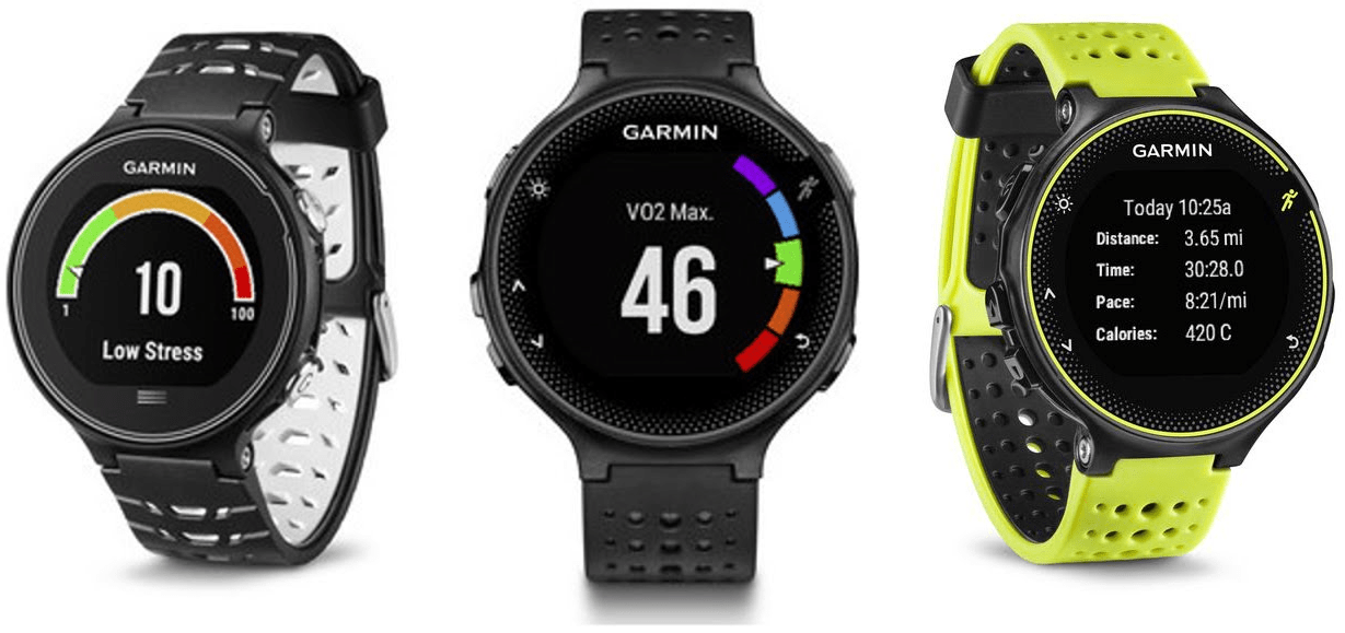
I’m yet to see convincing usage of “screen real estate” on circular sports watches, although some of Garmin’s newer dial-displays are probably the best so far – as shown above.
You might even have a limited argument against Apple’s Watch Series 2, below. Have they really designed for a square face in all cases?
The boring bottom line for me is that when I want a performance RUNNING watch then square/rectangular and a straightforward 4 metrics wins the day.
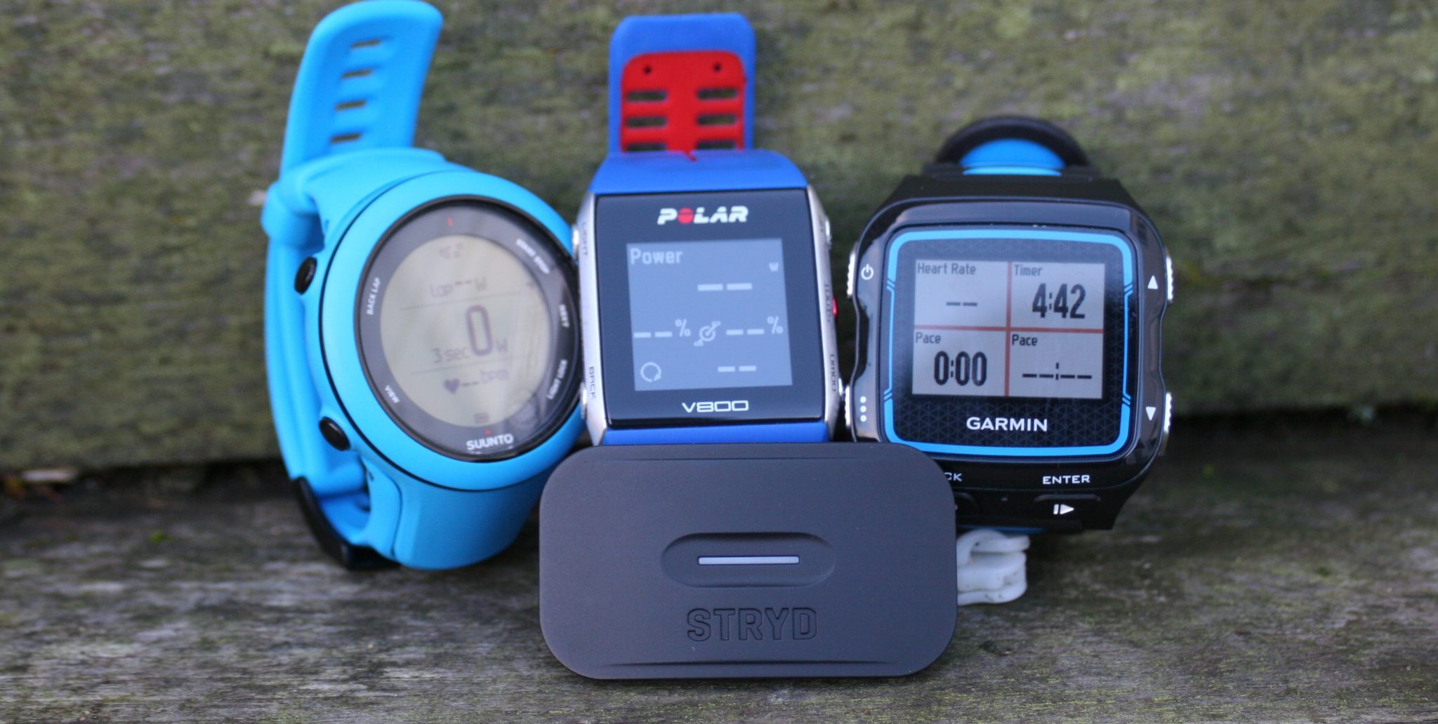
For cycling, the screen’s the limit. And the goal is always to cram as much useless info on the screen as possible so that you crash whilst trying to see the right metric 🙂
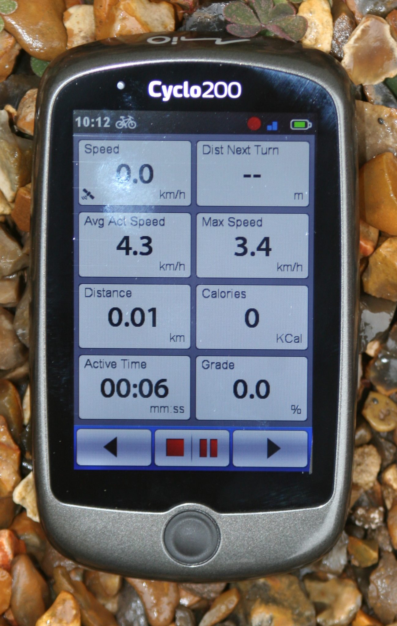
Finally swimming. Really? Does it matter. Lakes are usually so murky you can’t see your hand let alone the watch and in pools I’m normally on the edge of passing out for an hour and a half. I suspect I really just use the watch as a lap counter….but don’t tell anyone. 🙂
[Design Story] Rethinking the Circle: Circular UX Design Story
The circular UX of the Samsung Gear S2 and S3 represents a new chapter in user experience, as it takes its start from the form of a conventional watch face.
The circular UX utilizes both the physical control of the bezel and touch screen capability to present an intuitive interface for the devices. The 24 detent rotation of the bezel allows the user to access the app or controls he or she needs without covering the screen. Truly a new experience for the user, as well as the designers who developed this unique innovation.
To achieve this new direction in UX design the designers at Samsung Electronics had to literally think outside the box. Find out what challenges they had to overcome to create this new and unique UX.
Challenge #1: UX Optimized for a Circular Display
Breaking away from the conventional square-screen format was a major challenge. The four corners, where crucial controls are often placed, would simply not work in a circular environment. The entire design had to be reworked from scratch.
To do this, we had to think outside of the physical confines of the circular screen. To think beyond, if you will, by imagining how buttons, apps and controls would enter the corner-free display for a user’s interaction. We also utilized a sense of depth to differentiate between the content in the center and that in the periphery.
Without any corners, the result is a user interface that actively displays content for a more focused screen that is optimized for the wearable smart device experience.

Challenge #2: Continuous UX by Utilizing the Bezel
To optimize navigation on the circular displays, we made the bezels on the Gear S2 and S3 intuitive controls. They allow users to interact with their devices quickly and accurately without obstructing their view of the screen, and even without looking.
To further streamline the user experience, we performed numerous interface and motion design tests to identify the bezel’s most appropriate applications. Together with the touch screen interface, this physical control completes an entirely new UX.
For example, in Apps, it’s easy for users to find the applications they need simply by turning the bezel. Also, selecting a song in the music player or switching the watch face setting is as easy as a flick of the wrist.

Challenge #3: Precise Control for a Compact Display
In a successful marriage of form and interface, the Gear S2 and S3 applications have all undergone a new UX makeover.
Although the physical size of the device has decreased compared to smartphones, the bezel interface counters such limitations to effectively allow apps a wider range of control and functions in the new user environment.
Specifically, the Timer or Alarm apps can be set with more ease and accuracy than before, as they are optimized for a circular screen. S Health’s 24-hour logs are also easily accessible with the bezel controls, allowing users to view their daily fitness activities and records.

Perhaps changing a screen from a square to a circle may not seem so innovative.
However, the circular UX is not merely a form change but a totally new way of combining product and UX design for an optimized user experience in smart wearable devices. No easy task there.
As this new direction in innovation shows, the circular UX of the Gear S2 and S3 is testament to Samsung Electronics’ dedication to go forward with new chapters in wearable technology.
Related reading: Garmin Edge 8xx series to be discontinued? 810 820 530 1010 1030 505.
Last Updated on 8 April 2026 by the5krunner
tfk is the founder and author of the5krunner, an independent endurance sports technology publication. With 20 years of hands-on testing of GPS watches and wearables, and competing in triathlons at an international age-group level, tfk provides in-depth expert analysis of fitness technology for serious athletes and endurance sport competitors.

For a watch I’d go with circular every time; much prefer the look. The difference here though is that a smart watch and a watch aren’t the same thing and so I’ll trade a little bit on aesthetics for extra pixels on the screen without it meaning I’ve got a dinner plate on my wrist.
It seems at the moment that making round displays is a problem…look at the Garmins at the top of this post, there’s a huge border around the screen, all lost pixels compared to square ones which can go pretty much edge to edge. Don’t get me wrong, I like the design of the new Garmin devices but I suspect the percentage of the face covered with pixels is lower than you’d like when space is at a premium. I guess the other challenge for a round smart watch is the pixels that make up the face are square so even if you dreamed up a user interface based on circles then it’s going to be made up of square pixels and without ultra small pixels that’s going to look weird.
yep, circular looks best. rectangular more functional (for functional sports requirements). yep wasted space everywhere and yep needs smaller pixels/higher resolution. I think we/the market is almost there hopefully.
A rectangular screen will have significantly more surface area compared to a circular one with the same diameter. The extra space afforded by a rectangular screen allow you to add extra field at the same maximum font size in each quarter. The only advantage I could see in a round screen is perhaps aesthetics and this is highly subjective matter. I wish the updated 935 will have a rectangular screen.
yep i agree.
there are some interesting mini dial data fields that can utilise the top/bottom quadrants of some round 4-screen displays
epson had a good one where the were dots representing hr zones always on display and that was on top of the regular 4 metrics….epson dont really sell sports watches any more 🙁