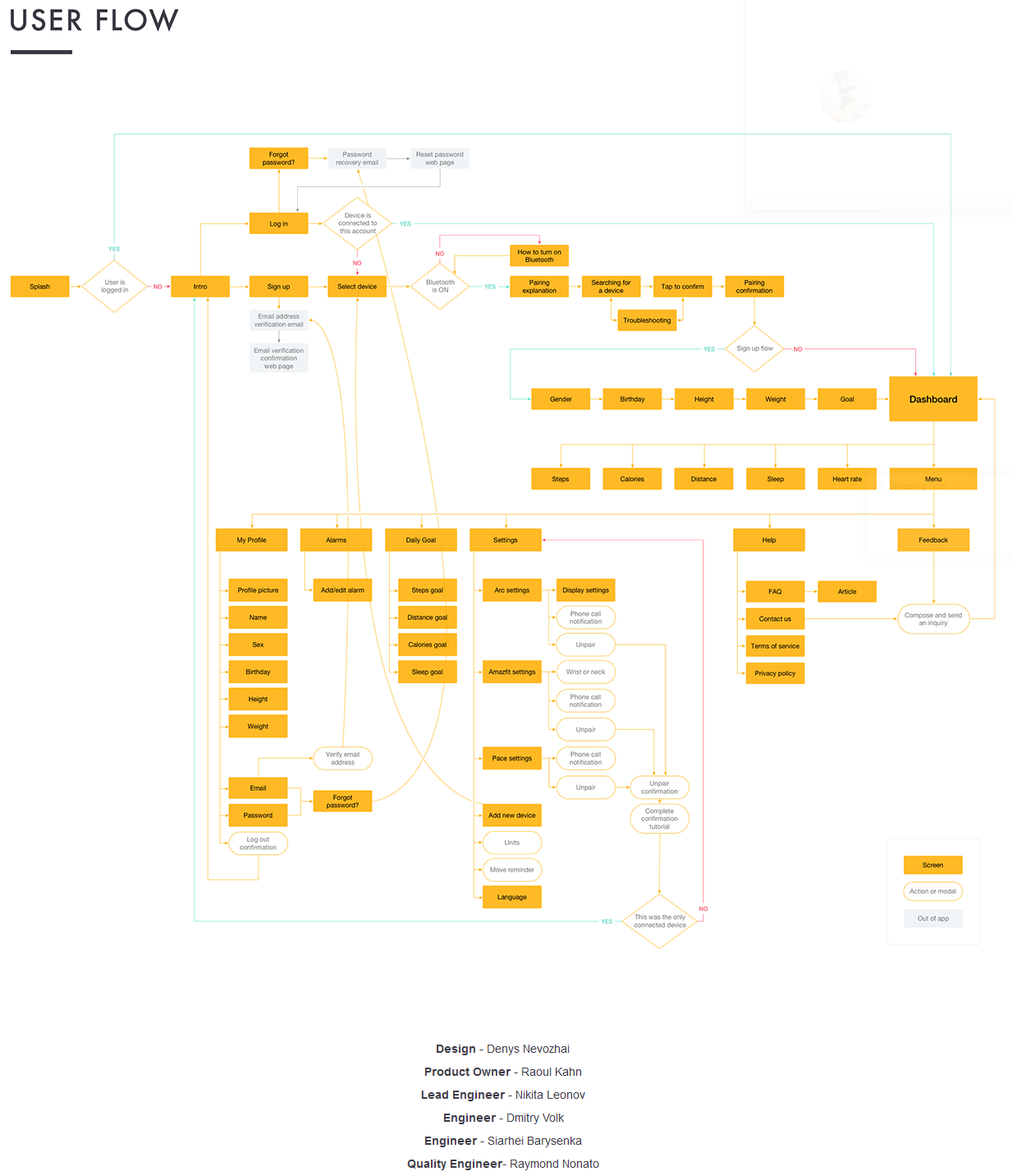
For those of you who have never thought about App design for Sports then this is a great image from Denys Nevozhai which is part of a larger and more complete project he has uploaded to Behance (link to: behance.net).

Each of the orange boxes represents a unique screen on his Amazfit V2’s app and the lines between the boxes represent user navigational flows from one screen to another, as well as other actions. For those of you into your IT and tech design, none of this will be new. However for the tech-uninitiated it might just hint at some of the complexities of creating an app. Indeed the final, real app (link to: itunes) will include more detailed elements of functionality on many pages.

If you also look at the earlier link to the full project on behance.net then you can see that the designer also has to specify every last detail down to the icons, fonts and grid layouts on the screen. Well, I guess technically, the designer does NOT have to specify them but doing so will probably make the project finish more predictably. With luck.
So my challenge to you is to have a quick look at the orange boxes on that chart above. Get a quick feel that the app doesn’t really do that much. Then go and play with your favourite app (Garmin Connect, or whatever). You may well then find that your favourite app is VASTLY more complex. Perhaps then we can all understand that such complexities mean that those bugs are going to continue to appear.
Another pause for thought for the poor sports app designers: if the coders are developing for Android then there are several versions of Android and each version of Android may well be implemented slightly differently by each smartphone manufacturer. So really the developer may well be developing for ‘MANY Androids’ and this partly explains why your or my relatively obscure smartphone just doesn’t seem to work as well as our friend’s Samsung – even though we all have the same Android version.
Also the screen flows and interactions are not always the same on iOS as they are on Android, so this will probably need subtly different designs for each platform. Then, of course, the coding on each platform will be entirely different. There are cross-platform tools but….
Last Updated on 17 January 2026 by the5krunner

tfk is the founder and author of the5krunner, an independent endurance sports technology publication. With 20 years of hands-on testing of GPS watches and wearables, and competing in triathlons at an international age-group level, tfk provides in-depth expert analysis of fitness technology for serious athletes and endurance sport competitors.

Any word on the Stratos coming to the US market?
no word.