STRYD Power Center – Features
Return to the main STRYD Review
Background
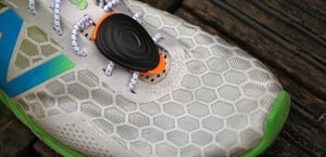 Once STRYD v4 hit the streets in 2019 with power adjustments for wind fully included, that meant that STRYD now covered most of the hardware needs – dual-sided power and treadmill incline remain to be added. The major running power capturing platforms have been covered as there is now an Apple Watch app to sit alongside functionality for Garmin, Polar, Suunto and iOS/Android devices. Coros might add STRYD support in 2020 and there are now the 3rd party apps Ghost Racer and SportyGo to cover Wear OS and Samsung users of STRYD.
The Garmin app (data field) has been superseded with the new STRYD ZONES data field that replicates some older functions on the watch and adds automatically updated power zones derived from dynamically updated Critical Power calculations in Power Center.
With all those boxes ticked, STRYD has now considerably expanded the usefulness of their POWER CENTER platform. It’s now a great place for detailed insights – to the point where it could provide all the analyses that many of you want.
Platform Links
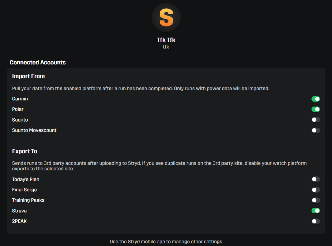
It’s worth pointing out that you can still link to these key platforms to sync data in and out. AFAIK, Strava ignores running power data but takes other data from your workout.
 Calendar View
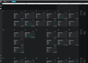 The calendar view of your workout history is not especially novel and is similar to that found on other platforms. That said, there are some nice touches which include
- Breadcrumb GPS view of each workout, handy as we often know the shape of our regular routes and it makes them easier to find
- Headline metrics included in the summary tile, namely RSS, distance, average power, time
- Custom name
- Ability to ‘favourite’ any workout
Dashboard View
Then we have the main dashboard view, which I think is pretty cool. There are 7 key areas on the one dashboard which I’ll briefly outline and then cover the more interesting ones in more detail
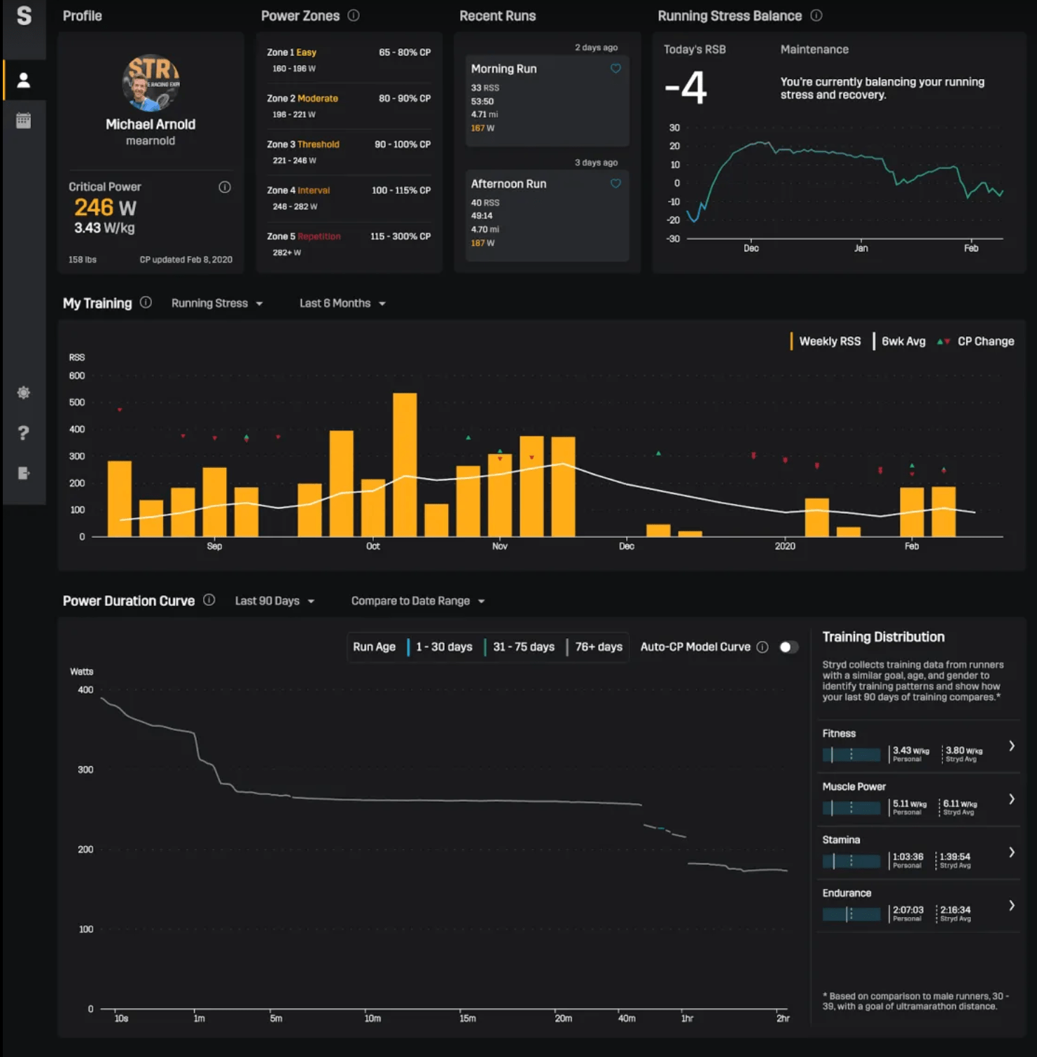
- Profile – includes critical power, weight and w/kg, plus the data the CP was last updated.
- Your latest power zones. a 5-zone model showing the absolute power ranges of each zone as well as the how the zone limits correspond to %CP.
- Last 2 recent runs, using the same tiles that we found in the calendar view.
- Running Stress Balance – interesting. I’ll cover this in a minute
- My Training – interesting. I’ll cover this in a minute
- Power Duration Curve – very interesting. I’ll cover this in a minute
- Training Distribution – interesting. I’ll cover this in a minute
Let’s look at the last 4 of those
4. Running Stress Balance
Stress is created by each workout as a result of both the intensities and durations you achieved in that workout. You can think of this as fatigue. You will have some fatigue from your workout today and some of today’s fatigue will be there tomorrow but slightly less the day after tomorrow. Yet you also might introduce NEW fatigue/stress tomorrow and the next day from additional workouts. These complexities are summarised in a daily RUNNING STRESS BALANCE metric.
In the short term, you need fatigue/stress to stimulate your body to adapt and improve.
On race day you do NOT want as much residual stress.
Here you can see I’ve been upping the stress in the last 4 weeks or so as I hopefully have turned the corner on last year’s injury.
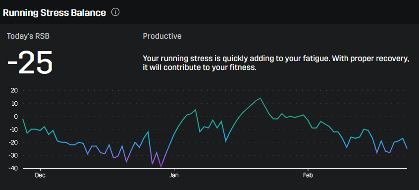
This chart maps out your stress/rest balance over time in a range from +30 (Unproductive training) to -60 (Overreaching). A race readiness level would be >+5. As a runner at a stress level of -25 then I would probably feel fairly good, however, a triathlete will need to factor in the stresses from bike and swimming and these combined will probably make you feel tired. As an indication, I track my stress in other software and I would say I am at about 90% of the max stress I’ve ever historically had. (Plus the -25 is coming from my incomplete running data set)
5. My Training
Here you can look at your total WEEKLY stress going all the way back to the start of your data. So on the following chart, the weeks where there are no orange bars are weeks where I was either not wearing STRYD or was injured. This chart contains some duplicates and omissions, so you can’t read too much into it.

There are also then other indicators on the chart to show trends and to allow you to look at the chart over shorter or longer time periods. Since July 2019, the is also a green/red indicator to show if your auto-calculated CP is rising or falling.
Finally, instead of running stress bars, you can instead choose to display weekly mileage bars, weekly elevation bars or weekly time bars.
Nice.
6. Power Duration Curve
The power duration curve shows you the best power you’ve ever held for every duration with a logarithmic X-axis to aid readability. It’s hard to grasp at first but worth taking the time to understand it.

STRYD also let you choose a period from which to calculate a CP curve from AND another period to compare it to. In the chart above I have 2016 vs 2017. Then, as you move the cursor from left to right along the curve, you are told the actual value of the curve and the date it was achieved.
The auto-CP curve is not shown. However, that adds a further, similar line to the chart. Except this time the auto-CP curve models your best power possible over each duration. For example, it could model (extrapolate) your 90-minute power for a half marathon even if you had never run over an hour. It could also model (interpolate?) your 20-minute power if you have only raced a mile and 10k. That is useful in itself.
Further uses are when planning breakthrough sessions. To get faster you probably might want to run faster and /or further at some point in your training! You can have a breakthrough when you beat your best ever power/duration OR you can have a ‘special’ breakthrough when you actually exceed the modelled power/duration. In the latter case, STRYD will choose to re-evaluate and reset your CP.
The underlying ‘stuff’ is more complex than that as the modelled CP curve also adds in decay factors so, for example, it will, unfortunately, exclude that PB you did 6 months ago as that workout has ‘no effect’ on your current potential.
I like power duration curves! This implementation does not disappoint.
7. Training Distribution
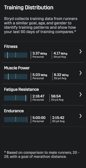
Finally, the TRAINING DISTRIBUTION component of the dashboard looks at your training over the last 3 months in relation to those in your age group training for the same distance.
If you are self-training this is nice as it shows you the areas of your fitness you may need to improve AND you can click through and see what types of training you can do to achieve that.
Even cleverer than that, as you hover over Fitness/Muscle Power/Fatigue Resistance/Endurance, the relevant parts of the CP curve are highlighted in turn.
Other Insights
There is also an improved ability to analyse in more detail specific workout and it is now possible to better see individual laps that comprise the full workout. Here we’ve zoomed in on a particular KM on a long 10mile run and I’ve selected AIR power on the chart to also display the +/- effect of the wind
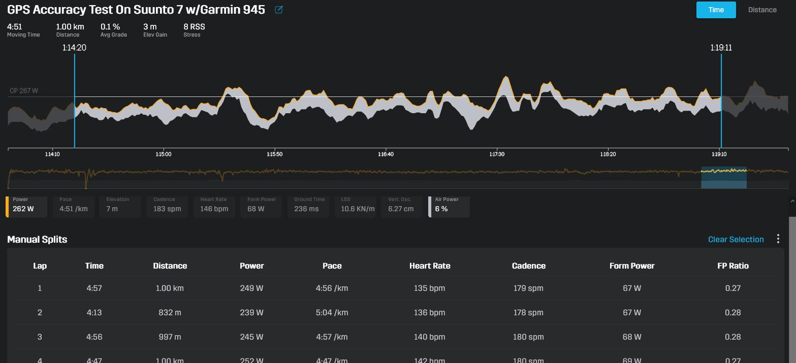
The FP ratio is interesting. This is the amount of wasted power when running. If you can improve your form you will go faster by getting this ratio lower. For example, you could run KMs at slightly different cadences to see if your ideal cadence might differ from your preferred one – more likely it will trend better over time if you do strength work!
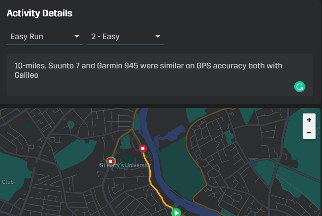
You can also tag your runs to help you find them. Here I’ve tagged the type of run as well as the perceived intensity (2-Easy) of the run.
What’s Missing?
You can always add more stats but what is there now is good. These spring to mind as omissions
- More explicit measures of intensity and normalised power (IF & NP for cyclists) for workouts. Normalized power for a workout will be HIGHER than average power if you exceed CP. Thus NP better reflects the effort you expended (STRYD is a metabolic-cost power model after all). These measures were developed by Coggan et al.
- A heatmap on the CP curve showing the frequency of your trainings at every time period (you will probably see clusters around 1 hour yet might be training for a longer race)
- If you train only ever for less than 60 minutes then it’s HIGHLY likely that modelled CP for 90-minute or longer races will be wrong (over-stated, perhaps significantly). Some form of indication of how well-trained you are for each duration might be interesting.
- Golden Cheetah has some nice additions to the CP curve where you can view mini-curves that represent LAPS, STRAVA SEGMENTS and MATCHES (sustained efforts). Thus, for example, you can see each of the 3 individual CP curves for a 3x 1km interval session…and compare them.
- Let me know below any further thoughts
Summary
Very useful Well implemented. I like it.
Return to the main STRYD Review
Last Updated on 24 January 2026 by the5krunner

tfk is the founder and author of the5krunner, an independent endurance sports technology publication. With 20 years of hands-on testing of GPS watches and wearables, and competing in triathlons at an international age-group level, tfk provides in-depth expert analysis of fitness technology for serious athletes and endurance sport competitors.

Yes, I’m also very happy with the changes the Stryd team did to their PowerCenter. It’s now a lot more helpful than before. Also those explanations that occur when you click on the small “i”-icons make sense and help you a lot to understand what you should train more/less. My favorite is the power-duration-curve with activated “auto-cp-curve”. Together with their explanations what it means if you have gaps between the calculated curve and your real curve are great IMHO. At least they got me to the point to add more strides or 30s / 60s “bursts”. As I had a very big difference there. I knew that before but now that I got it show on a graph I couldn’t debate it any longer 😉
Not totally related to the post, but is the latest STRYD now fully compatible with Vantage V? I remember that it initially was impossible to get instant pace and distance through STRYD. My Polar Stride Sensor is in serious need of replacement and comparing the price for a new one with what I get form a STRYD, I think its time to change.
yes they are fully compatable even through to manual calibration.
check latest prices here: http://www.stryd.com/?utm_source=tfk&utm_medium=b&utm_campaign=r
Thanks, I guess its time for an upgrade then; I trioed both Miletone pod and Runscribe before but none of them gave me as reliable pace/distance as Polars Stride sensor – now I get an excure to get a Stryd and experimenting with power as well. I find Polars Wrist-based Power quite unsatisfactory.
Generally, people waste so much time trying to save a few tens of $£Eu.
just go for the products that work. for 99.5% of people, stryd ‘just works’.