STRAVA StatMaps
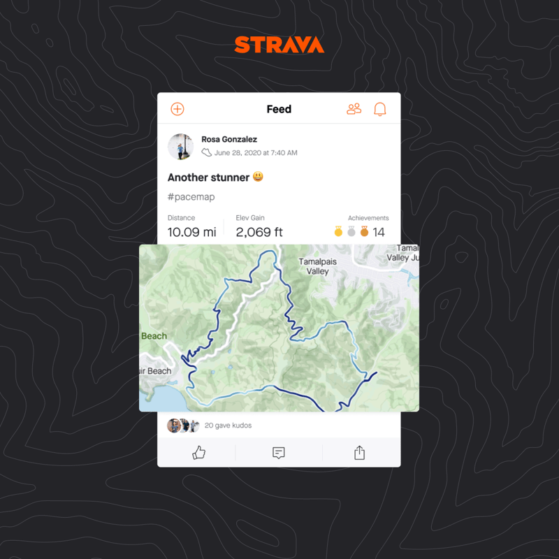
STRAVA’s StatMaps are available now to subscribers, they are not novel but they are new to STRAVA and I like them.
What the heck’s a StatMap?
Good question! STRAVA call these “data-driven polyline colourations” and they replace the existing monochromatic (orange) lines on your post-workout tracks that show where you have been on your adventures. Clear? In my words, I would say that STRAVA will
colour your GPS track differently depending on how fast you were going at the time.
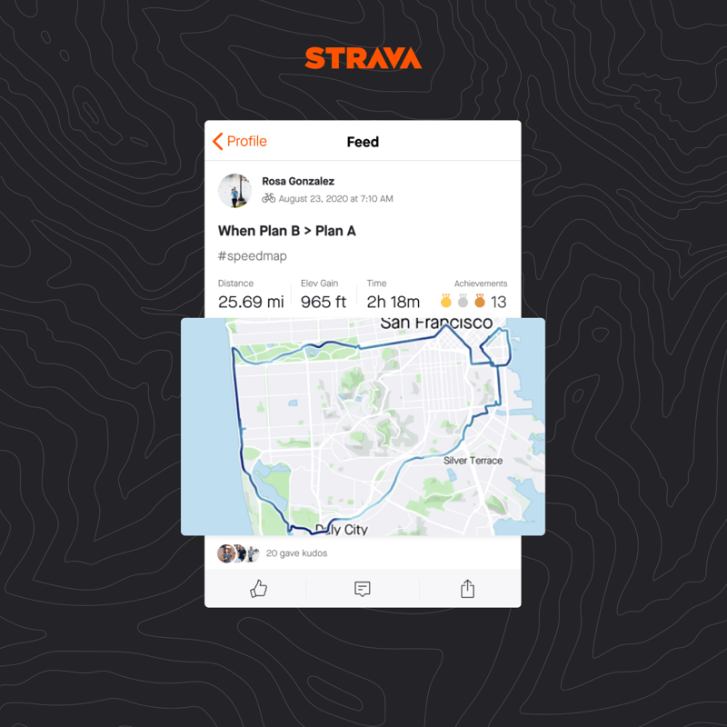
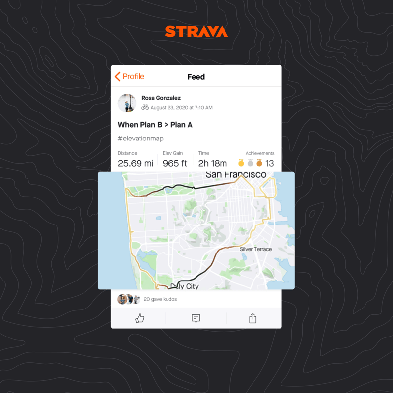
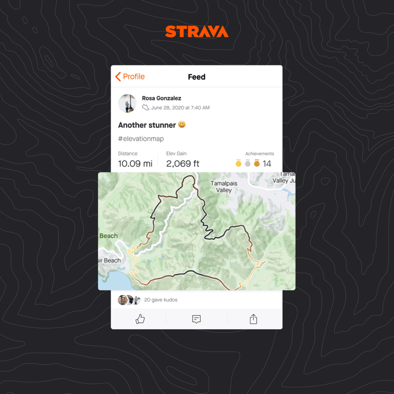
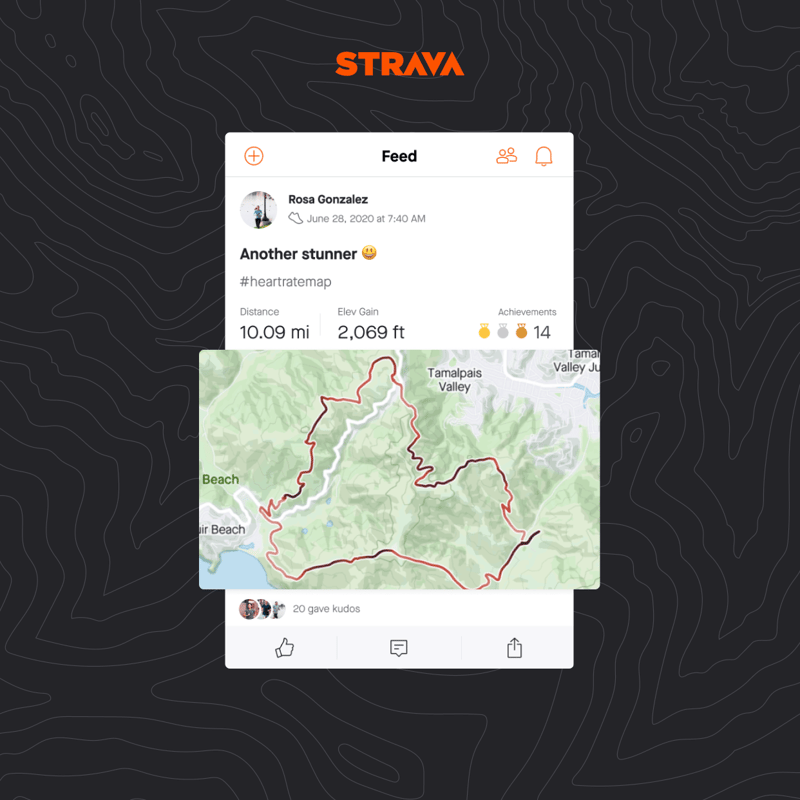
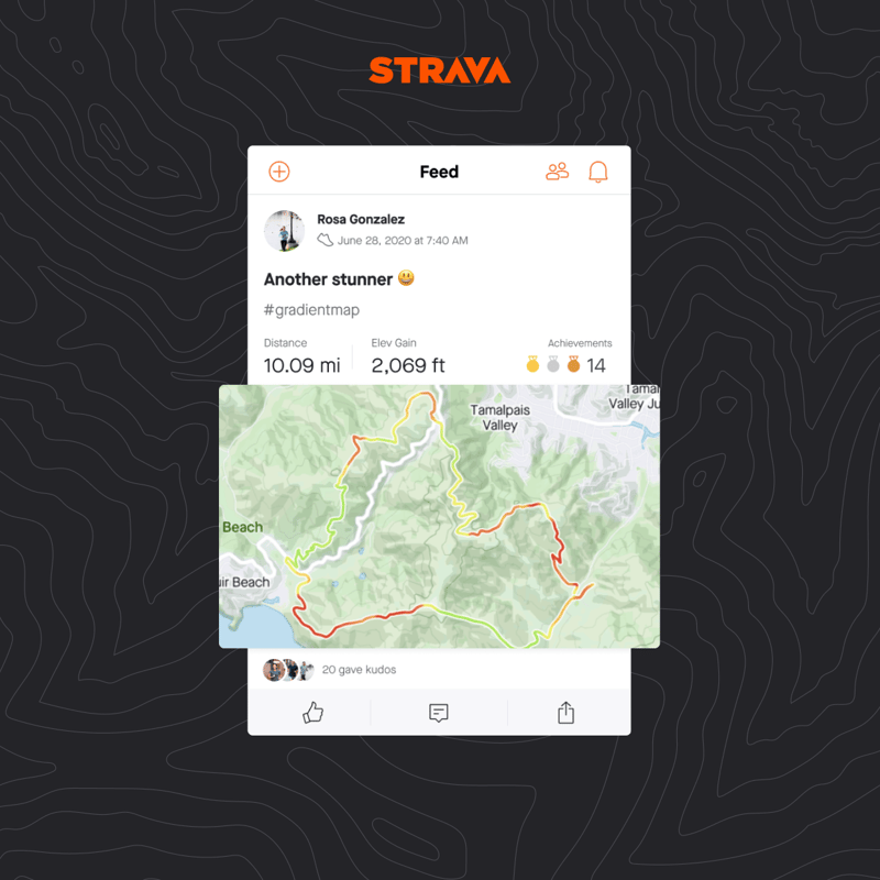
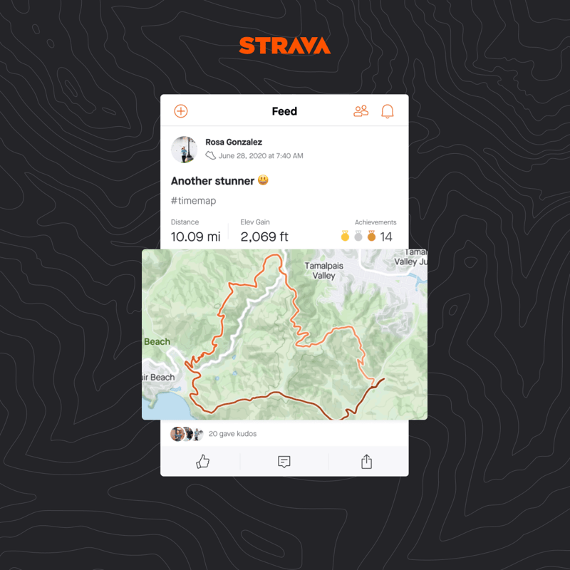
Actually it’s cleverer than that as you can colour the line based on different criteria which are speed/pace, heart rate, elevation, time temperature, gradient and power. Now, these are not coloured automatically and you have to manually choose which StatMap to apply to which workout and then you add a specific Hashtag which changes the colouration scheme that you see AND which any other STRAVA will also see. These are the hashtags and you put the hashtag in the activity description.
- Pace #PaceMap – Darker colours are faster paces
- Speed #SpeedMap – Darker colours are faster speeds
- Heart Rate #HeartrateMap – Darker colours are higher heart rates
- Elevation (Absolute) #ElevationMap – Darker colours are higher elevation/altitudes
- Elevation (Gradient) #GradientMap – Red is climbing, Green is descending
- Power #PowerMap – Darker colours are higher power outputs
- Time #TimeMap – Darker colours appear later in the activity
- Temperature #TemperatureMap – Red is hotter
Here’s a few examples from STRAVA then we continue to have a look at how Garmin and others have done this.
Garmin’s Statmaps
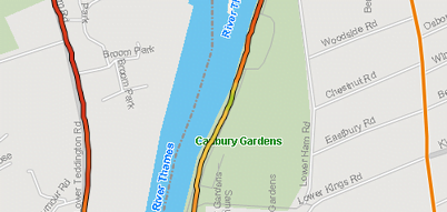
Here’s an example of a Garmin ‘StatMap’ which were only added in September and I’ve chosen to display this one by PACE, with HR and elevation also being available as the other options. Garmin doesn’t seem to vary the colouration by Zone, instead, it seems to be relative to the average for the run/ride. So on this following example, I was running at a consistent pace for about 90 minutes but in this particular section there was some variability and hence Garmin started adding some colours. It works well.
Polar’s StatMaps
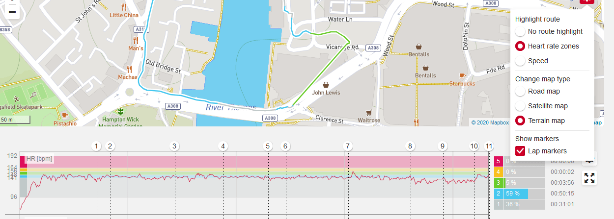
Here’s an example of the StatMap on the web version of Polar Flow. I’ve chosen to display HR here and you can see that the line colour on the graph has been changed to match the zone colour on the chart. It’s horses-for-courses as to whether or not you prefer this method to Garmin’s. I prefer Garmin’s and I also think that the colours of Polar get washed out by the maps, the same being true of Garmin at times, but to a lesser extent.
Golden Cheetah StatMap
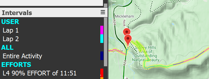
I’ve been aware of the Golden Cheetah StatMap for a long time but confess to never really looking at it until today. I’m also not entirely sure what it shows but, rest assured, Golden Cheetah is very clever..it will definitely show something clever. I’m just not sure what 😉 . Anyway, I think what it is doing here is that it auto-identifies matches/efforts and then ‘StatMaps’ the colour of the effort onto the ride map. I thought the following image was showing my L4 ascent of Box Hill but I’m pretty sure I can do it a little bit faster than 11:51 minutes and probably harder than L4…oh well, that’s roughly the idea (I think).
Runalyze Statmap
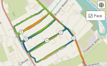
Here’s another one from Runalyze. This only seems to give me the option to add PACE.
Please feel free to add in the comments below any other platform that has this kind of feature.
Take Out
The STRAVA implementation is nice and the gradations of colour work well and are pleasing to the eye without being too visually intrusive. The colours seem to form a more natural part of the map than the efforts of Polar and Garmin. It would be nice if the colours were available within the full map functionality rather than just the high-level map on the feed.
You then have to wonder why this is a premium feature and you might also query the way the colours are triggered with the insertion of a manual hashtag – clumsy at best.
Negativity aside, I like it.
Last Updated on 24 January 2026 by the5krunner
tfk is the founder and author of the5krunner, an independent endurance sports technology publication. With 20 years of hands-on testing of GPS watches and wearables, and competing in triathlons at an international age-group level, tfk provides in-depth expert analysis of fitness technology for serious athletes and endurance sport competitors.

Also Runalyze recently rolled out a similar feature.
yes, i just saw that and am adding something above now !
Definitely interesting they just didn’t insert a drop down select for premium users instead. It works well (just tried it), but with my subscription ending in August, oh well. Too expensive for my liking for the “nice to have” features.
Hmm, when you select the map in your activity (at least in the iOS app), the StatMap is gone and it’s just the normal orange…
yep, i think it goes for any kind of zoom on the map
The writing in this article is terrible! What’s with the random capitalisation, italics and bold?
thank you for your kind words and feedback, I’ll reduce some of that for you.
Use my.klimat.app and add the #tag to the text it inserts. Job done.
(If you don’t want my.klimat’s weather, then leave out all that info and just put in the tag)
yes we love klimat:
https://the5krunner.com/2020/04/03/new-strava-weather-service-vs-klimat-strava-add-in/