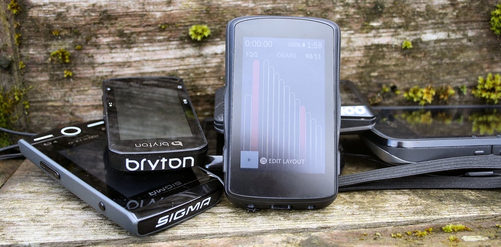
 Karoo Responds – the Hammerhead Visual Fightback
SRAM/Hammerhead irked Karoo 2 owners recently with changes to the aesthetics of the main ride screen. That’s a fairly big deal as 1) you don’t want to hack people off when a Karoo 3 might be in the pipeline 2) the main ride screen is what you see ALL the time…it needs to look good and work well.
Unsurprisingly Hammerhead has responded to the situation and, perhaps, already had these new changes in the works. Anyway, whatever was happening behind the scenes is now somewhat of a moot point as Karoo 2 owners now have 3 ways to change the appearance of tiles on the ride screen.
Data Field Design
Hammerhead uses the concept of a data field STATE. A simple, illustrative example would be a power data field where a message might be either ‘No Sensor’ or ‘Searching…’ to explain that you either haven’t paired an appropriate sensor or that it isn’t yet connected.
Now you have the ability to:
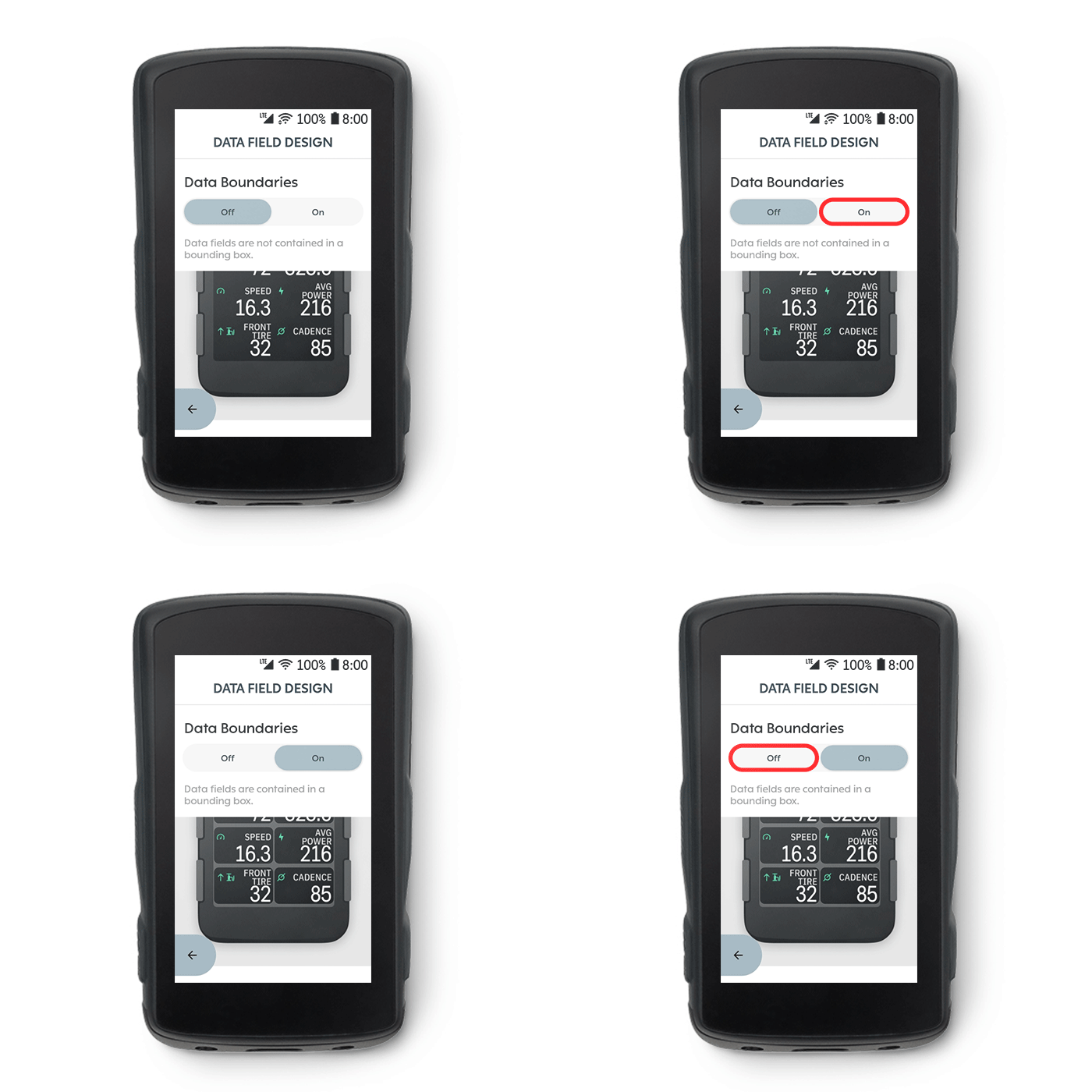
- Change data field boundaries – essentially showing the data in a tile or blended invisibly into the background (I’ll have the latter option please).
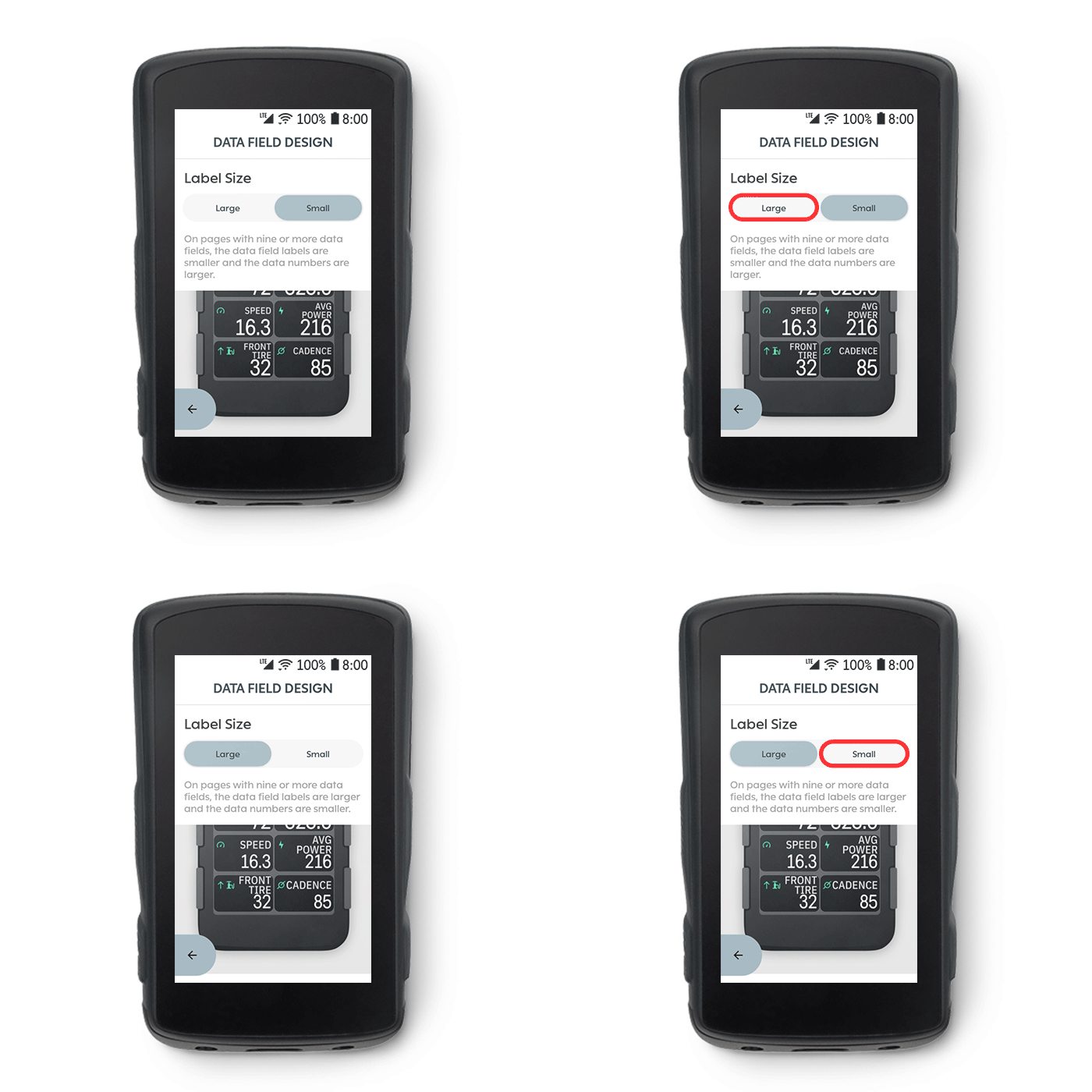
- Change label size – so you could have SPEED shown in either a large or small font (Again, I’ll take the latter even though my eyesight is pants)
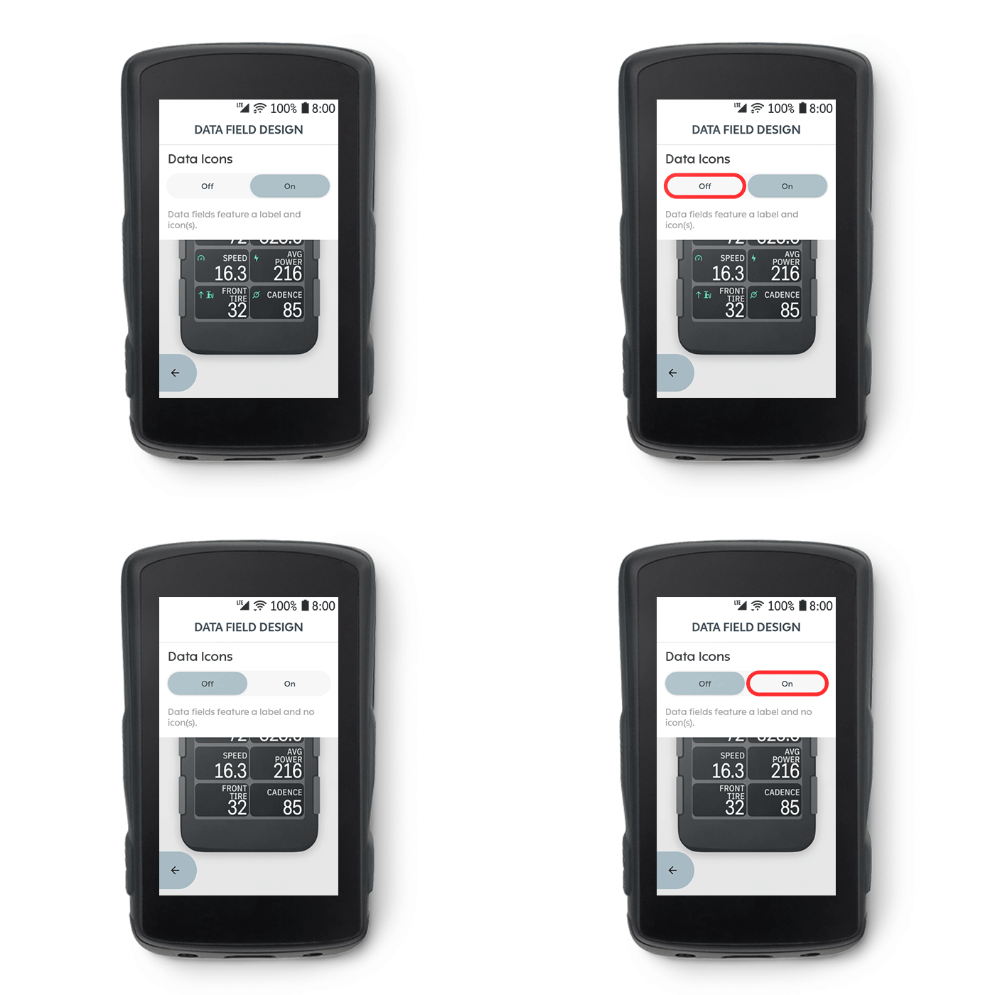
- Show Data Icons – I mean, if you have a word there saying POWER…why do you need a little lightening arrow as well?
Take Out
I think this is a pretty cool level of customisation and probably sufficient to keep most people happy. In an ideal world, I’d like to be able to fully remove the units of measure from some fields eg my main, at-the-top 3s power field doesn’t need to tell me it is 3s power. I just know it is. Give me a whacking great big digit as Wahoo does.
One downside to all these little tweaks and new abilities to do X, Y or Z is that a maintenance/configuration menu option needs to be added somewhere. As Garmin has found this eventually leads to an extremely unwieldy out-of-ride interface that’s very hard to navigate. One of Karoo’s earlier selling points was its sleek software design…it’s getting less sleek by the month.
What do Karoo 2 owners think? Are you happy now? (with the looks)
Last Updated on 27 January 2026 by the5krunner
tfk is the founder and author of the5krunner, an independent endurance sports technology publication. With 20 years of hands-on testing of GPS watches and wearables, and competing in triathlons at an international age-group level, tfk provides in-depth expert analysis of fitness technology for serious athletes and endurance sport competitors.

More options is always good.
Now give us the option the keep the icon and remove the label 🙂
And while they’re at it, I’d like to have a few analog fields (speedometer like, bar graph and so on)
I’d also love to have non grid layout, which is just plain boring. Just consider each field as a widget that can have any shape and any position, similar to what we have on smartphones.
In short, it’s a move in the right direction, but why not give us more fancy stuff?
yeah, agreed.
i touch on a few of those in the link above to thoughts on the K3
Well, adding a few layout/widget personalization options is arguably the easiest thing to do.
Why it’s not here already is likely because they have a small software team and had a lot of important features to focus on first and foremost.
The core features are mostly there now, so maybe we’ll start having some fancy stuff.
Well, one thing I’d love before the fancy stuff is a fix for the elevation tracking thing, which is so broken it consistently reports elevation values anywhere between +20% and +350% (vs my Garmin watch) depending on how long the ride is…
It’s not ok Hammerhead…