new look Garmin Connect v5.0
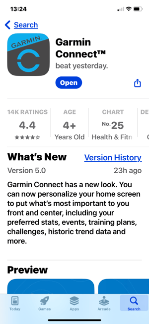
Garmin Connect has a new look. A 4-month beta program ended today and everyone can now enjoy the new interface by updating the app in their app store. Maybe ‘enjoy’ is the wrong word judging by the comments below.
Garmin Connect 5.0 – What’s New?
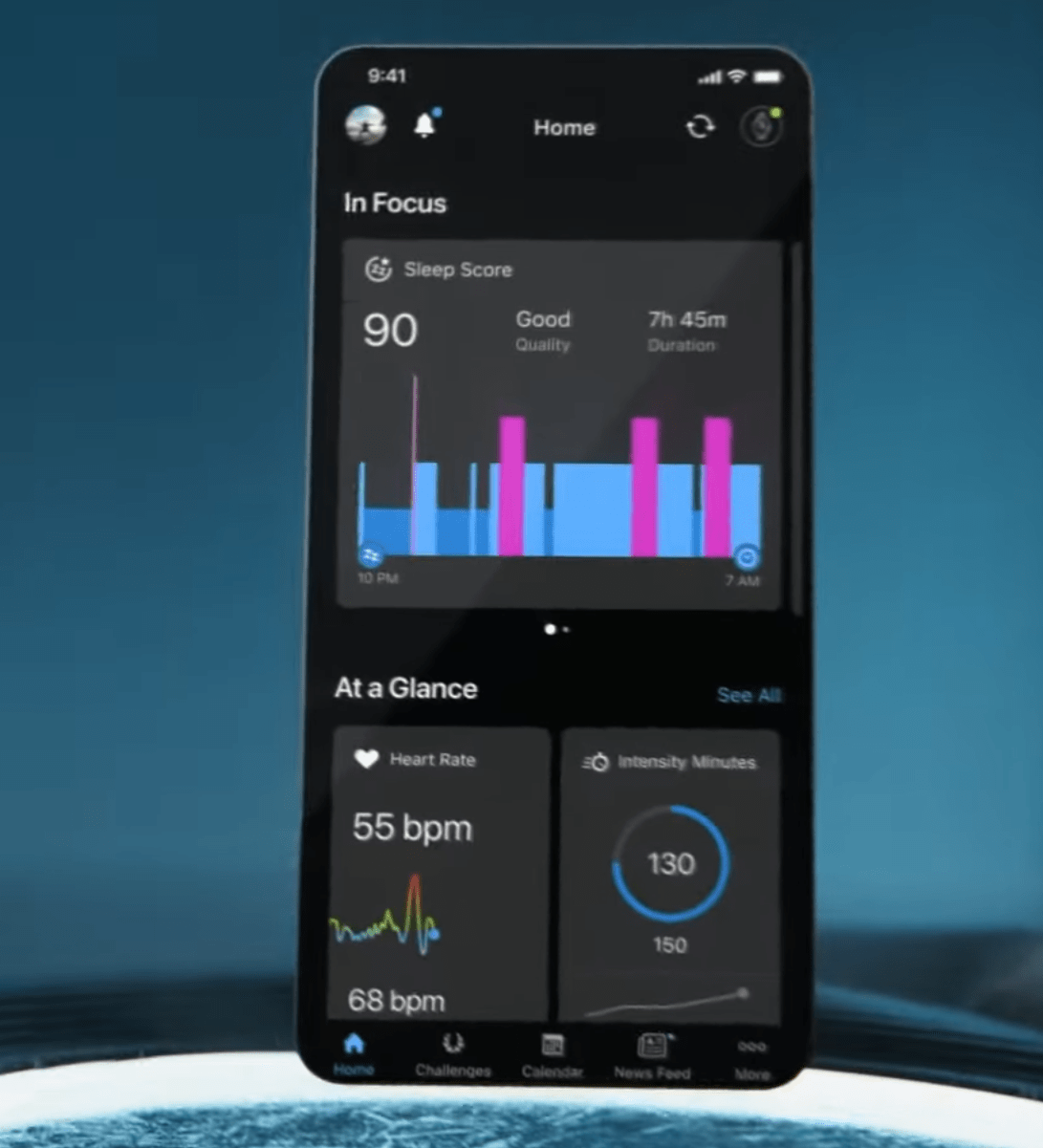
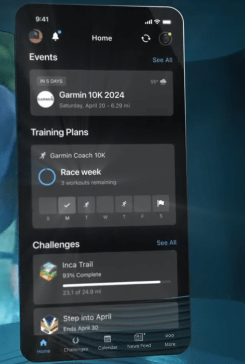
The change is almost entirely at the homepage level, everything else stays the same. Your smartphone app homepage is highly customisable with any changes mirrored to Garmin Connect online.
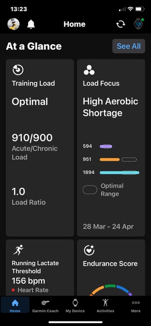
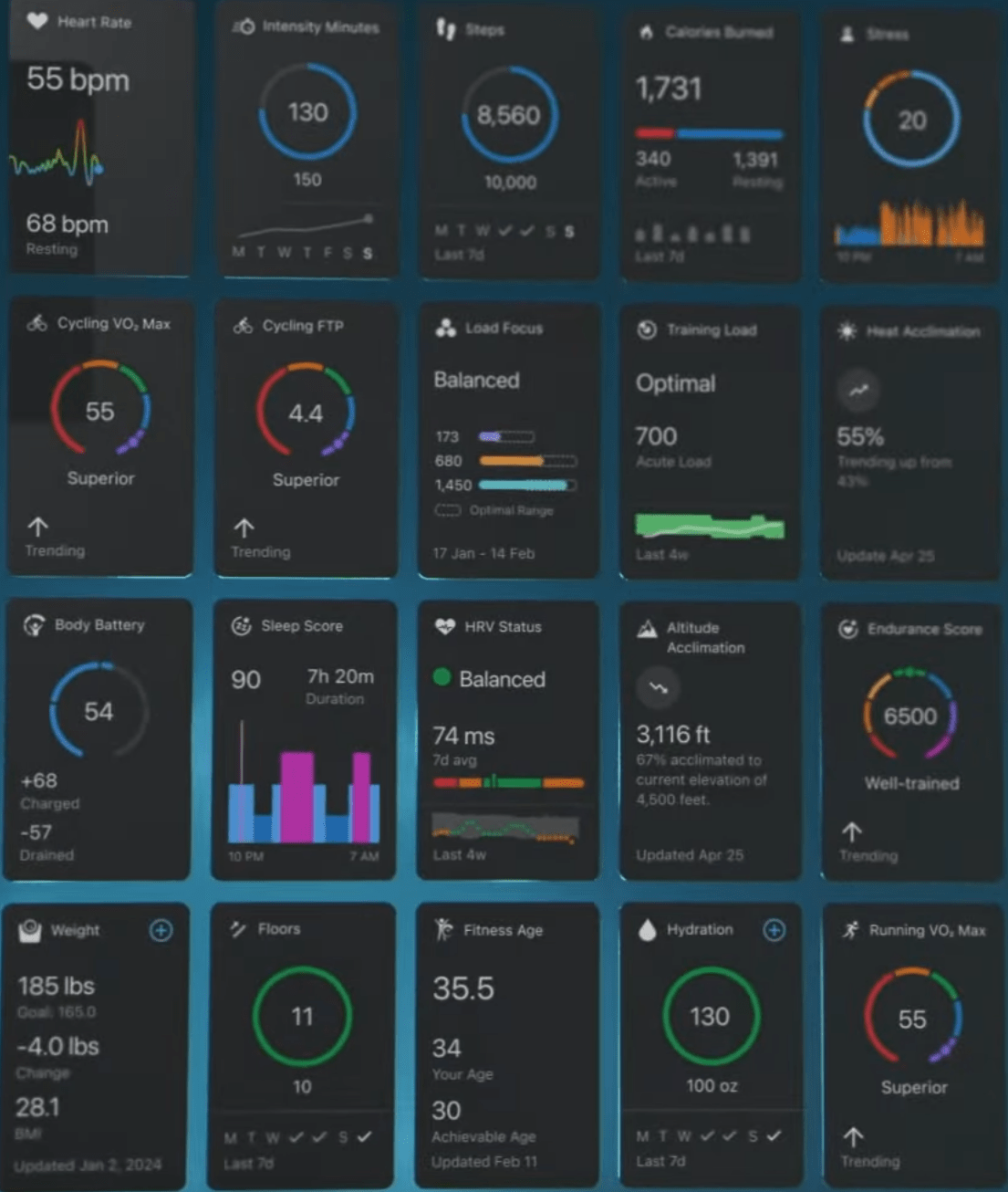
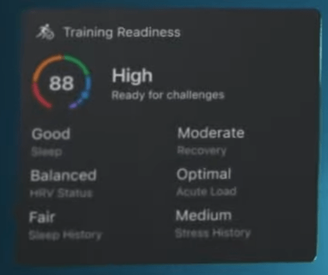
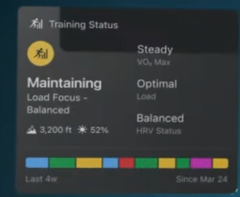
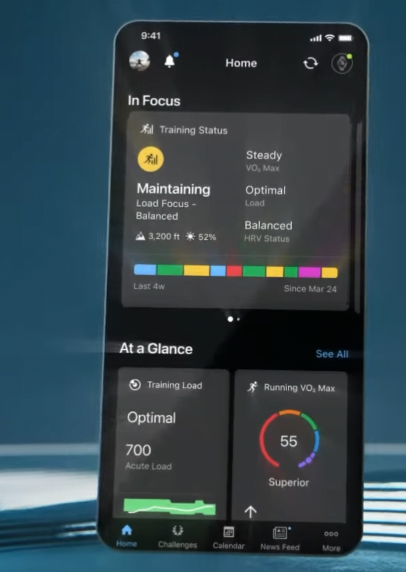
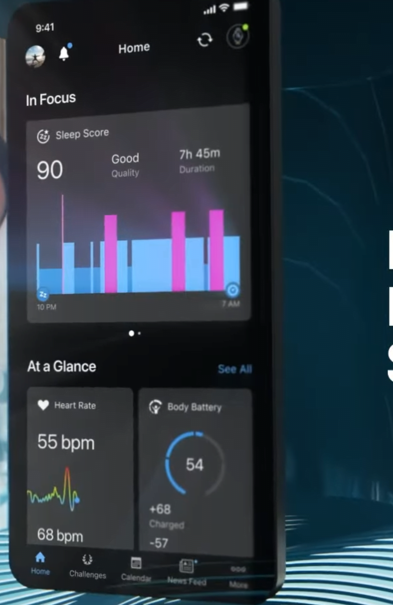
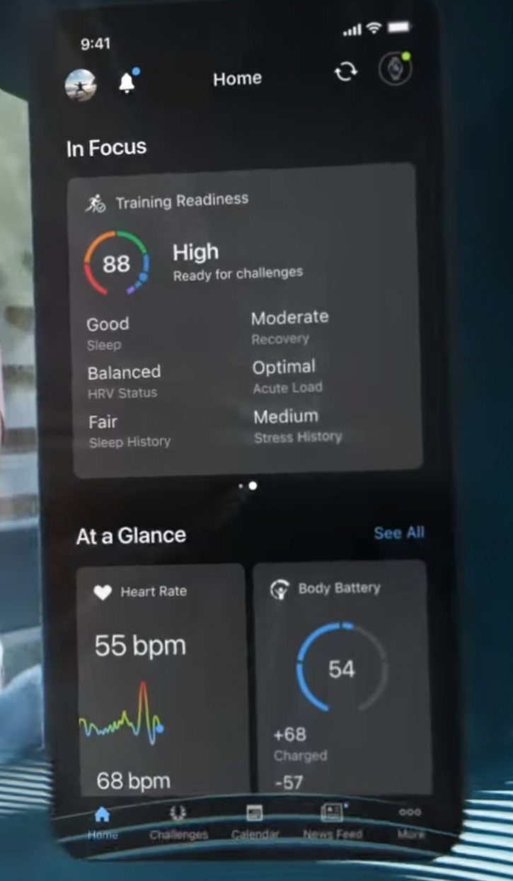
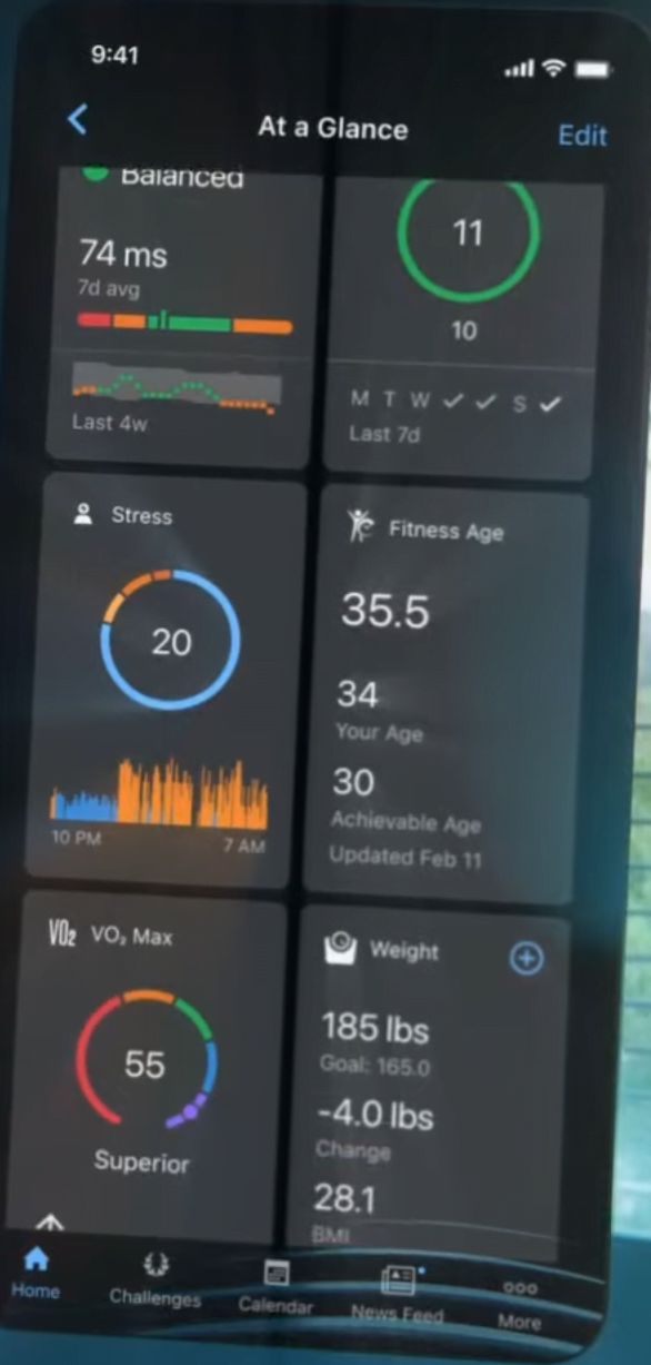
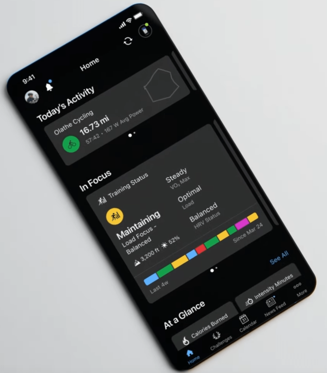
The refresh is based on TILES or CARDS, whichever you prefer to call them. So HEART RATE or TRAINING STATUS could be two examples of cards.
The cards are organised into 3 areas, typically you swipe left/right between your favourite cards.
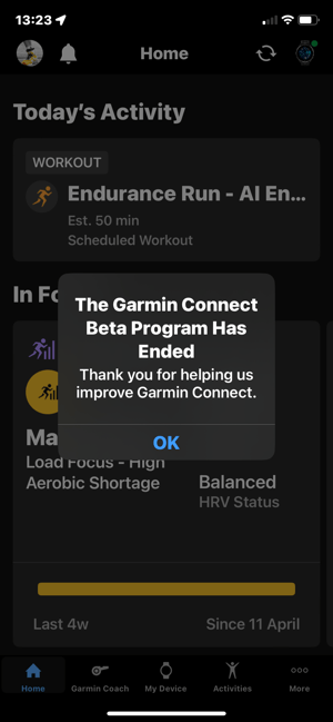
- Area 1 (Top): IN FOCUS – swipeable
- Area 2 (Middle): AT A GLANCE – swipeable
- Area 3 (Bottom): EVENTS, TRAINING PLANS & CHALLENGES, shown if you have activated them
That’s pretty much it but there are two more caveats.
Firstly when you use the new homepage for the first time a questionnaire is used to determine your preferences. Alongside that, Garmin introduces the concept of FOCUS which might elsewhere be called a THEME. You can reset your homepage back to normal OR you can choose to reset to one of the FOCUS settings BE HEALTHY, STAY ACTIVE or TRACK MY TRAINING. Each FOCUS gives the cards that people typically want for the FOCUS. Fair enough.
These are some indicative images for the CARDS, none of which cover new features, there are no massive changes to the method of displaying some bits of data eg the same type of line chart or pie chart might be used, but it gives the impression of a cleaner interface.
Garmin Connect v5.0 – Thoughts
What do you think about the new-look Garmin Connect? https://t.co/oPXoW7qVbn #garminconnect #garmin #running #run #strava #runner #instarunners #runningmotivation #runnersofinstagram #garminforerunner #garminfenix #runners #garminrunning #trailrunning #instarun…
— the5krunner (@the5krunner) April 25, 2024
Related reading: Long-Term Leasing in Thailand: An Alternative Route for F….
Last Updated on 10 April 2026 by the5krunner
tfk is the founder and author of the5krunner, an independent endurance sports technology publication. With 20 years of hands-on testing of GPS watches and wearables, and competing in triathlons at an international age-group level, tfk provides in-depth expert analysis of fitness technology for serious athletes and endurance sport competitors.

When are Garmin going to present heart rate data over time, like Polar Flow does?
If I open the Connect App on my iPhone then I can click on the heart-rate and see my average heartrate over time.
I can choose between 1 day, 7 Days, 4 weeks and 1 year.
Yes, that I know, but I want to see my heart rate in retrospective over weeks and months, to compare intensity from one week, months or years with each other
If only it looked great, AND was properly configurable.
That the layout config is shared between mobile and and Garmin Connect’s web view is frankly ludicrous!
100% with you on the shape of the tiles, its so odd, especially as its easy to imagine/visualise square versions of all of them without losing any data.
Hopefully this is just a first step on an evolving strategy for improved visualisations.
strangely, i think it works better on the web tho
Any ideas what happened to the Sleep Pulse Ox tile which showed the lowest pulse ox and average heart rate while sleeping? I find monitoring my average heart rate while sleeping really helpful as one gauge of fatigue. However, I can no longer find this tile in the new ios app. Is it still there and I just can’t find it or has it been removed?
I’m glad it’s so easy to see a bunch of useless metrics I don’t care about, but it doesn’t seem possible to see my week over week and month over month mileage like I used to be able to on the website. Now I have to click all around and not get a useful dashboard.
Maybe I’m weird but I found garmin connect the differentiator that kept me in their ecosystem. But at this point I have no reason to stick with garmin if their website/app become harder to use.
I have thousands of different activities.
I usually name them, like: “Berlin Marathon”, “North Coast Ultra” and so.
But the mobile interface does NOT have a search function, where one can search for a specific activity.
FFS Garmin!!!
Exactly this. also the lack of the ability to show all running activities filtered on race and distance. It’s available in the web version, why not on the app?
I think it’s ridiculous. In the ‘focus’ section I have to swipe, in the ‘glance’ section I scroll through tiles and ‘last week’ is a list. That seems to be the whole update. Some lists have become tiles or even larger tiles that contain a lot of empty space. On top of that, the ‘focus’ and ‘glance’ areas are also limited to 6 and 8 objects respectively.
It feels like I now have fewer options, even though the app needs more memory. It appears to be an update for CEOs, designers and shareholders, but not for end users. For a good experiences, you would have to let users decide which section (focus, glance, last week) they want to see with lists, tiles, circles or icons.
I cannot get the new design. It is bloated and not very practical. the tiles use a lot of space and do not have enough data.
Although it is good that the app can be customised, I cannot see the point of the focus and glance.
Simple is better
I cannot get the new design. It is bloated and not very practical. the tiles use a lot of space and do not have enough data.
Although it is good that the app can be customised, I cannot see the point of the focus and glance.
Simple is better
The new design is AWFUL
Tracking of Goals on the website has disappeared. The app tiles are visually poor
i thought it was just me
The new design is not only way worse visually and UX but on my phone it is extremely buggy and keeps crashing. WTF Garmin?!? The old connect was Great!
Somebody made a dogs dinner out of a pile of horse manure.
It’s not user helpful.
I think Garmin wasted their money on this, which makes you think are they competent.
I don’t like it at all. Why change something that worked? I will probably move to another platform.
This update is horrendous. Please tell me there will be a way to get the old version back!
With all the love for novelties this one is not for me 🙁 I really liked the old compact view, where one can see all basic stats in one mobile screen. Now I need to scroll. “In Focus” is something entirely useless as it also forces horizontal swiping.
I like the better visual integration of events and challenges tho. But oh I miss the compact view so much!
Well, in a few months time I’ll likely will forget the old look. Like I almost forgot the old colorful Web Calendar that was before the “modern” on the Connect. Now, that I remembered it, damn, I miss it so much, it was so much better visually distinguishing!
Oh, and with all those bells and whistles Garmin still fails to add a simple photo upload feature to the gear! For me this small feature would really help to manage my gear, like red shoes and green ones. Also it would be much easier to manage my collection of unicycles. Which is another big rant against Garmin. They have “RC” activity or “Driving”, which has nothing to do with sports, but they fail to add simple unicycling, even though international community is constantly bugging them!
Looks like I might be a minority, but I think the new layout might be better in general, however it requires some further improvements. For instance – having a tile title below tile icon is such a waste of space. Also it’s not very consistent between sections and generally looks a bit ugly and unfinished. I hope it will be worked on in the near future.
What I would do as a concept is this: fully customizable sections, where you can define number or sections, naming and style for each individual section (list, large tiles, small tiles). I will never understand why software engineers (well, I’m one myself) are often so reluctant to giving more control to the actual user.
Garmin, learn from Polar Flow webb app!
The most stupid thing is that the garmin connect website now mimics the data on your phone.
A website is, or can be, looked at via a large screen, so you can easily see more data. A phone is a small screen, so you have to limit the data and show it more compact.
Garmin didn’t think of this. Just one sits fits all is good enough for them.
But in the end I don’t mind. Garmin connect on my iPhone is only there to sync data to strava. The new layout only adds a reason to ignore garmin connect even more.
yep I agree with that.
Although in my case it makes me slightly MORE likely to look at the web interface (I prefer PC/web interfaces in any case, before it was unusable exept for emergency admin)
I dont like it. Not good at all. Please go back to the old one. This visual homepage sucks.
The updates stops me seeing what I want to see at a glance. Now I must swipe or choose. No progress here. I think it is shite.
It’s a bit manipulative to divide those who don’t like it into two groups and keep those who do in one. Real outcome is:
Don’t like: 61,6%
Like: 38,4%
Biggest issue is that most of the functionality of the website is gone. They should have not released it until every info tile that was available before was available now.
Making web and app mirror is also dumb, I want to see more long term data on my big desktop screen (yea I can’t anymore anyway) and more today related stuff on my phone. Also desktop is usually in landscape mode, makes no sense to mirror the phones portrait layout. Old layout wasn’t that great in using width but new one is even worse.
Additionally the app and web are very wasteful with space, lots of blank spaces, more scrolling in different directions. Different limitations on tiles, “in focus” can show 6 at once on desktop (not that there are that many tiles in this section that matter) but only one without scrolling on the phone, which makes setting it up so both work reasonable at a glance is even more ridiculous, both behave differently but can’t be setup independently. Not at all a good update.
Overall it looks like a rushed beta release.
or 75% don’t hate it.
you can manipulate the data how you want. Twitter Polls limit the number of questions to 4. I thought I’d keep it simple. there are similar twitter polls from others with similar options. Maybe the whole world is out to manipulate you? It’s crazy out there 😉