SRAM Hammerhead Karoo 3 – preceded by design failure with new UI?
Detail: Hammerhead Karoo 3 Review
It’s over 2 years since the Karoo 2 was launched to great acclaim and a replacement model is therefore due around about now – that’s speculation, no intel.
Then, yesterday, we saw the biggest-ever discount on the Karoo 2; notably bigger than the Black Friday sales of the past, and it’s also worth noting that the 2021 launch of the K2 was preceded by a large, and successful sale event on the first generation Karoo bike computer. Again, the sale is an indication that something is in the offing.
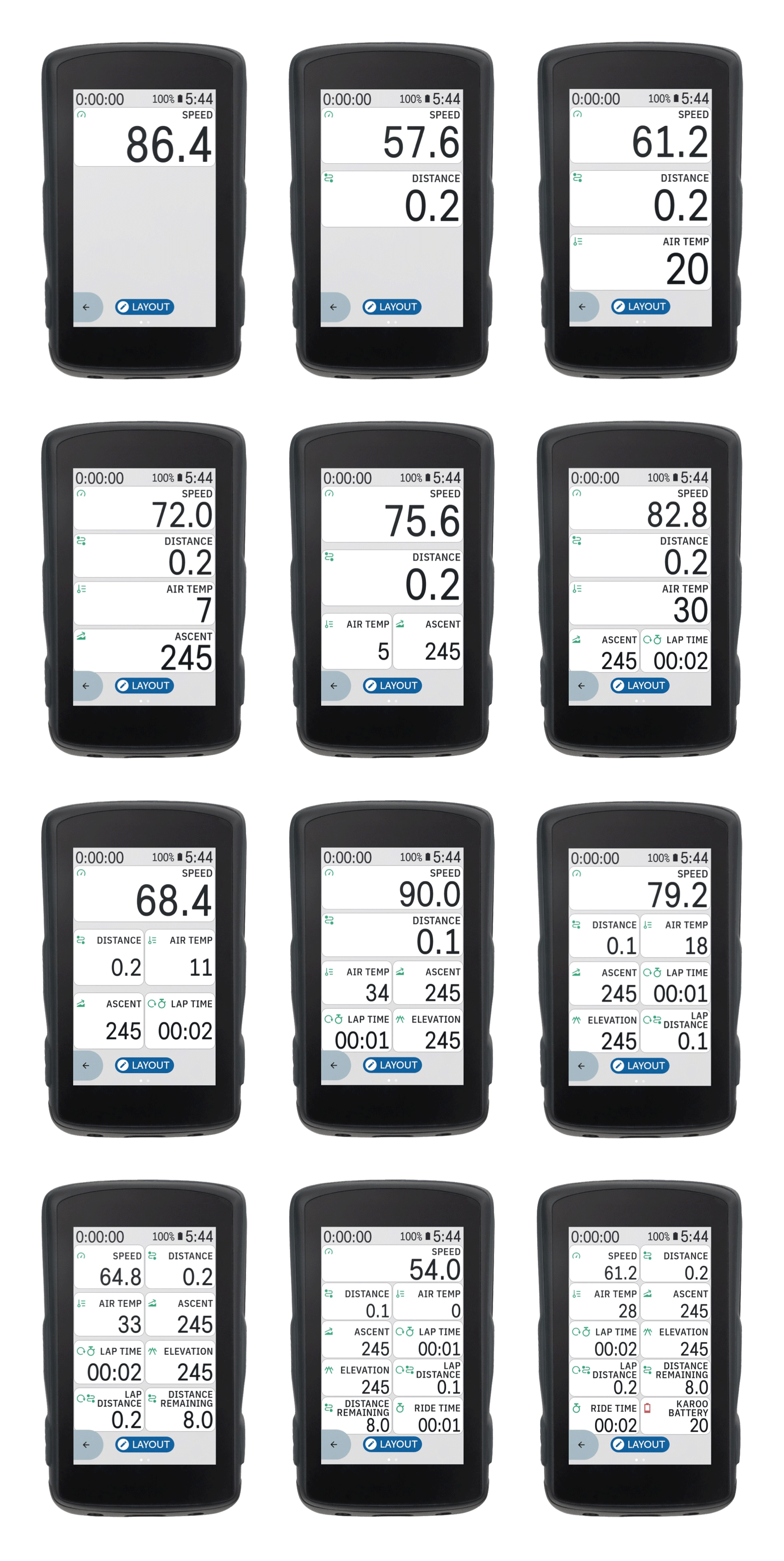
Thirdly, the latest monthly update from Hammerhead has tweaked the look and feel of K2 by introducing on-screen metrics that have more of a tiled appearance as well as a slightly larger font and rejigged metric icon position. That doesn’t in itself strongly signal a new model. However, it DID signal some quite vociferous complaints on the Hammerhead Forums. Most comments were either negative or outright complaints mingled with some threats to jump ship and go to Garmin or not to buy any updated model, which many people there also seem to think is due.
More: Hammerhead Forum
Karoo 3: Thoughts
I do think a Karoo 3 is due sooner rather than later and if I had to guess it would be a complete guess of Mid-July.
I’m also swinging toward the negative when it comes to the tweaked new look. It does look cleaner and better laid out BUT at the same time, the tiles do look a bit old-fashioned and there is more wasted space than might be needed. Hammerhead normally does a pretty good job with the visual stuff and generally listens to beta uses. I’m surprised that they didn’t get so much negative feedback before the new look was launched.
I suspect they’ll backtrack here as they definitely need to keep users on board if a new model is coming…watch this space.
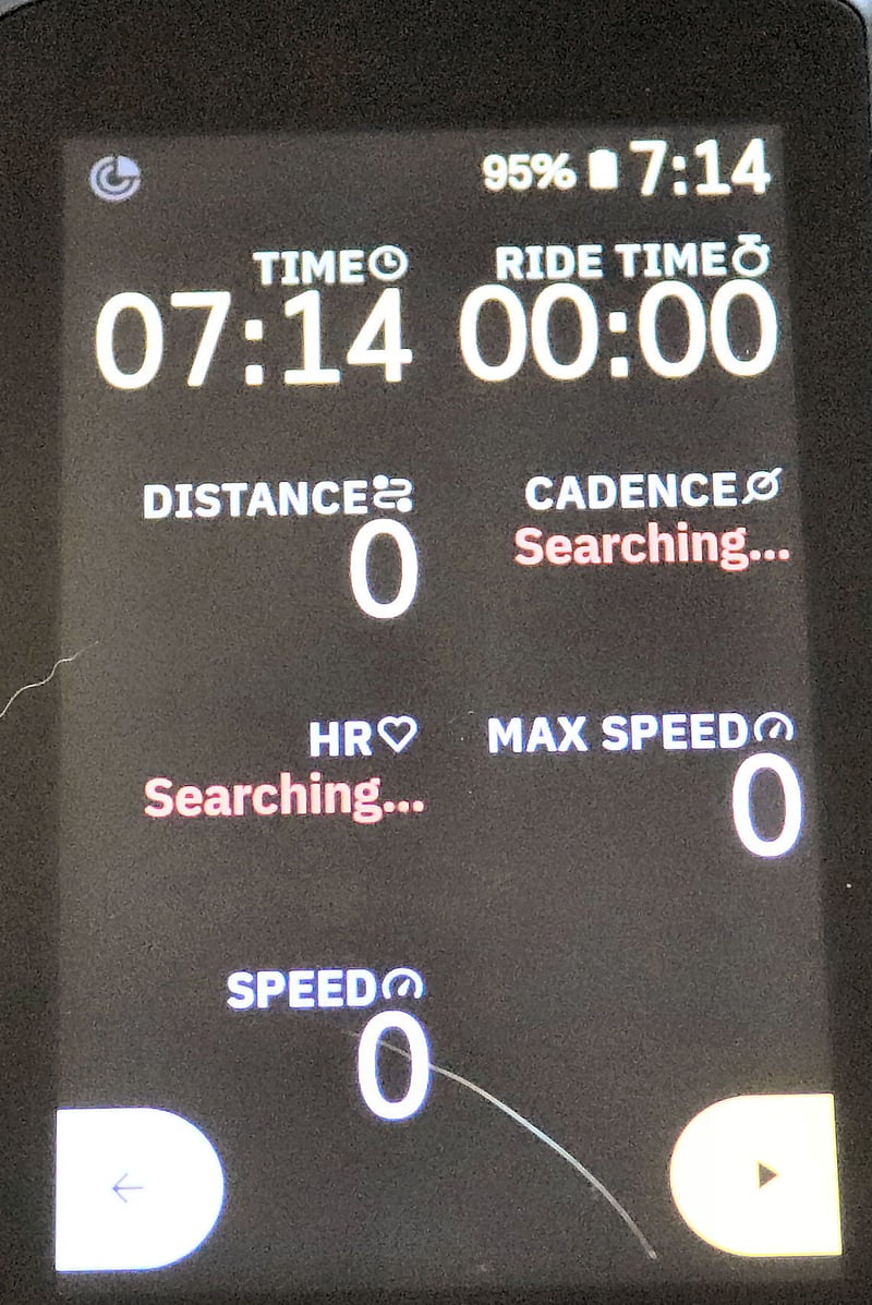
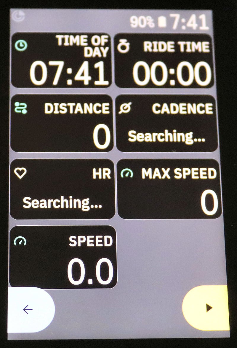
Here are some cleaner images of the new layout:
Further reading: Top 3, Head to Head, Win Outright: The Different Types of….
Last Updated on 10 April 2026 by the5krunner
My favourite kit and nutrition
- Injinji – Runners protect your toes. Avoid discomfort and minor injury. Run more. Run faster. I use them.
- Garmin 90-degree charging adapter — The small adapter that keeps your charging cables tidy. Essential for race day. I use one.
- Garmin charging puck — the fastest and most reliable way to top up your Garmin before a session. I use one.
- Ravemen FR300 — Front light that mounts directly under your Garmin or Wahoo head unit. Keeps your bars clean and your beam pointed where it matters. I use one.
- Body Glide – The blue anti-chafe stick that all swimmers and many runners use. I use it.
- Maurten — The race nutrition trusted by elite athletes. Gels and drink mixes engineered to be easy on the stomach. I use them.
- Garmin Varia RTL515 — A radar rear light that alerts you to vehicles approaching from behind. Pairs with your Edge or Garmin watch. I use this model.
- Favero Assioma Pro RS2 — The power-meter pedals most serious cyclists choose. Accurate, easy to move between bikes. I use this model.
- Garmin Forerunner 970 — A serious choice for a pro-grade triathlon watch. I use this.
- Polar H10 — My daily driver for accurate, waking HRV readings.
- Wahoo ELEMNT Roam 3 — The bike computer that has the feature Garmin lacks: usability. I use mine on most rides.
Reader-Powered Content

This content is not sponsored. It’s mostly me behind the labour of love, which is this site, and I appreciate everyone who supports it.
Support the site: Follow (free, fewer ads) · Subscribe (paid, ad-free) · Buy Me A Coffee ❤️
All articles are written by real people, fact-checked, and verified for originality. See the Editorial Policy. FTC: Affiliate Disclosure — some links pay commission. As an Amazon Associate, I earn from qualifying purchases.
tfk is the founder and author of the5krunner, an independent endurance sports technology publication. With 20 years of hands-on testing of GPS watches and wearables, and competing in triathlons at an international age-group level, tfk provides in-depth expert analysis of fitness technology for serious athletes and endurance sport competitors. ID

Threatening to jump ship because a new slightly tweaked layout is being tested?
It maybe a test, it may be an option on top of the existing one. And even if not… It’s barely different from the current one.
And let’s being honest, the current one looks like a rip-off from older Garmin devices and is not a beauty to begin with
To my eyes, all bike GPS look the same, and they all look… not good.
At least the K2 team made efforts to get the rest of the gui quite nice, updates after updates.
I’d say: let them push their vision. We can always complain later if the change proves to be bad in the end. It’s software, it can be tweaked indefinitely…
People really need to calm down and accept the fact that a bit of change is not always a bad thing.
I agree with you on all polemic of the new UI, it was way over-the-top. Some of the people on the forum were making absolutely disgraceful comments (one guy wanted people fired, even killed!).
The data screens are basically tabular data and in most progs/docs this is delineated to make each cell clearer. HH’s original delineation was a bit extreme, however they have rectified that. Albeit, whilst the vertical line is perfect, the horizontal lines still need thinning down.
I didn’t like the big grey bar at the bottom for the buttons as that was an extreme waste of space, so I switched the buttons off.
However, I for one appreciated the larger top bar as I can actually see it now when riding with sunglasses. I also liked the larger data field texts as. again, they are now readable.
HH made a brilliant response to the whingers with end of June update, making the data field screen fully customizable. so well done to them.
I am eagerly waiting for K3 but will wait 5KR’s and other reviews before buying.
(I quickly bought a 1040, but have since sent it back, too much R&D on the Solar gimmick, not enough on good chips (barometer/temp) or solving their Navi problems that have existed since, at least, my 1000.)
This article looks like the typical Garmin subtle lobby…”to jump ship and go to Garmin” LOL simple inception…Karoo2 is way ahead, GARMIN SELL OUTDATED AND OVERPRICED DEVICES, period.
check out the Karoo forum, that’s what I refer to. I’m definitely not in the subtle pro-Garmin lobby (check out my karoo 2 review which refers to it in the title as a GARMIN KILLER…that’s about as subtle as a brick https://the5krunner.com/2021/02/06/hammerhead-karoo-2-review-the-other-opinion/)
Personally, I favour Wahoo over Garmin and Karoo. I’ve used Karoo for extended periods over the years as my main bike computer and am using an Edge 540 this year just to remind myself how annoying it might be.
Interesting that you’re saying that as of today, you’d still go the wahoo route rather than Karoo.
Why is that ?
i prefer simplicity and ease of use. my own personal needs (outside of this blog) are relatively straightforward when it comes to bike.tri training. i’d probably also use wahoo rival watch just in sport. I’m aware of the downsides
Ok, we’re in the same boat. Simplicity and « straight-to-the-pointness » beats everything for me (for devices). The K2 discount made me raise an eyebrow, but I’m pretty sure that I’ll end up with an overcrowded feeling. Roam v2 is good.
And despite some issues (gps pace not really stable, let alone in challenging env., impossibility to properly pair a Stryd to benefit from its pace and advanced metrics), I still mainly use a Rival for running/swimming (alongside Suuntos as I beta test for them).
It does nothing fancy, it looks like a dead line in their devices, but…something keeps pushing me towards it.
yes the gps pace appears to be an issue for many people
i expected a next gen RIVAL last year…hopefully this year.
I’d really be disappointed if they ditch the Rival line. I still think it brings something different.
The big numbers closer to that edge than the uninteresting small label texts (on fields where the label texts fits in a single line), that’s so bad it’s almost good again, endearing like a toddler’s first steps. Can’t wait until they fix it by making the longer labels animated marquees!
I’m excited about the hopefully soon release of the Karoo 3 (or whatever they will call it). I’m still using a Wahoo Elemnt (the OG) and it still works great, but I’m ready for some new bells and whistles. If the UI isn’t super cool, they can always change it later.
I had to laugh at the comment that the new design looks old fashioned … it just comes around. I’m a Designer for 20+ years and I was quite astonished as I saw what the young designers in my team nowadays find state of the art design language … you can guess it … rounded corners (just like we had in the web 2.0 days)… and you can see that trend all over (from Android to many more places).
All to say – they just want to make it look fresh to the eyes of the public – as a UX Designer I find it to be a step in the right direction as it is clearly more legible.