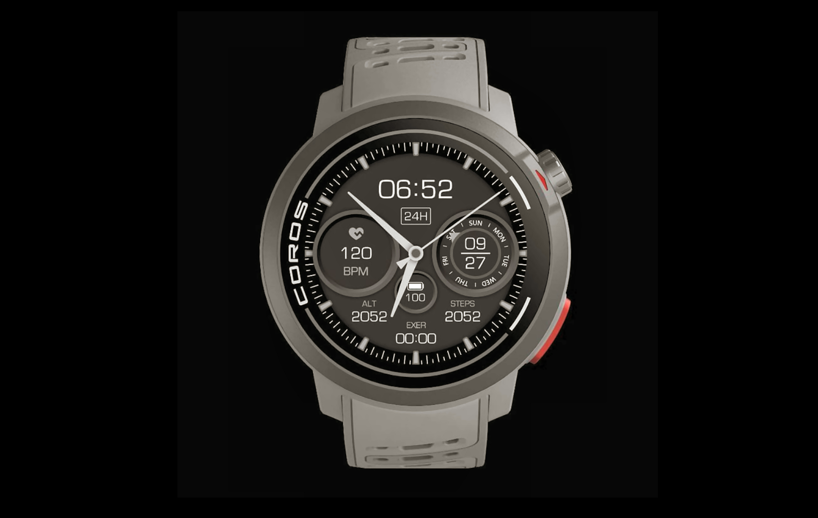
Finally, a Watch Face for Adults? Coros ‘DARKNESS’ Tackles the Sports Watch Design Crisis.
If you own a $1,000 Garmin Fenix 8 Pro or a new Coros Apex 4, you shouldn’t have to deal with watch faces designed by what appears to be a teenager. The problem of childish, poor-quality sports watch design is everywhere in sports watch brands, making formal wear impossible. Coros’ new ‘DARKNESS’ face attempts to fix this, but does it succeed?
If I buy a $200 watch solely for use in sports, I’m fine with that look for a short period of time. However, if I’m at a business meeting or a more formal evening meal, a garish, large-fonted visual monstrosity is simply inappropriate.
To me, that’s a statement of the obvious, yet brand after brand has failed to deliver a regular stream of adequate, let alone best, professional watch faces suitable for adults to wear. As I’ve often said, it genuinely seems that some of the designers of many of these watchfaces are teenagers. Maybe I’m getting old. Well, I am, we all are, but my eye and common sense tells me that a buyer of a $1000 Garmin Fenix isn’t expecting a Mickey Mouse or Marvel Superhero watchface.
A lingering excuse remained with me, “those old MIP screens just don’t have the colours or resolution to display a good watchface”. Then along came AMOLED and, sure enough, the same old garish watchfaces were still there but now just a bit brighter and a bit more colourful.
Maybe it’s just me?
I looked wider and easily found over 50 quotes on the Coros Sub-Reddit echoing this frustration. Here is the consensus, focusing on the common criticisms against Coros, which sadly apply to many brands. Look for the key phrases “hate”, “ugly”, so bad”, immature” – strong words.
The Sports Watch Design Crisis in 5 Key Points:
- “well honestly i hate coros watch faces .. well maybe three can be used at all.” – (u/Ok-Organization-695)
- “It would be nice to have a watch face that looks like it was designed for grown-ups.” – (u/ExpensiveStretch3083)
- “but there was this very… immature feel about it.” – (u/Medical_Juice1)
- “almost all of the watch faces I’ve seen for it are (in my opinion) hideously ugly.” – (u/apola)
- “A lot of them shouldn’t even make it to the public, they are so bad.” – (u/frogsandstuff)
Maybe it’s just impossible?
If your only argument is that creating a good watch face is impossible, then you are on thin ice.
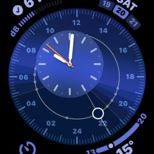
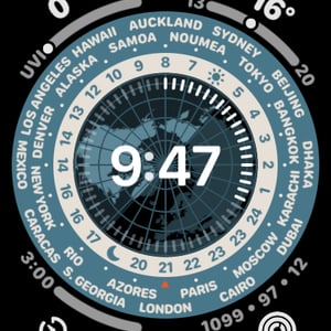
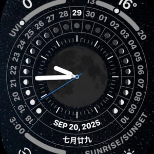
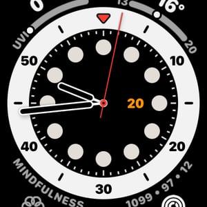
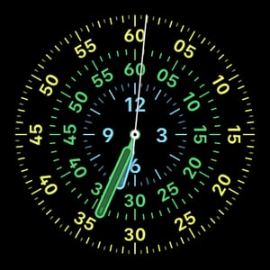
I don’t personally like either of these watchfaces from Apple and Amazfit, but they are good for the style.
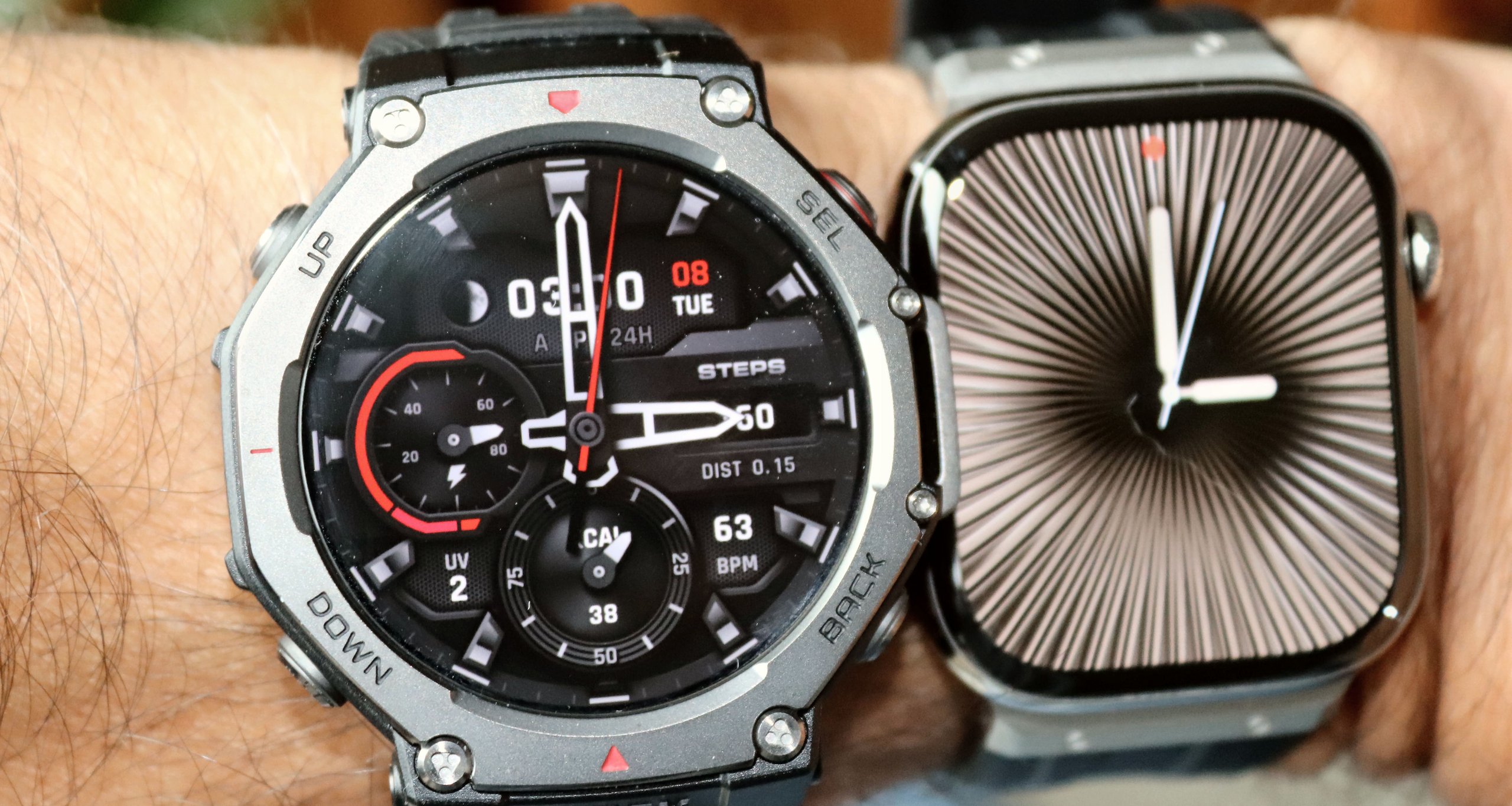
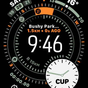
Of course Apple does a variety of watchface templates and there is something there for everyone
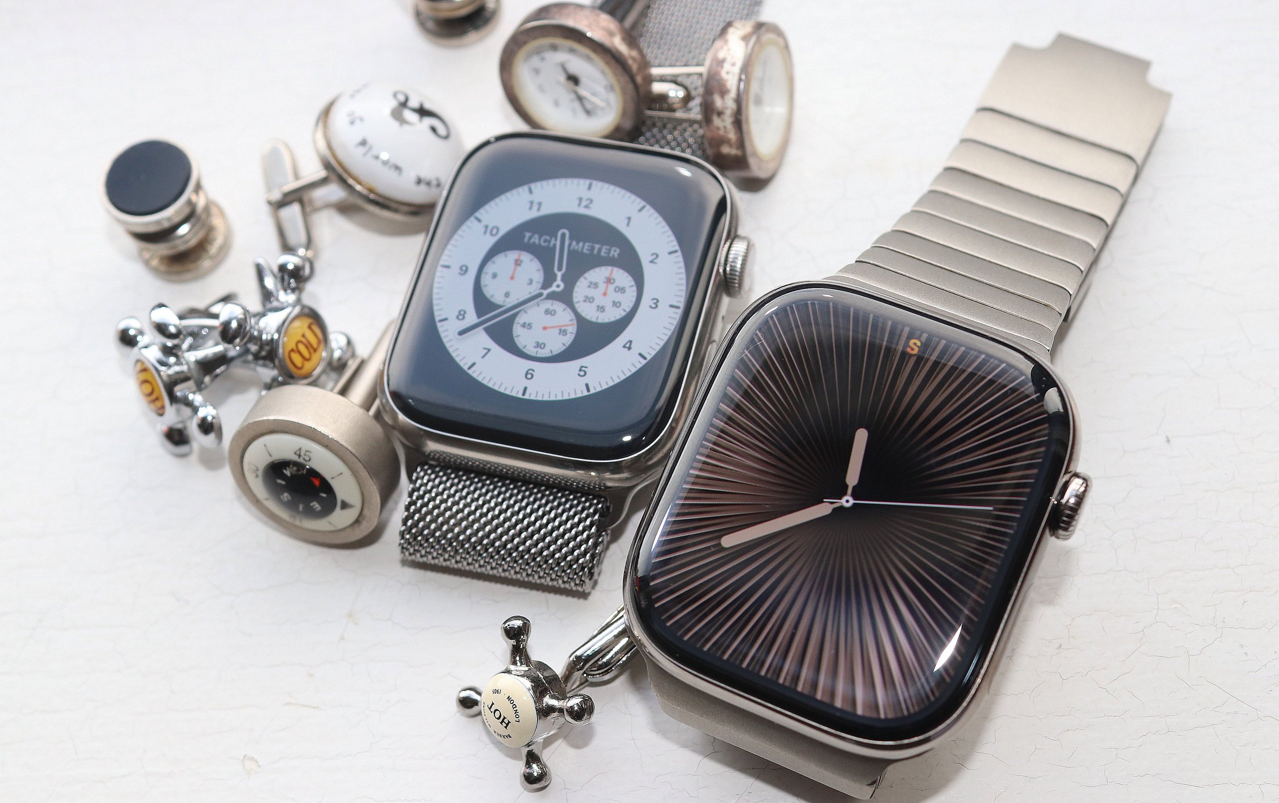
Here are some others from Apple
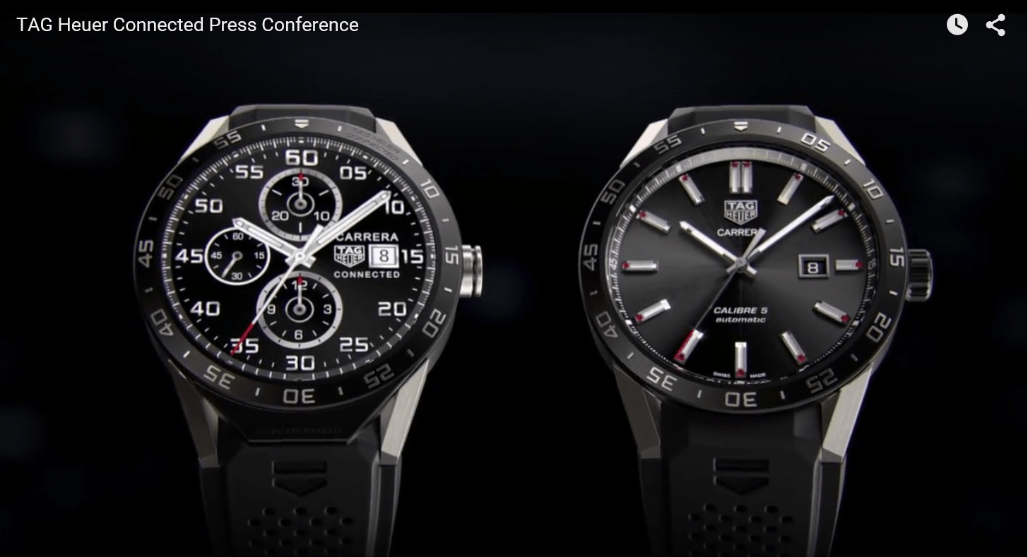
and another from TAG Heuer in 2015 – yes, ten years ago.
Returning to Coros
The DARKNESS face is a clear admission from coros that their design language was insufficient for their adult, high-end user base. While the bezel and awkward branding standout as clear visual flaws, this new face signals a welcome shift toward minimalist watch face design.
This is more than just an aesthetic update; it’s a signal that coros understands and has changed its ways. For customers spending hundreds of dollars, the days of accepting “childish” design are over. Coros is moving first; Garmin and the rest must now follow suit or risk ceding the professional market to the likes of Apple and impressive, new challengers like Amazfit.
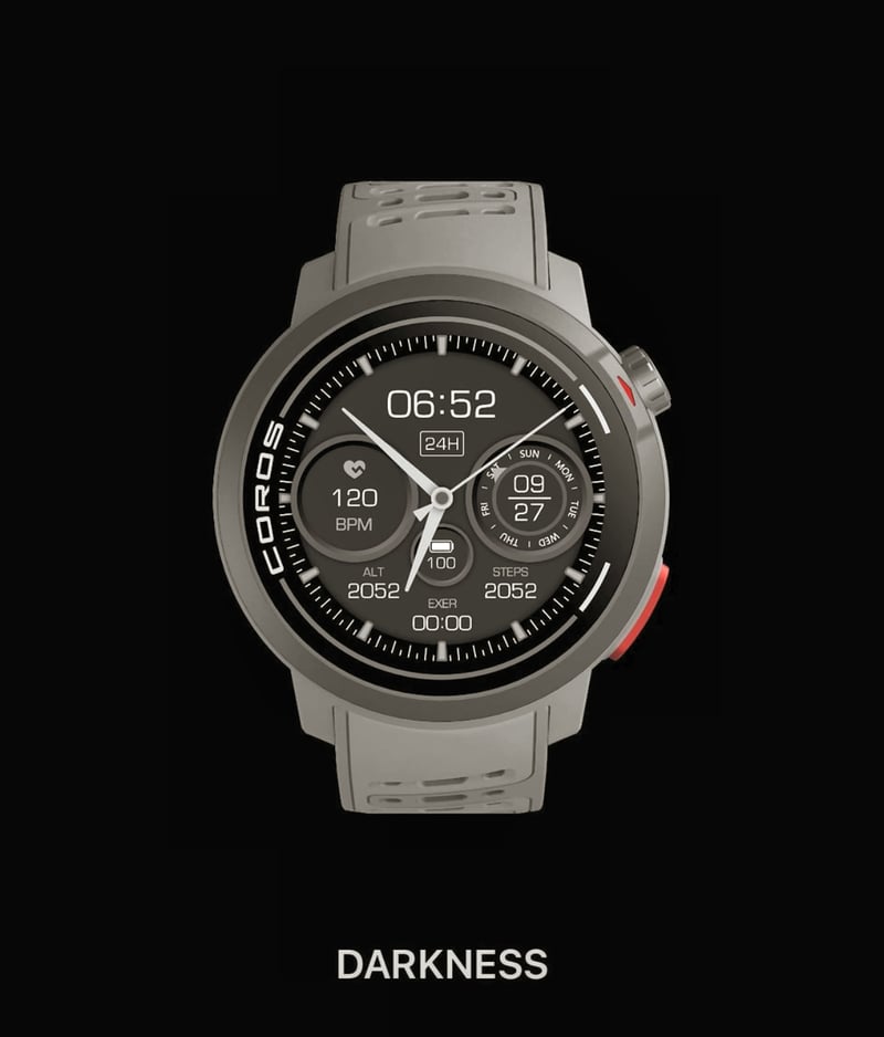


That looks like a rendering rather than an image of what this face would look like on a MIP display. It’s tricky to antialias the hands to look decent at diagonals across the pixel grid. This looks like it has drop shadows and crisp rendering that is not possible on MIP. I’m not even sure fine fonts like that will render well unless they align to the grid.
As a general matter the #1 complaint I have with Garmin is the design language of watch faces. They are weirdly 80s vibe or just garish or have incorrect skeuomorphic behavior like stacking the hour hand on top of the minute hand. (On an analog watch the hour hand is on the bottom, then the minute hand, and then the second hand.)
I like an analog dial. The fenix 8 has one reasonably normal analog dial — which is “Deep Sea”. It has some oddities such as seconds / 24-hour hatch indicators being brighter in AOD than high power and the hands are stacked minute, hour, seconds. But I find this the least offensive and the AOD hands are very readable. And most important the background in high power is not busy with rendered textures.
The CIQ store doesn’t save the situation very much because there are a huge number of attempts but few really well-designed faces. It’s not easy.
The European brand designers at Suunto and Polar and of course Apple with its Swiss Bauhaus aesthetic do a much better job at baseline. Note nthat these brands don’t actually generally render realistic hands and drop shadows. They never render wacky backgrounds — not because they can’t but because it looks like trash.
I can’t argue with that.
It seems that peopel are tasked with these designs that simply aren’t up to the job. Maybe they are tehnical designers trying to re-iamgine what took the Swiss watch industry decades to ‘perfect’.
ciq: yes . there ARE some good ones there and some perfectly acceptable ones. I’ve got some tactical face right now. i don’t especially like tactical faces but it is well done. as you say though there is SO much other nonsense there that you just lose the will to live trying to find somethng nice. With apple, its easier
Hi, this watchface is not the only one, but really great on my F7Xss. A good solution to balance sapphire and solar ring effect on this model.
https://forums.garmin.com/developer/connect-iq/f/showcase/381566/watch-face-ultra-plus
I use a CIQ watchface resembling the Sinn 257 design. It’s only hands, date and (I don’t like that) a UTC hand.
It has a nice luminose Design resembling the watch at night and is really well done. It’s a perfekt companion for the F8