Garmin 970 vs AWU3: GNSS/GPS Accuracy Deep Dive (The New Benchmark?)
This article provides a detailed deep dive into the GNSS (GPS) accuracy differences between the Garmin Forerunner 970 and the Apple Watch Ultra 3.
There are several bonus sections!. I’ve included a comparison to Polar Grit X2 and Suunto Run with Garmin HRM600 and Polar SENSE, providing a bit of heart accuracy fun. There’s more…I’m also providing a quick overview of the differences in native running power, and I’ll highlight the variations in distance, cadence, and everything else I have available.
Important Background
The downsides? It’s just me, so n=1, and it’s one run over a flat 10 miles, or so.
This test is primarily for the Watch Ultra 3 and forms part of a decade-long series of GNSS tests over the same route. I follow a fairly strict methodology (here), which describes the points of difficulty, the precise route, and the pace range I aim for. The idea is that anyone else can replicate the test, which just so happens to start and end at one of the UK’s key Sports Science universities.
There were two unusual problems with today’s test. Firstly, part of my official route was closed; luckily, it didn’t affect the parts of the course where I give an accuracy score, but it means the total distance is invalid. Secondly, I had my dog with me, often off-lead, so I had to occasionally stop to strap her up, but these were never in the scoring sections, so the overall GNSS accuracy score is valid.
Finally, I tested 4 devices, and the more astute readers will point out that I have two wrists. Indeed so. The test only really counts towards the decade-long scores for AWU3 (left wrist), but the others (hand-carried and right wrist) are good enough for the purposes of this article.
Highlights
- The Apple Watch Ultra 3 disappointed slightly on GPS and HR.
- Forerunner 970 shone – regular readers to this site know I am far from being a Garmin fanboy…if I say a Garmin is good, it is. I can say what I think as I buy my own Garmin gear.
- Many lesser-used metrics seem questionable, to say the least.
Let’s go.
FR970 vs. AWU3 – GNSS Accuracy
The Garmin was in maximum accuracy mode (SatIQ disabled), and the Ultra 3 utilised the Apple Workout app, which artificially smooths the GPS tracks. For anyone interested, the Workoutdoors app displays rawer data.
The high-level route overview provides a sanity check that none of the devices have strayed too far off course. Often, with these kinds of tests, reviewers can show zoomed-out maps to hide a multitude of sins. For me, the bottom line is that I expect almost every GPS point to be within a maximum of 5m of the correct point.
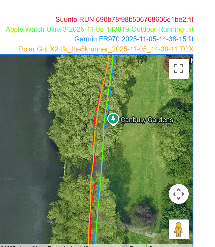
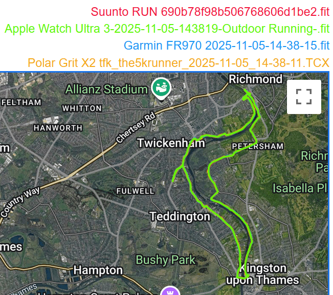 Route Overview
The results are shown using the dcranalyzer tool, which is pretty good for this kind of comparison, and handily, it has a very big zoom button. Let’s hit it.
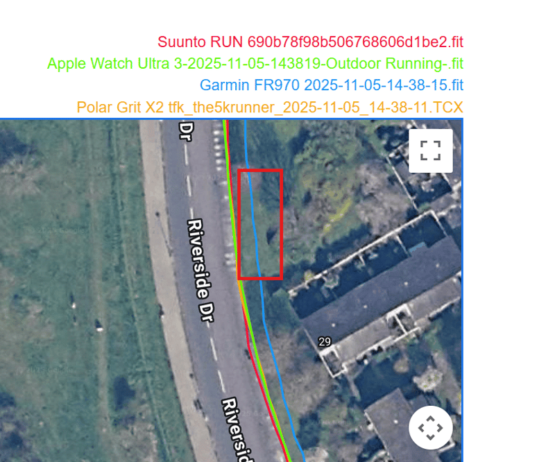
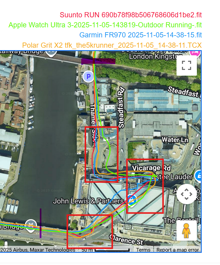
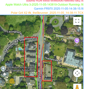
The Shops at Twickenham (first scoring section of the route)
Here, I run 1-2 meters from the shops, which open directly onto the pavement. At Esquires Coffee, I run underneath an awning and take a sharp right, then head diagonally across a minor road (closed, so I turned around). Polar and Garmin get this about right, with Apple running in the middle of the road and Suunto running on the rooftops. Oh dear. Still, even that’s not too bad as it’s within 5m and buildings reflect GPS signals, which shifts the position unless corrected for. As you can see, some devices don’t do the ‘corrected for’ bit. That’s precisely what dual-frequency chipsets are supposed to do…but usually don’t.
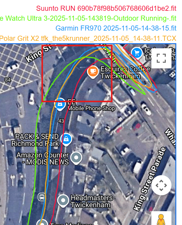 The Shops at Twickenham
Road Section with High Walls and Trees
Next up is a road section bounded by 3m high walls and trees, which passes the Trevi Fountain (OK, I lied, it’s the Twickenham Naked Ladies Italian fountain, which is good…but not that good).
Apple Watch’s smoothing algorithm works wonders here, but Polar’s doesn’t. Garmin is OK.
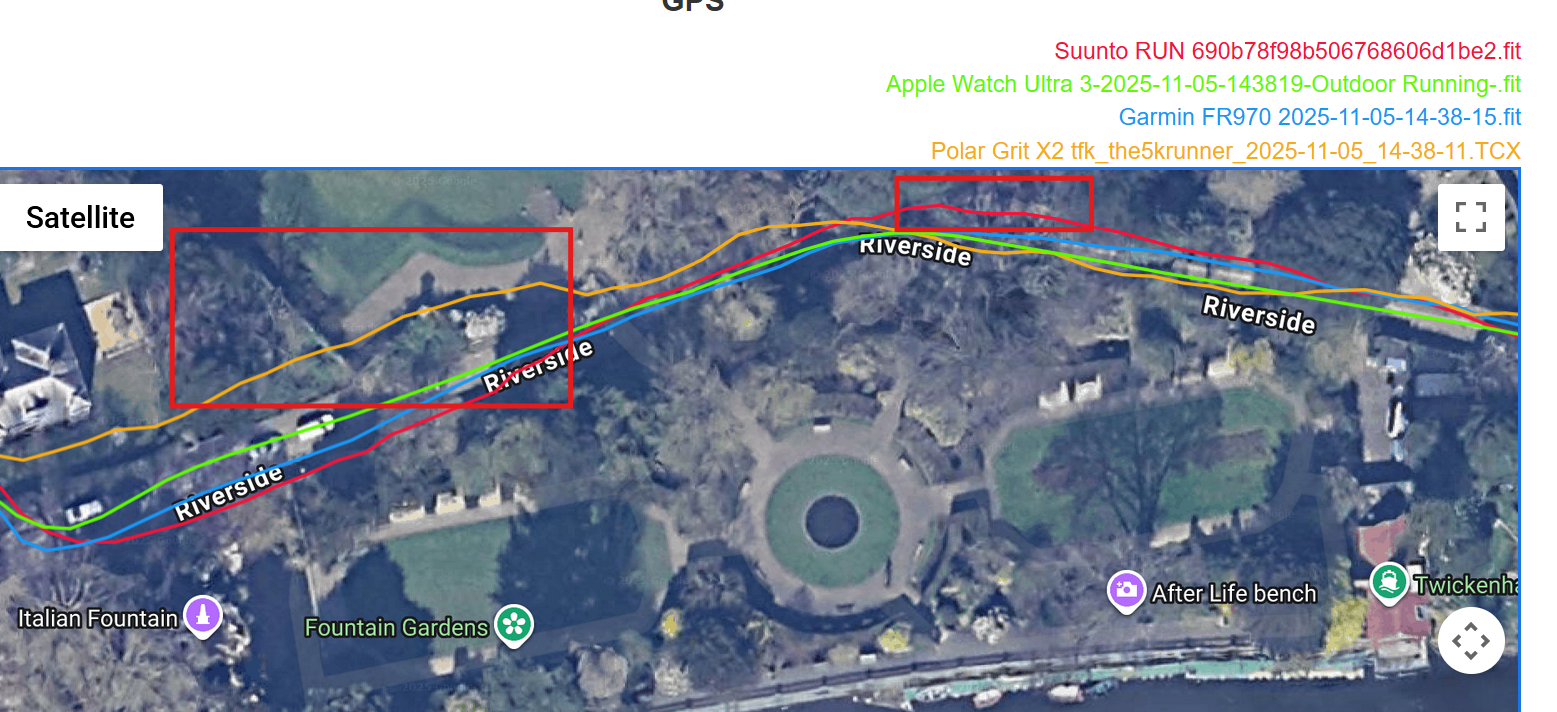
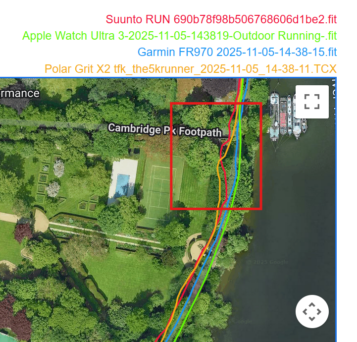
Dense Tree Cover near the River Thames
Next is a long, sweeping section that goes under relatively dense and high tree cover, next to the River Thames. It’s November, but there are still leaves on the trees, #GlobalWarming. If I zoom in a bit, Suunto and Polar have two mini moments of madness; I’ve shown one below.
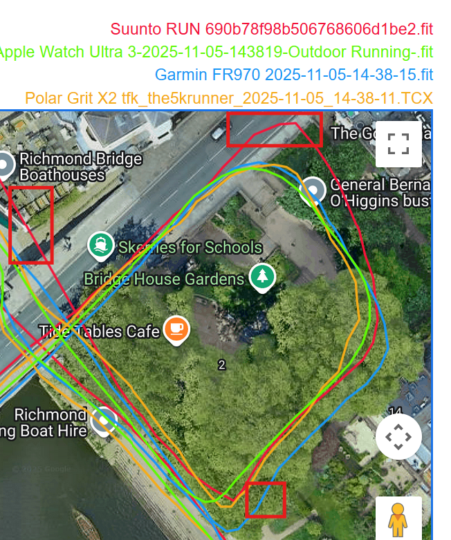
Richmond Bridge and Underpass Loop
Next, I run over Grade I listed Richmond Bridge, do a loop under trees and near a wall, then go through the underpass, and the section then ends. Apple Watch Ultra 3 is unusually excellent here, and FR970 is not too bad.
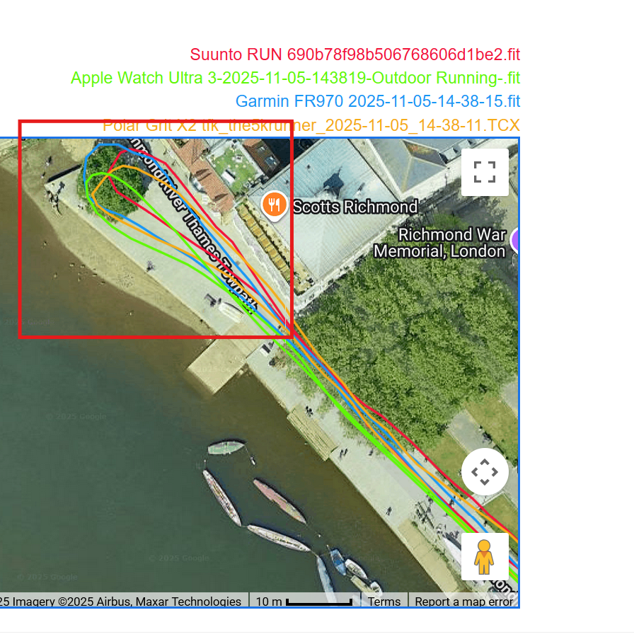
Riverside Out-and-Back (Ted Lasso Pub)
Next, I do an out-and-back along the riverside and around a tree at the end – fun fact: the tree is a minute’s walk from the pub in the Ted Lasso series. The return leg sees me running under a different underpass of the same bridge as before. Here, I verify that the out-and-back tracks do not overlap, that the route passes around the tree, and that the second underpass is correctly used.
All four watches are very good here; Better than normal.. The only criticism is that Suunto/Polar’s tracks are shifted slightly northward.
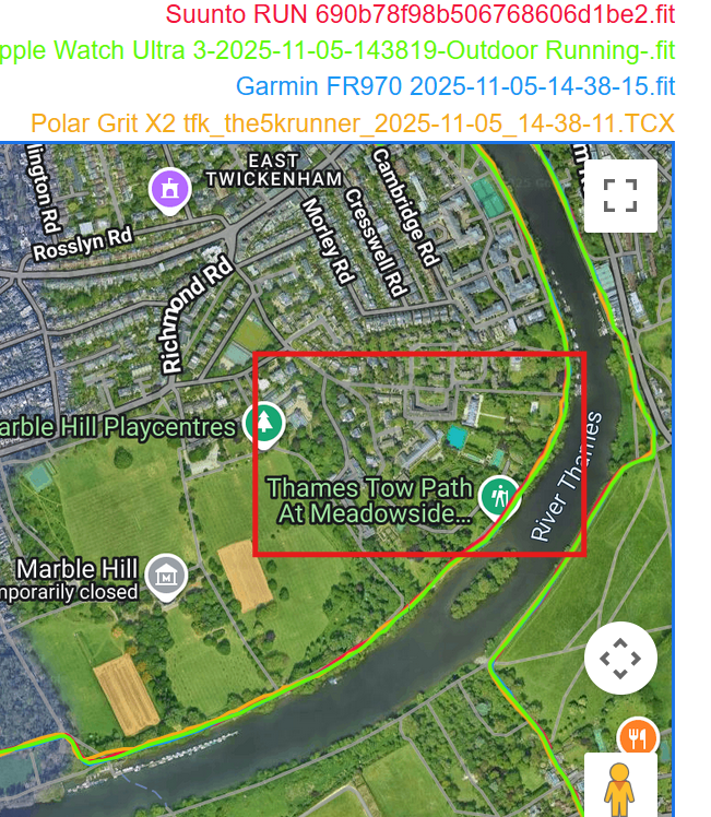
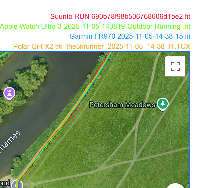
Petersham Meadows (Open Skies)
Then comes the easiest section of the test as I run in a straight line in open skies past a field of cows grazing in Petersham Meadows (yep, cows in London, it’s a thing).
This is probably the most boring GPS track you’ll ever see, and all the devices perform as expected.
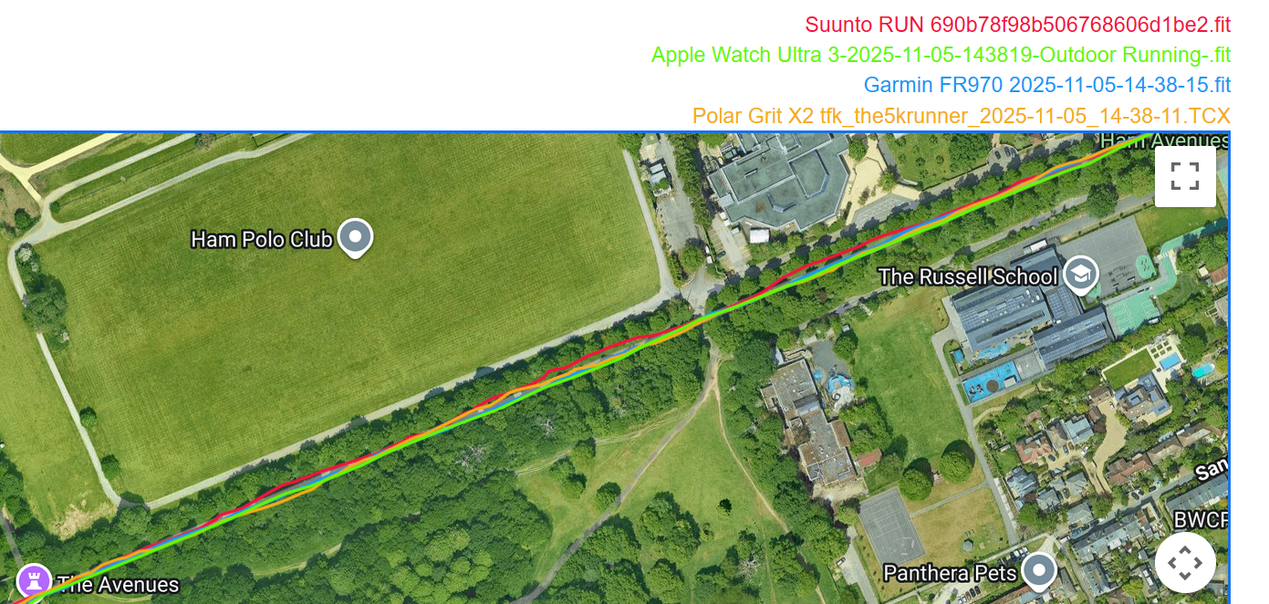
Polo Field and German School
Most people live near Royal Palaces and Polo clubs. I’m no exception. So here I run past my local Polo field. Anyone for a chukka? It also passes the German School. In SW London, there are a lot of Europeans still living here despite Brexit, and they need to educate their kids somewhere. At least the richer ones do.
This is another easy section, with a slight element of GPS difficulty added by the tree cover. Suunto Run drops a point here for its slight deviations.
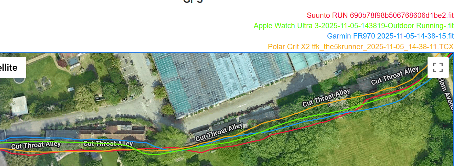
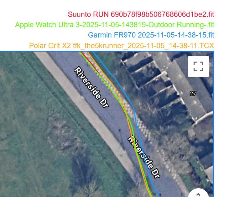
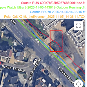
Cut Throat Alley (Impossibility Check)
You can probably guess the history of the next section, called ‘Cut Throat Alley’, which is immediately behind Ham House where several period dramas were filmed including: The Young Victoria (2009), Never Let Me Go (2010), Anna Karenina (2012), Sense and Sensibility (2008), Taboo (2017), Belgravia (2020), The Great (2020), Mary & George (2024).
The Alley is virtually impossible from a GPS accuracy perspective. It is 1m wide, with a 3m high wall, and features a kink in an otherwise straight path. Apple Watch Ultra 3 is the most accurate, and I would speculate that it uses its accelerometers here to finesse the route found by the GNSS chipset. Its rounding algorithm also makes the track appear ‘correct’ at first glance; however, it isn’t, as it identifies the kink in the path too late. You can also see to the left (exit) that Polar and Suunto have not adjusted for the kink. That said, considering the impossibility of this section, they are all good.
Sweeping Section in Open Skies
The following long, sweeping section in open skies should be easy, but watches often make slight deviations, and Suunto and Garmin do that here. I have no idea why watches can’t get this section exactly right. Still, all are pretty good.
Curved Track near Hawker Centre (Rural Usage)
The following section is relatively easy, featuring rural usage with a mixture of open skies, low-density trees, and a curved track. It passes the former site of the Hawker Siddeley company (parts were made for the Harrier Jump Jet used by British and American navies) and the Hawker centre is the start point of the Kingston parkrun – an underrated, fast and recently improved course. On the other side of the river is the Lensbury, where international sports teams train before internationals at Twickenham Stadium.
The GPS tracks are all OK here, but they all meander a little bit, especially Polar in one place. Again, Apple’s smoothing makes it appear the best.
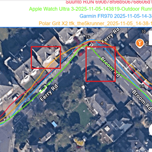
Kingston Rowing Club & Dense Trees
The next section passes Kingston Rowing Club and goes under dense, high trees. All watches performed well here, with minimal disagreement among the four. Check out the track below, you see that Apple and Garmin are very close, and Polar/Suunto are close. The tracks split into pairs after a slight kink under the trees, again suggesting that Apple/Garmin better incorporate accelerometer readings into their algorithms – I believe Suunto Polar use the same Sony chipset, explaining why they are similar but differ from Garmin/Apple.
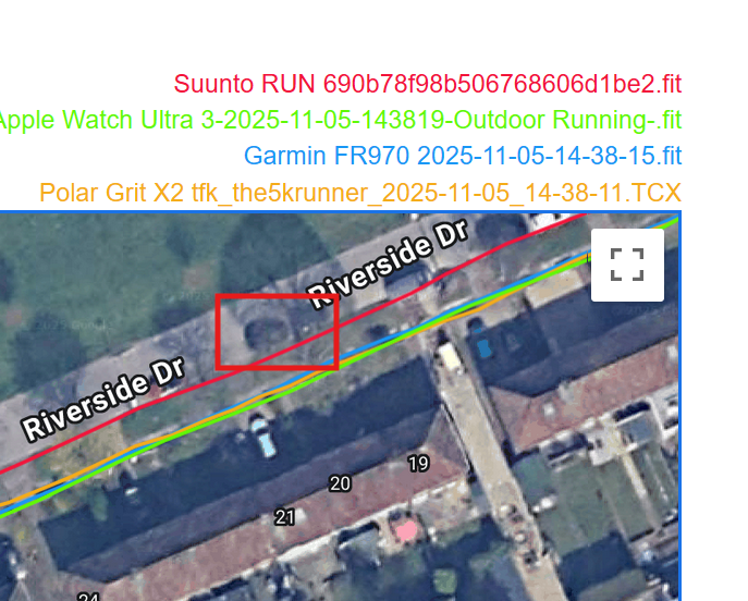
High Buildings and Tunnel Section
So you may have got the sense that Apple was winning to this point. However, as shown in the following image, a significant deviation occurs when high buildings are introduced. Yet, going through the 50m+ long tunnel, the Apple Watch oddly gets a good GNSS track… when clearly no satellites are visible for 20 or so seconds. After the tunnel, Garmin and Apple both recover the correct position quickly. Overall, I would say Polar/Suunto are better here.
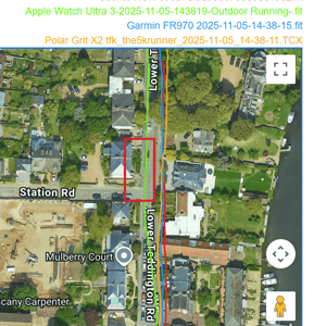
Suburban Residential Test
The following section of road is lengthy and simulates classic suburbia, sometimes situated close to large buildings but mostly adjacent to the garden gates of semi-detached houses. I used to live down here, opposite Kiera Knightley, in fact. If that doesn’t interest you, the excellent Sigma Sports high-end bike shop at the start of the section in Hampton Wick should!
Apple Watch had some bad sections here and seems particularly affected by proximity to moderately tall buildings. Garmin was the best.

Overall GNSS Accuracy Result Evaluation
Garmin Forerunner 970 scored 92%, which is the joint best score alongside Suunto Vertical (2023). Apple Watch Ultra was closely behind at 90%. Effectively, the closeness of these results means there is no meaningful difference. However, Apple’s score would have been better had it not messed up the last two parts of the tests. Before that, it was ahead of Garmin.
Interestingly, this is only the second time a watch has scored 100% on the combined total of what I consider to be the easier sections of the test.
Polar Grit X2 scored 85% and Suunto RUN 82%, both excellent scores by historical standards.
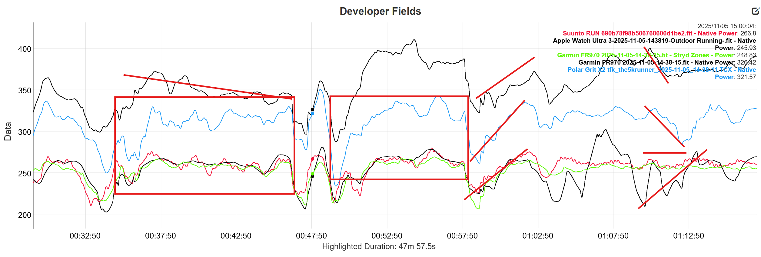
Running Power Comparison
Check out this comparison of the native running power metrics captured from each device, calculated on the wrist. Here I also have Stryd running power pods (4.0). For some reason, the software displayed the wrong colours on the Developer Fields chart, so note that the top black line is the Garmin native power. I’ve massively averaged the data here (120 secs) to smooth it out for easier visual comparison. Also note again that the Polar and Suunto watches were handheld, which probably affects the power calculation.
Most readers here will be familiar with the fact that there are two methods for calculating running power (GOVSS, EESA), but neither is universally accepted as the gold standard. So all the numbers here could be wrong, or one of them could be correct.
Apple, Stryd, and Suunto data are broadly similar for the first half of this chart, but then differ considerably after 60:00. The Garmin data is consistently and significantly higher (which doesn’t mean it’s incorrect). Still, it trends differently from the others, which makes me think it may be wrong.
Furthermore, if you look at the red, highlighted box sections, you can see quite different behaviour of the smoothed power curves for each device.
Turning to the power duration curves (the software can’t display the Stryd data on this chart). As this was supposed to be a consistent effort at 5:00/km ± 15 seconds on a flat route, the power curves should be broadly flat and parallel. The jumps around power at 0-30 seconds probably can be ignored.
What can’t be ignored is the odd behaviour of the Apple curve.
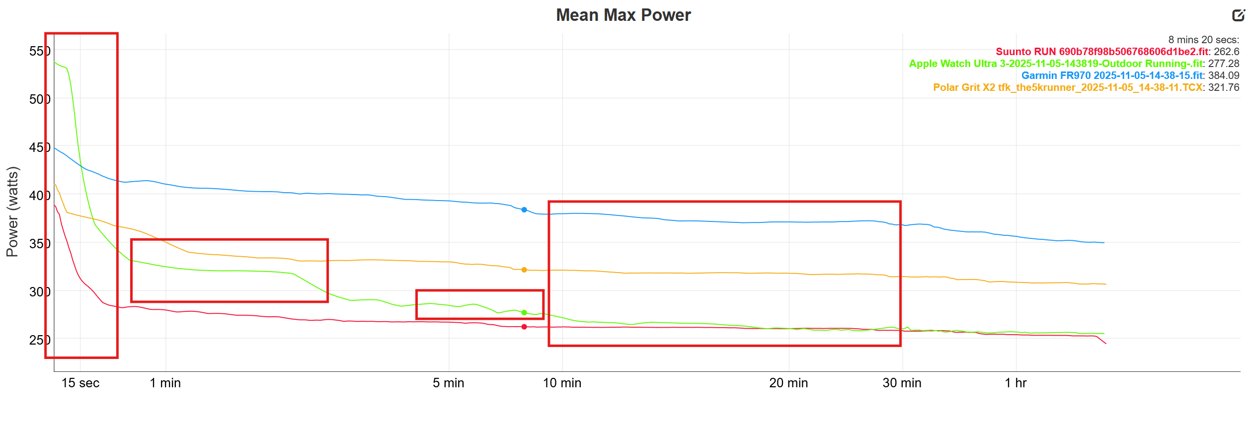 This data ‘feels’ wrong to me. There seems to be unexpected behaviour, too great a (changing) magnitude of differences between the various curves, lagged behaviour, and differing rates of change. Or I could say they’re all totally different! That should not be the case.
FWIW, I use Stryd for running power.
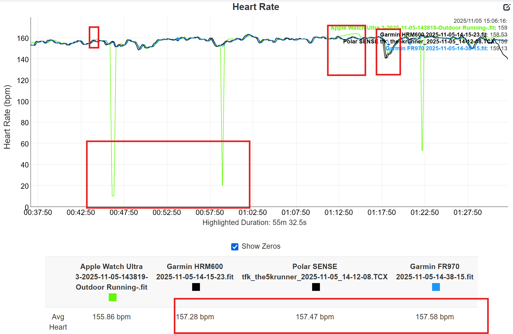
Heart Rate
Let’s discard the Suunto and Polar Grit HR data, as they were worn incorrectly, and the data is wrong.
The chart shows that the known good sources of Polar SENSE and Garmin HRM600 are in near-perfect agreement on this steady-state part of the workout. (incidentally, this flat HR line confirms that the running power in the previous section should have been similarly flat). The chart also shows excellent agreement with Garmin FR970. (There is a slight lag at 1:17:50).
Between 10:00 and 30:00, the Suunto, Polar, and (mostly) Apple curves are flat, but the Garmin one trends downward more than the others.
The chart shows a 30-second moving average, so when the Apple Watch completely drops out, the averages make it appear as if there is a dip. This seems like the Apple data might be incorrect (it might), but let me explain: Apple does not display data where it attaches a high chance of error; instead, it shows zero. So it’s possible that Garmin also noted zero in the same periods but instead reported the last value instead of zero; that makes the chart look better, but is it correct? (I’m not saying Garmin has done that here, but some watches DO do that).
Cadence
Cadence is an essential metric in one sense, less so in another. It’s the kind of metric that you might look at periodically during a run – e.g. to ensure you’re not overstriding uphill. However, like me, you’ll probably never analyse it afterwards (like I’m doing here!). You might also question that if a watch can’t get cadence right, then how on earth will it record the various running dynamics metrics correctly? Cadence will also be a factor in determining running power.
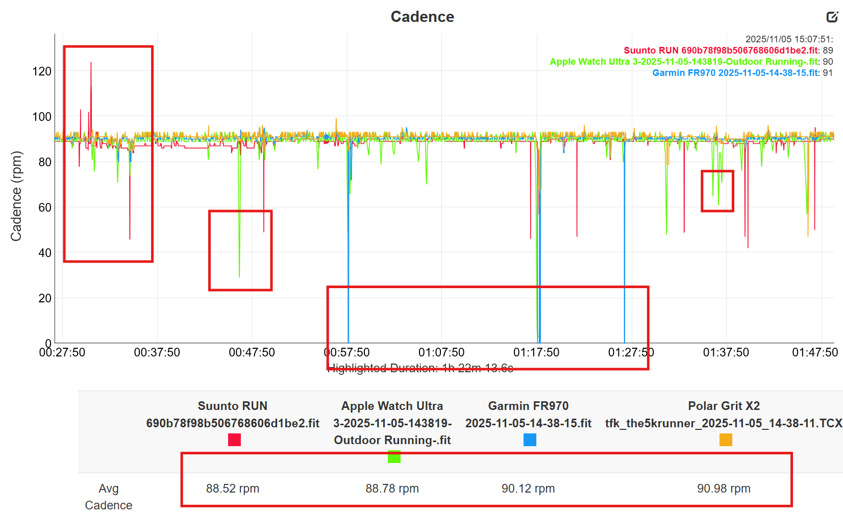
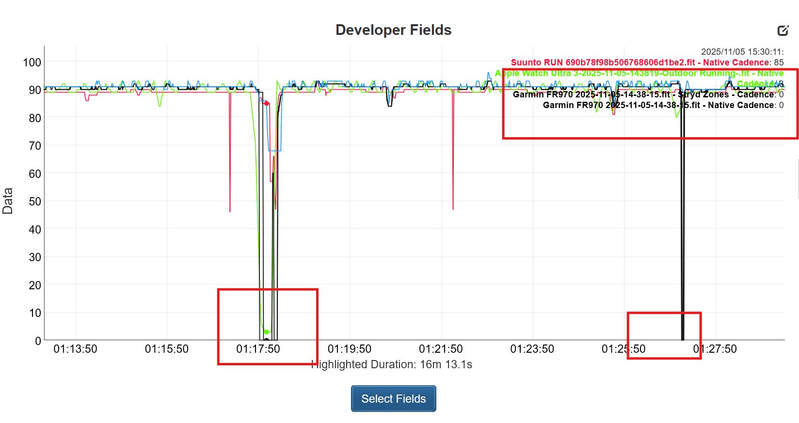
Let’s examine the same cadence data, but this time through the developer fields chart, which allows me to add Stryd cadence. I’ve removed all averaging and zoomed in to show that when I stopped at 1:17:50 (with the dog, remember), only Garmin and Stryd properly recorded zero. Furthermore, if I zoomed out on this chart and adjusted the line colours (not shown), only the Stryd cadence is accurate and steady for the entire run (Garmin is also excellent).
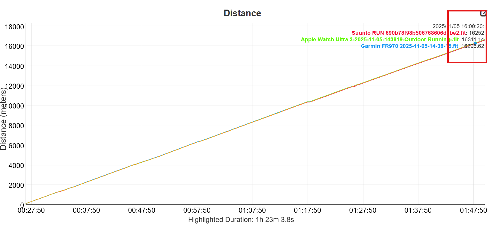
Distance
Perhaps the most boring graph of the lot! But boring means good when we compare the cumulative distances recorded. The total variation over 10 miles is 50m. Which I think is pretty good. I’ve set an uncalibrated Stryd as the source of speed and distance on the Garmin, so the chart might be showing that.
The HRM 600 overestimates the distance here by about 500m – not good, not shown.
Summary and Conclusion
I want to make several points here, which extend beyond the results presented.
Firstly, Garmin watches are now notably more accurate than they used to be, especially with the GPS, which is market-leading. A similar consensus seems to be emerging among other independent reviewers who take GPS accuracy testing seriously.
I get the feeling that there is just a little bit more accuracy that Garmin should be able to eke out from the Synaptics chip it uses to improve performance a little in all the situations where we can reasonably hope for accurate data.
If you revisit some of the GNSS charts above, you will see that all the devices on test, at times, have tracks that extend away from buildings when I ran close to them. The devices all use dual-frequency chipsets, and they should be able to detect and temporarily discard reflected GPS signals; however, it’s clear they do not do this. I’ve talked to a couple of industry experts on this who agree. MIKEG (speed sailor) pointed out that this effect can only work if the frequency-distance discrepancies are over 29m, which is pretty useless for running in urban areas. This is one area where I hope there is potential to further improve accuracy near large buildings.
I hope I’ve highlighted the issues of Apple’s intentional HR dropouts when bad data is present. That’s the decision the company made, and there are pros and cons to the approach. Both Garmin and Apple have accurate HR sensors (on the whole, on average), and the data will usually correlate well with known good sources – just realise there’s more to accuracy than simple correlation. ie where do the inaccurate components of optical HR come from.
The running power data appears to be broadly incorrect across all watch brands – or inconsistent, at best. I wouldn’t trust any of it. Stryd uses the most inputs and the most accurate inputs; make of that what you will.
The cadence data also seems odd. It was 2025 when I last looked, and I kinda hoped this most basic of metrics would be sorted out. The data above clearly shows it isn’t sorted out on watches. Fine, you might say, cadence is not that important. However, for anyone examining running dynamics, you may also want to question the accuracy of what you are observing, as errors related to motion (like cadence) will undoubtedly exist.
To end on a positive note. Garmin Forerunner 970 in this one test recorded the best GPS track I’ve seen in 10 years on my standard course. Even if you consider possible scoring errors on my part, it will still be equal-best.
Last Updated on 30 January 2026 by the5krunner
Reader-Powered Content

This content is not sponsored. It’s mostly me behind the labour of love, which is this site, and I appreciate everyone who supports it.
Support the site: Follow (free, fewer ads) · Subscribe (paid, ad-free) · Buy Me A Coffee ❤️
All articles are written by real people, fact-checked, and verified for originality. See the Editorial Policy. FTC: Affiliate Disclosure — some links pay commission. As an Amazon Associate, I earn from qualifying purchases.

tfk is the founder and author of the5krunner, an independent endurance sports technology publication. With 20 years of hands-on testing of GPS watches and wearables, and competing in triathlons at an international age-group level, tfk provides in-depth expert analysis of fitness technology for serious athletes and endurance sport competitors.

Running dynamics are practically useless other than cool graphs. I don’t think there is much incentive to de-noise the data. Similarly I don’t think running power has taken the world by storm like cycling power did nor do I think it is really the same thing. Very few use running power as the basis of training. It’s more RPE, pace, and heart rate not necessarily in that order.
As an aside there is a new rolling (1km) average pace field in the latest round of Garmin betas. It is a compromise with lap pace which is generally accurate but not responsive and (current) pace which is responsive but not very accurate. Averaged over 1km Garmin is very accurate.
did you mention the rolling pace before? someone did. yeah, that’s useful.
stryd IS used by a lot of people eg well over 100,000 downloads of just the CIQ data fields. that’s just garmin and just stryd on garmin. maybe a million people use running power worldwide? i might have to do some research.
obvs, more people use cycling power data more holisticaly. i wonder how many bike PMs are in use? a lot less cyclists than runners.
I do wish the rolling pace was configurable. I’ve always used Lap Pace, but on average, it’s using a 1/2 mile distance to average over. I’d probably choose 1/4 mile for the rolling pace if I had my choice.
Yes, lots of people have Stryd, and use it. But is it mostly for running power or is it for more accurate pace? What other metrics does it provide today? I haven’t used a foot pod since my Run Scribe’s many years ago. How many people really pay attention to the power, or more importantly, do anything actionable based on it?
Running power is a completely different tool from bike power. Bike power clearly helps with training and is actionable in real time.
agreed on the 1/2 mile or similar for rolling average. of course you can set that as your lap length but…(I tried that for a week, years ago, not good)
stryd: power and pace accuracy. the pace accuracy was more important a few years ago, less so now that dual frequency chipsets have improved accuracy.
i dont see a good argument that sets bike and run power apart. they are equally as useful imho. i agree that ahigher percentage of cyclists probably actively use power.
I would agree that pace is probably the main reason people buy a Stryd. Power is sexy to think about at first, but it would require a lot of rethinking of training plans and as the previous posts mention, its just not the same as cycling power. The difference between my Coros Pace Pro and a Pod 2 vs any Garmin or Suunto I have put it against is remarkable. Stryd is also very useful in the same way. Hiting a climb and having to wait 10-30 seconds for an accurate pace is pretty much solved with a Pod 2 or Stryd.
Of note I am sure it was just because that is what you had on hand, but I did find it curious that you put the top end Garmin running watch against the basic bottom end Suunto. The Run is accurate, but also costs 1/3 of the price of a Garmin 970. Not exactly apples to apples. My last grip is where is the Coros?
I am not trying to be cringe or discount your hard work, the test was looks like it was a ton of work and it is great writing. Just curious about what motivated the specific watch choices. You have top end watches against a wee little Suunto Run.
I live in South Korea.
High-rise buildings are everywhere here, and people live in large 30-story apartment buildings, not small houses.
The town I live in has hundreds of 30-story apartment buildings.
I’ve used the Forerunner 10, 920XT, 630, 945, 955, and finally the 970 since 2012.
Until the 945, I couldn’t run in the high-rise apartment buildings (the GPS tracking was absolutely terrible), so I had to move to the beach to train for a marathon.
With the 955, the GPS tracking has become very accurate.
The 970 is slightly more accurate, and has shown very consistent and stable GPS tracking performance during repeated runs in the same location (under 15-meter-tall trees in a 30-story apartment building).
This is much more accurate than the COROS or SUNNTO users who run the same course as me on Strava.
ty
you would need to compare only devices from coros/apple that have dual frequency and check the other runners enable it.
fr955 uses the Airoha AG3335MN chipset which is a prior gen dual frequency chipset and, in my experience, not as good as garmin’s newer synaptics dual frequency
i’m always surprised that people say they get good tracks in the kinds of areas you talk about, I vaguely recall dcrainmaker doing something similar in NYC.
I get sometimes quite significant >5m differences due to multipath errors when running close to building that are, say, 3 to 7 stories high
I suspect it is how close you run to the building. I run CLOSE.
I suspect it also depends how closely you zoom in on the track. I zoom in close.
You also need to use satellite mode not map mode when viewing and the maps are somtiems not quite right.
thus by the same token when road cycling, you are in the middle of the road, efectively, and >5m from buildings. I often get perfect tracks with the latest chipsets.
not that it matters!!
city marathon?…#Stryd !