Garmin Fenix 8 Watch Faces: Customisation, Gallery, and Best Picks
More: Detailed Garmin Fenix 8 Review
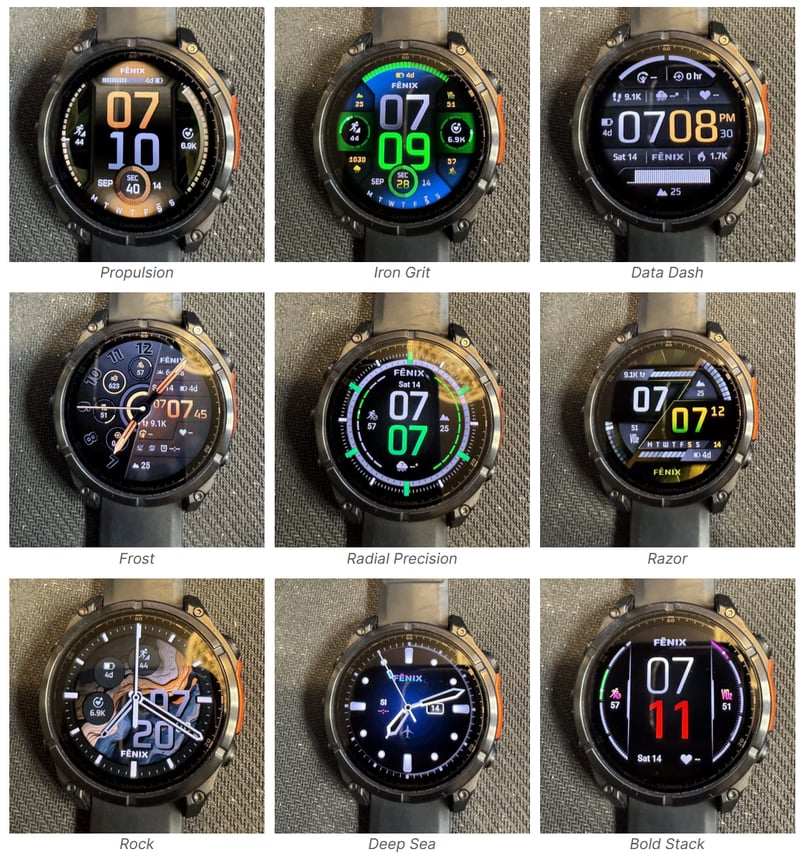
There are nine watch faces on Garmin’s new Fenix 8 Series. The new AMOLED screen handles high colour saturation well, but most of these faces look childish or ugly at first glance. I’m betting you bought this $1000+ watch for yourself, not one of your teenagers.
Fear not; there are ways to tone down some of the most vivid and wacky colour gradients.
Here’s an article explaining how I prettied up the standard Garmin Fenix 8 watch faces. I’ll add a screenshot image for each face’s customisation. I’ll also include some info on the number of complications and colours to help you decide which face to use.
I’ll probably not spend too much time putting my favourite complications on each face as their choice makes little difference to the end aesthetic. You can choose your own, and, in any case, I typically get quick info from the widget glances. That said, Battery Status, Temp/Wind, and a TSB/HRV chart would be at the top of my list.
There seem to be about 19 widgets and 105 widget colours, including a ‘colour’ that automatically follows the accent colour. The best way to change the widget data is to select the widget with the touchscreen—the buttons don’t reliably cycle through the complications. When you customise the face, it appears smaller than when finished. This is a little off-putting, but you get there in the end.
Choose colours that match your band colour, but note that the sensor guard’s colour may spoil your best attempts at visual awesomeness. They have the red sensor guard to match the Prada Red Strip idea from a few years ago (oh dear, Garmin isn’t Prada, get real).
More: Advanced Tips & Tricks for Garmin Fenix 8
All the images shown are my actual screenshots of the watch face I ended up with. Admittedly, they look better here than on the watch…but they are the same.
Iron Grit
There are a few complications here, and it can get too crowded. There’s also a slight blue hue to the face that randomly appears. You must set a bottom circular complication, as the NONE complication overlaps the minute digit (doh!).

- Fixed style
- There are four complications: one arc at the top and three small circles at 3, 6, and 9 o’clock.
- Four secondary circular complications are located equidistantly – I disabled these with the NONE complication.
- Data – Training Readiness (Arc), sunrise/sunset, Recovery Time, Seconds.
- Accent Colour – Silver
- Data Colour – Light Silver
Rating 3/5: Nicely customisable. I was let down by the inability to change the time font.
Rock
This face is dominated by the background TOPO style and digital time in the bottom right quadrant, neither of which can be removed. The analogue hands appear a pixel or so too large. This face nicely matches a leather band.

- Four background styles
- 3 Complications towards the top left quadrant of the face
- Accent Colour – Spark Orange
- Data colour – Light grey
Rating: 2/5 You’ll either love or hate the TOPO style as a background, which will determine your love or hate for this limited face. I feel the nicely contoured style visually grates with the angular analogue dial.
Data Dash
This face reminded me a little of my old favourite, Crystal (1 million downloads, or Crystal Tesla). So, I coloured Data Dash blue for old-time’s sake.
The complication bar at the bottom can only be either HR or altitude, which is limiting and puts me off using this face from a practical perspective.

- Fixed style
- 8 Complications, including a horizontal bar at the base and two arcs to either side of noon. The entire central horizontal section is non-configurable, and neither is the FENIX logo. The thinner bar of 3 complications above the digital time must have at least one complication on the left.
- Accent Colour – Cobalt Blue
- Data colour – Light Blue
Rating: 3 out of 5, but it would be higher if the bottom complication were more configurable.
Frost
This is a visually odd face split diagonally. To the left of the diagonal are relatively nice, circular complications, and to the right is a mishmash of poorly designed junk. The face supports a whopping 13 complications in total.

- Fixed style. The brown time bits can’t be changed.
- 13 Complications including a horizontal bar at the base and two arcs to either side of noon.
- Accent Colour – Muted Gold
- Data colour – Gold
I initially liked this face, but my love faded each time I looked at it. I tried to improve it by removing complications, but it only worsened.
Rating: 1 out of 5. If you have an eagle-eyed vision to see the microscopic and love steampunk, this one is for you if you are a human, less so.
Razor
This watch face relies on the gradients (bars) in each complication yet gives you choices of data that make no sense displayed as a gradient.

- Two very similar styles
- 4 Complications, each showing a bar, digit and icon
- Accent Colour – Muted Gold
- Data colour – Gold
Rating: 2 out of 5. If you love progress bars and this unusual split-screen aesthetic, you will use this face more than me.
Propulsion
Propulsion has a nice, clean font and layout. If you want a progress bar/scale to complement the circular complication on each side, you’ll love this for how it works and looks. HRV Status and Body Battery work as well as any other, and the obvious choice was to have battery over the top with seconds to complement the day of the week at the bottom. You might get away with this one as a serious watch face.

- 4 Complications, the top one being a bar. I chose a battery for the top
- Accent Colour – Red
- Data colour – Follow Accent Colour
Rating: 4 out of 5. This will grow on you. The red colours I chose also tie in nicely with the sensor guard.
Radial Precision
This is my favourite of the new Garmin faces. The time is stacked in the middle, which works well with a digital clock. Even the clock’s gradient colour is Acceptable for someone as picky as me.

- Two styles – analogue or digital, digital is easily the best
- 4 Complications at the Cardinal Points
- Accent Colour – Lava
- Data colour – Lava
The digital clock could form a more significant proportion of the display, but other than that, I have no complaints. The red works well with the sensor guard’s colour and is suitable for classy or casual usage with most straps.
Rating: 4.5 out of 5 for digital.
Bold Stack
This is pretty much the same as Propulsion, but with a different gauge style at the side and a couple of almost random vertical lines to make it look worse than it otherwise might. I chose yellow for funsies, but you might want to change it.

- 4 Complications, the top one being a bar. I chose a battery for the top
- Accent Colour – Amp Yellow
- Data colour – Yellow
Rating: 3 out of 5.
Deep Sea
Deep Sea is intended for divers with two unique dive-related complications: no-fly and surface interval, augmented with a secondary time zone. It looks awful, right?

- 4 Complications
- Accent Colour – Can’t be set
- Data colour – Turquoise
Rating: 1 out of 5.
Garmin Fenix 8 Watch Face Gallery – new Watchfaces
I started with great confidence that I could improve the aesthetics of the faces. However, they weren’t as customisable as I’d hoped, and although I think I’ve improved most of them, I don’t think I’ve improved them by much. What do you think?
Large Final Gallery
My Favourites
My favourite is Radial Precision, which works well in various colour schemes, casual or professional.
Data Dash would be my favourite complication-rich face, and if I had to use an analogue face, it would be Rock, even though I scored it poorly.
Closing Thoughts
There are some excellent faces here, but also some terrible ones.
When I first saw them, they looked better than after I spent four hours playing with them for this article. I don’t know why Garmin can’t produce much better ones, like TAG or Apple—not necessarily the same as them, but of a similar standard.
Comments are closed; please do so here if you want to comment,
Last Updated on 28 January 2026 by the5krunner

tfk is the founder and author of the5krunner, an independent endurance sports technology publication. With 20 years of hands-on testing of GPS watches and wearables, and competing in triathlons at an international age-group level, tfk provides in-depth expert analysis of fitness technology for serious athletes and endurance sport competitors.


Al subjective, i like the deep sea for example. Thanx for putting them all together 💪🏼
Comments are closed, if you want to comment please do so here