

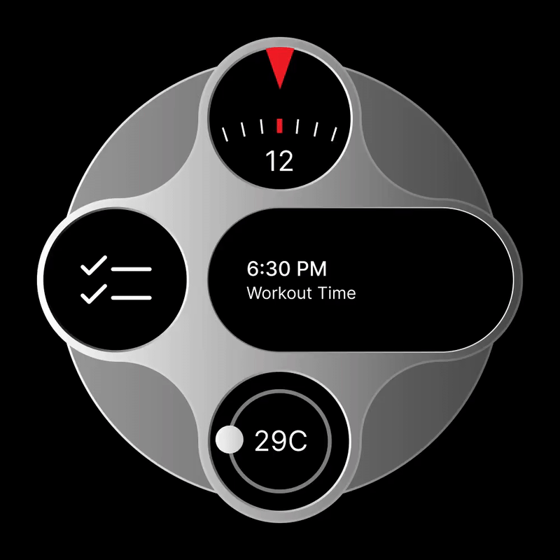
Garmin Instinct-inspired future smartwatch design – concept
Now based in Egypt, Saudi designer Ibrahem Hassan, seems to have taken inspiration from Garmin’s small circular display on its Instinct 3 smartwatches. Except where Garmin used the extra screen to make a watch look a little bit uglier, Hassan has played with shape, form and number to create a novel-looking smartwatch concept.
The Challenge
In a world of stagnation in smartwatch design, we have perhaps only experienced the circular form, or rectangular time pieces, if you are an Apple devotee.
Watch designers mimic the analogue past, leaving innovation for the UI and watchface engineers. The basic watch form is unchallenged and has changed little.
Tech has perhaps plateaued. Complications come in many and varied forms, but any variation remains in the data they contain, not how they are presented to their owner.
At least Garmin Instinct deserves some credit for breaking the mainstream mould. Hassan takes it to the next level.
Hassan’s Vision of Future Smart Tech
He is not envisaging what the Apple Watch could turn into; he is appealing to an archetypal Scandinavian who lives in a monochromatic world of predictable interiors – enjoyable to them but drab to others.
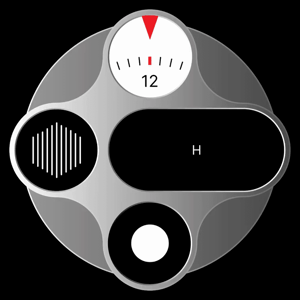
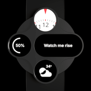
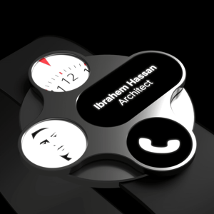
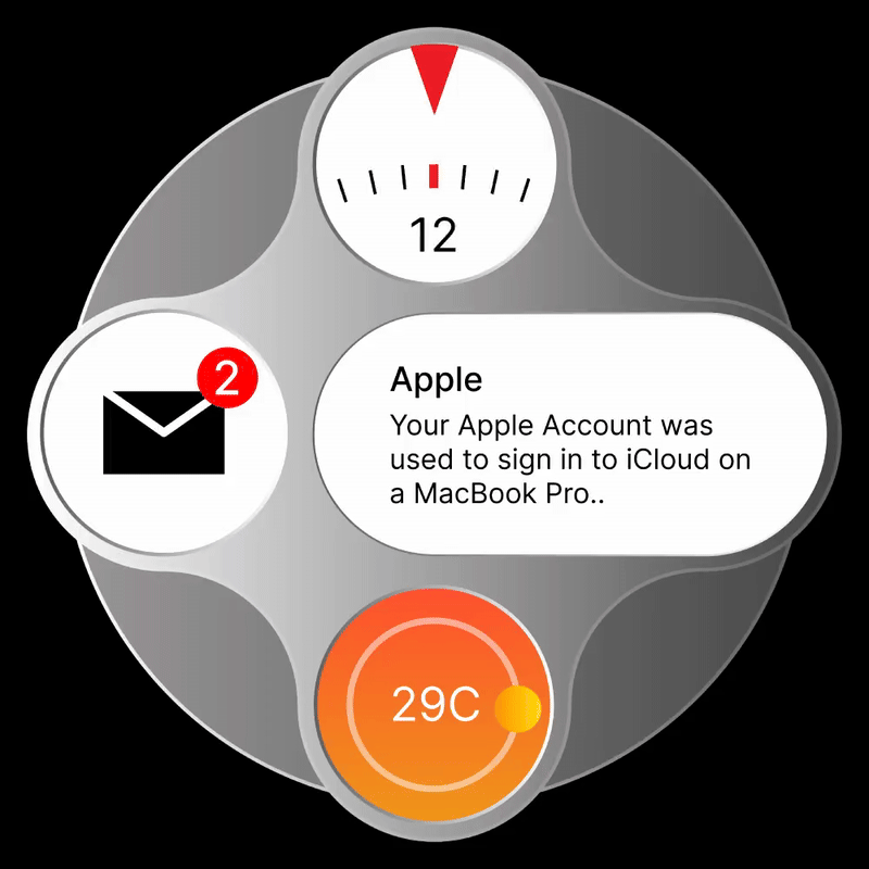
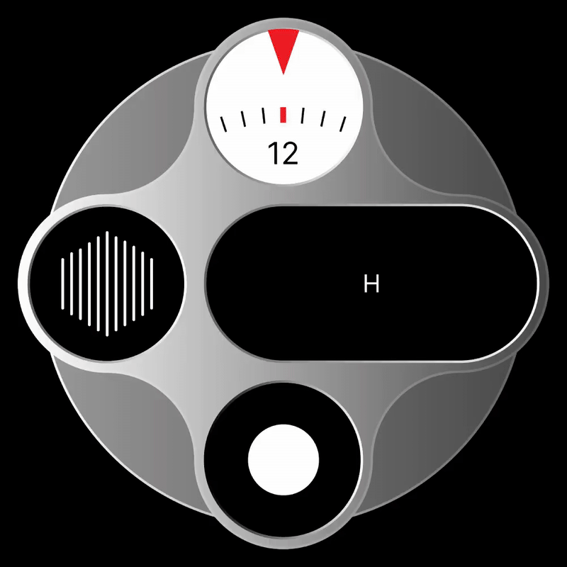
He transforms the complication into a hardware element, gives symmetry in the arrangement of three of them and stretches a fourth to give the whole look a new, visual twist. And a slightly larger area to display some textual feedback more visibly conveys a distinctive function to the novel form.
I would guess he imagines the complication screens are mini touch screens to tap, toggle and swipe through relatively rudimentary data and controls. That works.
Trade-offs and yet more challenges
The looks are a challenge. I like them, many won’t.
The battery is also a challenge, but without a heart rate sensor, it shouldn’t need a huge one, and while it has to power four screens, their total area is probably less than on many existing watches. In any case, by the time this could become reality, microLED displays will be all the rage, and they are especially battery-friendly.
Battery life is a challenge he will overcome.
I see no issue in designing software for this. It would be easy to develop the displays and numerous complications for them. Perhaps the challenge would be how the owners navigate to more complex, deeper levels of the watch’s control. Maybe that boring stuff is a job for the partner phone app.
This watch must link to a phone to get the live data it needs for weather, messaging and calls. But I don’t see it needing any form of health sensor. Just a smart controller and interface to some of the phone’s functions.
It will have to make and take calls, though, and needs 2-way audio integration to the ephone. No doubt there will be some form of AI somewhere, perhaps to transcribe the incoming voices to the stretched screen in real time and perhaps as a translator.
Could this be a universal language translator for the internal business connoisseur?
I can’t see this watch needing the latest GPS chipset, but it needs a good dose of tap-and-pay goodness. Even the most trendy amongst us still need to pay for things, and a digital wallet on your wrist avoids the need for that unsightly physical wallet bulge in your pocket, ruining the line of your trousers.
Take Outs
As a smartphone partner, I like it. It’s perhaps too trendy for me, but this design could work at an engineering level, providing it ditches those pesky, power-hungry health and activity sensors. The battery would last for weeks with 24/7 beauty lit up on the vivid displays.
Pay> Translate> Make & Take Calls> View Calendar Items, Notifications and Messages> Dictate notes and Texts> Access Key data (weather) from smartphone> Tell the Time/Date> Haptic, Audio and visual alerts
I like the idea. It’s different. It looks good. What do you think?
Last Updated on 29 January 2026 by the5krunner
My favourite kit and nutrition
- Injinji – Runners protect your toes. Avoid discomfort and minor injury. Run more. run faster. I use them.
- Garmin 90-degree charging adapter — the small adapter that keeps your charging cables tidy. Essential for race day. I use one.
- Garmin charging puck — the fastest and most reliable way to top up your Garmin before a session. I use one.
- Ravemen FR300 — front light that mounts directly under your Garmin or Wahoo head unit. Keeps your bars clean and your beam pointed where it matters. I use one.
- Body Glide – The Blue anti-chafe stick that all swimmers and many runners use. I use it.
- Maurten — the race nutrition trusted by elite athletes. Gels and drink mix engineered to be easy on the stomach. I use them.
- Garmin Varia RTL515 — radar rear light that alerts you to vehicles approaching from behind. Pairs with your Edge or Garmin watch. I use this model.
- Favero Assioma Pro RS2 — the power meter pedals most serious cyclists end up choosing. Accurate, easy to move between bikes. I use this model.
Reader-Powered Content

This content is not sponsored. It’s mostly me behind the labour of love, which is this site, and I appreciate everyone who supports it.
Support the site: Follow (free, fewer ads) · Subscribe (paid, ad-free) · Buy Me A Coffee ❤️
All articles are written by real people, fact-checked, and verified for originality. See the Editorial Policy. FTC: Affiliate Disclosure — some links pay commission. As an Amazon Associate, I earn from qualifying purchases.
tfk is the founder and author of the5krunner, an independent endurance sports technology publication. With 20 years of hands-on testing of GPS watches and wearables, and competing in triathlons at an international age-group level, tfk provides in-depth expert analysis of fitness technology for serious athletes and endurance sport competitors. ID

Looks “professional”. As in something handed out to employees to do their job. Perhaps the wrist worn barcode scanner terminal from the warehouse automation supplier, or some fancy dosimeter/intercom hybrid.
Could this be plastered over with enough veblen? Perhaps, but I would not bet on it.
Well, I might be a bit too old fashioned and maybe the elusive “modern audience” will buy into this design…but I think it is distracting and looks terrible. Little screens showing 4 different information instead of having one that shows even more if I want it too, seems more like an idea Fossil or some other cheap watchmaker would produce and sell for 175$ at the check-out of your local H&M store.
But, if someone wants to pay 1500$ for a “more” stylish Garmin that defies traditional looks, be my guest! It would be definitely interesting to see.