My contention today is that the key watch companies’ approach to sports watch faces needs improvement, not even the mighty Apple has got this right yet.
What Makes a Perfect Smartwatch Face?
We’re talking about 24×7 watchfaces here rather than the screens you display during sports usage. Don’t page away too quickly though as watch faces most definitely can have sporty components, for example, to let you open sports functionality or view sports physiology data.
Let’s start by taking a look at the differing approaches of Garmin and Apple and see if they can be improved.
Garmin
The Garmin watchface you choose can sometimes be a fully customised thing of wonder from a 3rd party.
Broadly speaking, what you see in a 3rd party Garmin watch face has been crafted by one developer. My favourite for some time has been CRYSTAL, shown above, and in this link, you can see that the developer lets you customise many elements of Crystal’s screen. For example, at the top of my Crystal Watch face, I have chosen HR, battery and notifications but I could quite easily instead have chosen altitude, pressure and temperature.
The reality for me is that I think most Garmin watchfaces are relatively ugly and this is one of only a handful that I think are pretty enough to wear.
I’ve just realised that I’m not especially bothered about the data that my chosen watch face shows. Why so?
Well, I wear my sports watch for sports. So when I want to start a workout I know the Garmin is one button press away from letting me choose from my list of favourite sports profiles.
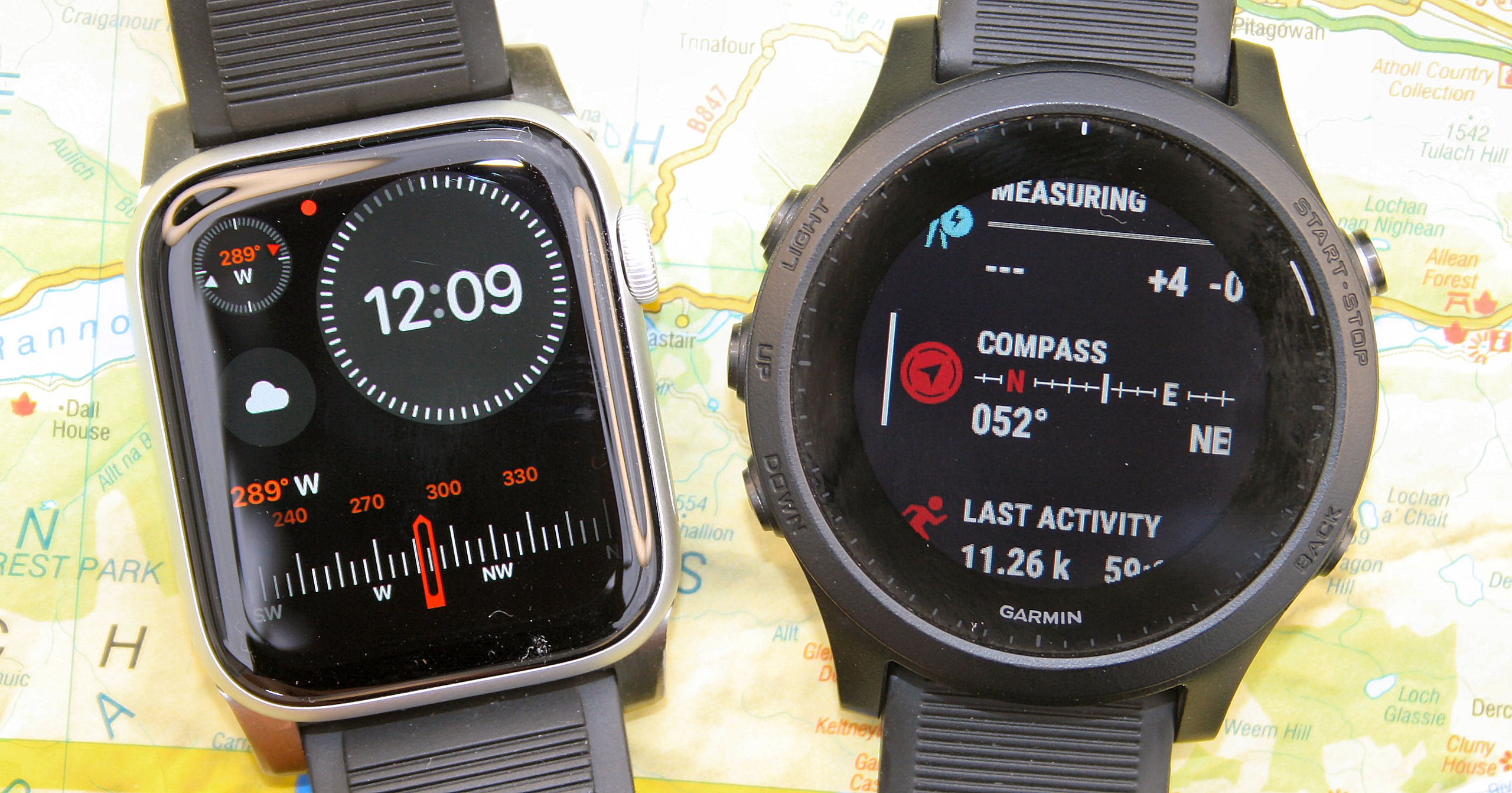
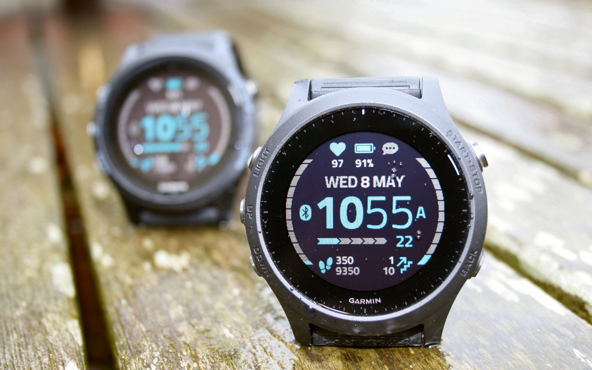
Sometimes I will be interested in ‘status’ pieces of info and Garmin lets me get to those relatively easily as well. With the buttons on the left side of the watch, I can scroll through a list of active widget glances which show me summary information about ‘me’, about ‘environmental factors’ and about ‘other things’. Thus I can scroll through widget glances to see a compass, respiration, my last workout, my next planned workout, my FTP and much more. If any of those widget glances strikes me as interesting I can drill through into more detail.
Widget glances were a relatively recent introduction by Garmin and, on the whole, I think they are great. It’s the rest of the labyrinthine interface that lets Garmin down in my opinion.
Pros
- Easy access to both pre-configured info like sports profile shortcuts and physiology data summaries/details
- Good flexibility for 3rd party developers to create & customise new watchfaces
Cons:
- Hardware screen quality typically has poor resolution and poor colour depth
- Often poor aesthetics on 3rd party watchfaces
- Changing a watch face takes at least 3 button presses
- Finding and installing a wholly new watchface is going to take some time.
- Adding the piece of information I want to any given watchface is typically restricted by the developer and can be tricky to configure.

Apple
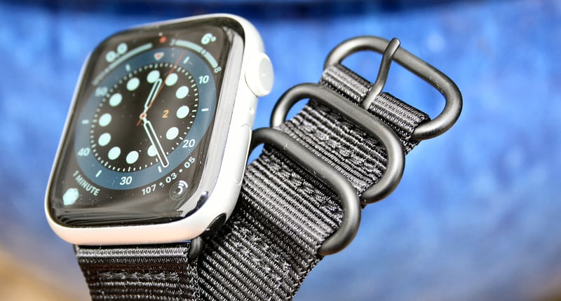
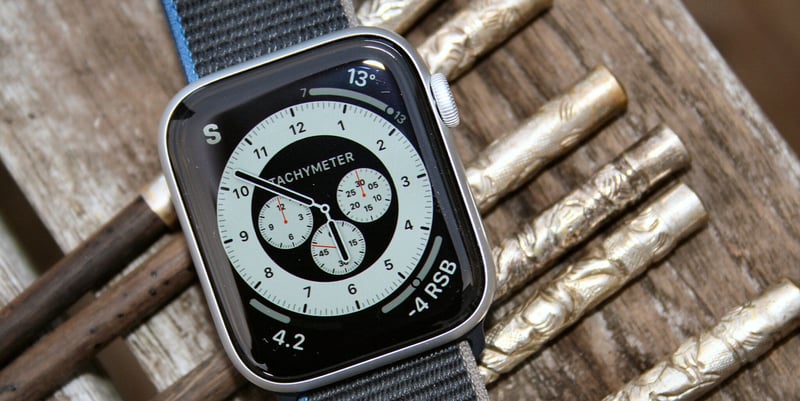
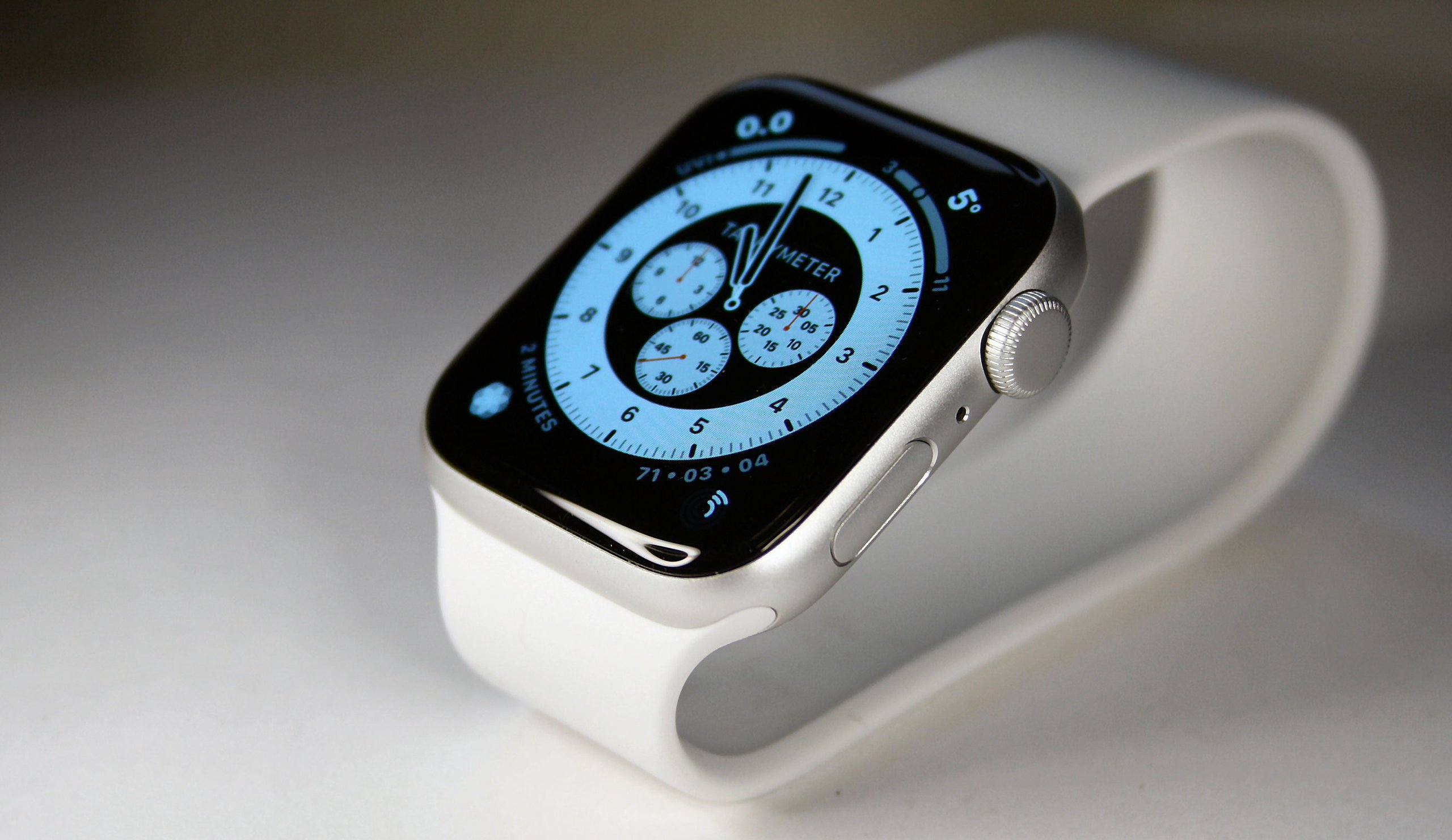
Apple Watchfaces are things of beauty. They are all made by Apple to a high technical & aesthetic standard, with the beauty further enhanced by great hardware. Apple let you choose between 20 and 40 watchface types, depending on how you want to classify them, with many being further open to customisation by colour and style to give thousands of combinations. Yet more customisation is possible where the watchfaces support the addition of data-rich components called complications. Once you add in complications there are literally millions of unique possibilities to personalise what you have on your wrist.
The data in these complications can be a shortcut to start an app or data from the app itself. Thus, for example, a complication could be a shortcut to start STRYD or it could display my current rTSB/rSB (running Stress Balance) from the STRYD app. Complications are typically small and circular for the main part of the face, weirdly triangular for the corners and rectangular complications also exist that can support charts or a novel displays like a rectangular compass.
New owners of Apple Watches thus initially feel constrained by only being able to use Apple Watchfaces but it soon becomes apparent that these ‘templates’ possess a decent degree of customisation.
 However, to get your chosen watch face ‘just so’ is a labour of love and can take many minutes especially if you start searching for that perfect complication – which invariably doesn’t exist or requires you to download a different app just to get the complication.
Until Watch OS 7 (2020) it was not possible to share watchfaces but now you can, thus online watchface-sharing sites like Facer are becoming more popular or you can simply attach your watchface and SMS it to a friend for them to install and, yes, the ‘special’ Nike Watch faces really do only work on Apple Watch Nike variants (I tried).
I curated a collection of watchfaces and switching between them on the watch is relatively easy with a press and a few swipes. I might have a watch face for ‘work’, socialising’, training status and other things too. I have way too many apps installed on the watch to easily find my frequently used one, so I tend to change between watchfaces as if they are a launch screen eg my sports screen has several of my favourite sports apps as shortcuts and then I might later change back to a training status watchface for taking HRV readings and seeing the results. Thus your collection of watchfaces becomes a top-level menu that potentially morphs throughout the day as you swap faces according to the need of the moment. I’m certainly not alone in doing that!
In a way, these reasonably flexible watchfaces are a workaround for other flaws in the Apple interface. Really what I want is fewer watch faces plus the ability to have a whole screen full of my often-used complications, shortcuts and favourites. Matt@birchtree has this video which is kinda where I’m coming from on this. Really all Matt and I want from Apple Watch 7 (Watch OS8) is something like Garmin’s one-button access to a list of widgets (complications) – Matt suggests this is added to the control centre as a swipe-up…fair enough. I’d use that. Apple has almost certainly considered this…and won’t do it!
Pros
- Performance and beauty is controlled by Apple
- Generally works well for most uses
Cons
- Watchfaces can take too long to create especially when adding special complications which you know must exist but don’t know how to find them
- A large watchface collection is not easily curated and managed
- Apple prides itself on the user experience, switching from one watchface to another takes longer than you think – compare that to Garmin’s button interface which feels more cumbersome but which is usually quicker than Apple.
- 3rd party smartphone app developers do not always create watch apps and if they do, they don’t always create the complication you want. Why should a complication rely on a watch app being installed when it could pull info from the phone app?
- The Apple experience feels constrained by Apple. Kinda anti-creative, although creativity is allowed within the bounds they set. #ControllingParents
- Watchfaces become a part of the high-level menu system to access watch features. I’m not entirely sure that Apple initially intended it to be this way.
Interesting Bit
- Apple Watch app developers don’t yet seem to have realised that they can use curated watchfaces to distribute a prompt to download their app via an embedded complication in the curated watchface.
Other Points
On the topic of watchfaces, there are some interesting things afoot with Google’s Wear OS. Only this week it was announced that higher-end Fossil Wear OS watches will now come with thousands of FACER watch faces pre-loaded. Google understands the importance of personalisation.
However, I still think Google is still missing a trick here.
Wear OS has the concept of ‘Tiles’. A tile is like a temporary watchface-cum-widget that you VERY easily swipe into view when you want to consume a certain piece of information. This works well however it’s limited to a maximum of 5 tiles and restrictions on how they can be customised to show what you want, rendering them much less useful than they could otherwise be. These Google tiles work better than the watchfaces from Apple and Garmin yet Google seems to be trying as hard as it can to stop people fully exploiting them! Strange.
Sports watch companies like Wahoo (Rival), Polar Vantage V2 and Suunto perhaps underestimate the importance of the customizability experience for their more mass-market customers. These companies are unlikely to ever devote significant resources to creating watch faces as it doesn’t directly pay the rent. So without an open watchface API there will always be a restricted supply of own-brand watchfaces. Don’t get me wrong Polar et al absolutely do understand the need for customisation, just look at the selection of bands that Polar sells. They know people will pay for customisation it’s just probably easier & more profitable with limited internal resources to sell extra bands than to develop free watchfaces.
Take Out
Customisable and pretty watchfaces are absolutely vital for the success of a smartwatch. For those smartwatches that also want to address the sporty segments of their market, they had better also incorporate sport-related data into the watchfaces…and that means WAY more than steps or calories.
For out-and-out sports watches I would say the watchface is much less important, perhaps even to the extent where it can and is overlooked. But as sports and smarts increasingly overlap a pretty and flexible watchface just becomes one more reason to buy a smartwatch. Death by a thousand cuts.
Last Updated on 24 January 2026 by the5krunner
My favourite kit and nutrition
- Injinji – Runners protect your toes. Avoid discomfort and minor injury. Run more. run faster. I use them.
- Garmin 90-degree charging adapter — the small adapter that keeps your charging cables tidy. Essential for race day. I use one.
- Garmin charging puck — the fastest and most reliable way to top up your Garmin before a session. I use one.
- Ravemen FR300 — front light that mounts directly under your Garmin or Wahoo head unit. Keeps your bars clean and your beam pointed where it matters. I use one.
- Body Glide – The Blue anti-chafe stick that all swimmers and many runners use. I use it.
- Maurten — the race nutrition trusted by elite athletes. Gels and drink mix engineered to be easy on the stomach. I use them.
- Garmin Varia RTL515 — radar rear light that alerts you to vehicles approaching from behind. Pairs with your Edge or Garmin watch. I use this model.
- Favero Assioma Pro RS2 — the power meter pedals most serious cyclists end up choosing. Accurate, easy to move between bikes. I use this model.
Reader-Powered Content

This content is not sponsored. It’s mostly me behind the labour of love, which is this site, and I appreciate everyone who supports it.
Support the site: Follow (free, fewer ads) · Subscribe (paid, ad-free) · Buy Me A Coffee ❤️
All articles are written by real people, fact-checked, and verified for originality. See the Editorial Policy. FTC: Affiliate Disclosure — some links pay commission. As an Amazon Associate, I earn from qualifying purchases.
tfk is the founder and author of the5krunner, an independent endurance sports technology publication. With 20 years of hands-on testing of GPS watches and wearables, and competing in triathlons at an international age-group level, tfk provides in-depth expert analysis of fitness technology for serious athletes and endurance sport competitors. ID

Very nice article. Honestly speaking, lack of 3rd party always on watch faces puts me off from a lot of watches.
Vantage M or Coros Pace 2 with the Cystal or Infocal watch face… 😍
More thought provoking topic than I was expecting. Since there is a wide spectrum between watch collectors and those that get by with a department store value purchase, there is a great deal of personal preference involved.
Technology has allowed information density to improve on smaller interfaces to the point that we now have dashboards manifested as watch faces. Simultaneously jewelry has been enhanced to the point where the function competes with form.
Despite really wanting to like the Apple Watch I ended up giving mine to a friend since it never fully substituted for the iPhone in my case. It is an undeniably well made product with excellent software & user interface, I just don’t want to interact with something on my wrist that much. Very stylish product as well, but for most of my life a Timex Ironman filled that need even if it was hidden under the cuff of more dressy clothing.
I didn’t mind having a dashboard as a watch face with my Fenix 5X, but unfortunately that trim level made it too heavy to use as a daily carry. With the FR945 I use a ConnectIQ watch face with minimal information which is easy to spot at a glance. The time, battery level, and sunset are the only bits of information that drive quick decision making from my wrist. Things like Body Battery are great to be able to lookup when I have a few minutes to consider them, so widget glances were a valuable addition in my case.
Still hopeful the Suunto heat-map face will get cloned over to the Garminverse at some point.
“More thought provoking topic than I was expecting” – thank you for the kind words.
AW: ” I just don’t want to interact with something on my wrist that much. “. that’s interesting as the AW restricts user interaction to a fairly superficial level in the sense of most functionality being accessed by shallow means. which is a good thing as it forces designers to get to the ‘key point’ quickly without too many swipes, presses or distracting data. i think the AW is much LESS able to be the DASHBOARD you talk about than Garmin. with Garmin you can cram a lot of the higher-level stuff in relatively well, with Apple it’s harder to (for example) change watch faces than for a Garmin user to scroll through widgets.
Interesting also that you mention dashboards as I have two side-projects that both are specifically looking at that kind of thing. I did some corporate work with Balanced Busines Scorecards a while back…quite a while back! there are some obvious things that can be done with athlete scorecards, and some less obvious ones too.
suunto heatmap. haha. good point as well. i think that would require AMOLED. a good point nevertheless, as the Garmin heatmap is superior.
What isn’t mentioned is that wear os, despite some of it flaws, actually does brilliantly when it comes to watch faces as the options are virtually limitless. A prime example of this is the marine commander watch face that allows additional info around the complication (i.e. my weather complication has sunset and sunrise data around it) and my fitness complication has watch and phone battery info around it; while the complications also have a dual screen option i.e. screen one of my fitness can show todays distance and steps (can choose what to show) where as the second screen can show calories, heart rate, barometer etc and the screen automatically flip between the data every couple of seconds. Of course you can also set apps to launch off complication and can also set menu shortcuts to launch settings/apps etc. Hands, hour, minute marks are fully themeable and customizable. pretty much mind boggling what you can adjust and how easy it is. Plus thousands of custom free and paid faces available between play store and the various other different watch stores like Facer and Watch face. Very easy to change watch face – just long press on watch face and select face. Can also have animated watch faces i.e. cogs etc that move. Watch face devs can also build in different levels of ambient modes for AOD on – can be basic white and black time, to including black and white complications to the full watch face.
PS – we are in the process of receiving the tile update which removes the 5 tile limit. Some watches in some countries currently have had this update. Biggest issue with tiles is the actual lack of them (not every dev and manufacturer includes a tile option).
thank you @jaamgans
yes I DO like Wear OS, for all its sins and for all my sins!
this was a garmin vs apple post with a bit of google thrown in.
5 tile limit removed – ooooh. I didn’t know that (or had forgotten about it…in case I wrote about in a while ago 😉 ). Great info, thank you.