A Year In Strava
‘Tis the season to be reflective.
As Christmas and the year-end approach, some companies turn to reviews of their year in stats and Strava is no exception. This year’s themes were MASSIVE GROWTH and WALKING. So perhaps not as exciting data as in previous years. Yes, data CAN be exciting but less so when it’s about walking. Most years I have to make a few enquiries to get both the UK and USA stats, the data is mostly identical except for one or two specific slides and this year was the same.
Let’s have a nibble at the entree with last year’s data.
STRAVA | USA vs GB | Who Won in the Lockdown Stats for 2020?
Strava ’21
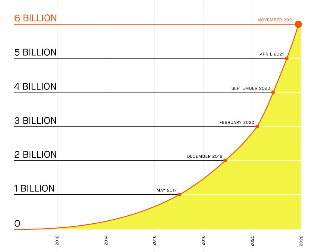
Perhaps surprisingly, the pandemic-led boom went from strength to strength with continuing growth in participation. Indeed Strava reports a 38% increase in the number of activities compared to the prior period.
Handily, Strava provides a cumulative chart to indicate that 38% growth, though I would point out that cumulative charts are VERY good at showing growth

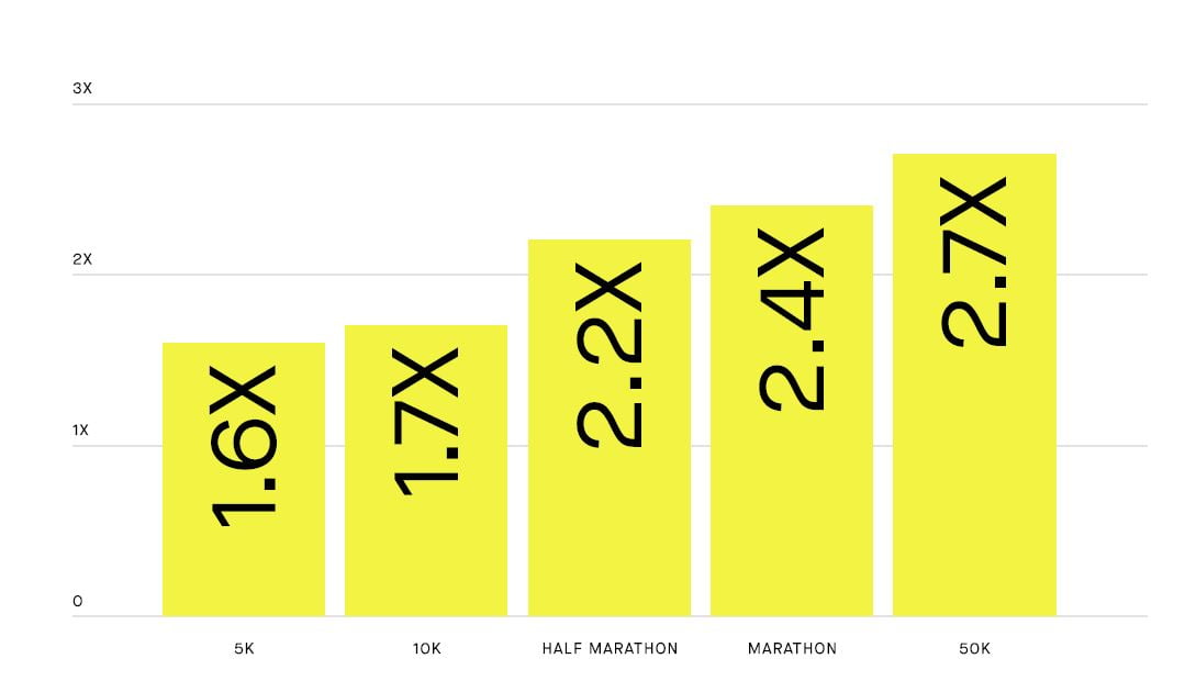
I have to say I’m very disappointed in humanity in 2021. I get it that you guys are all trying really hard and that there are an impressive number of you who are cranking out new (proper) PRs/PBs across all the standard distances.
But…c’mon people, get working on those 5Ks 😉

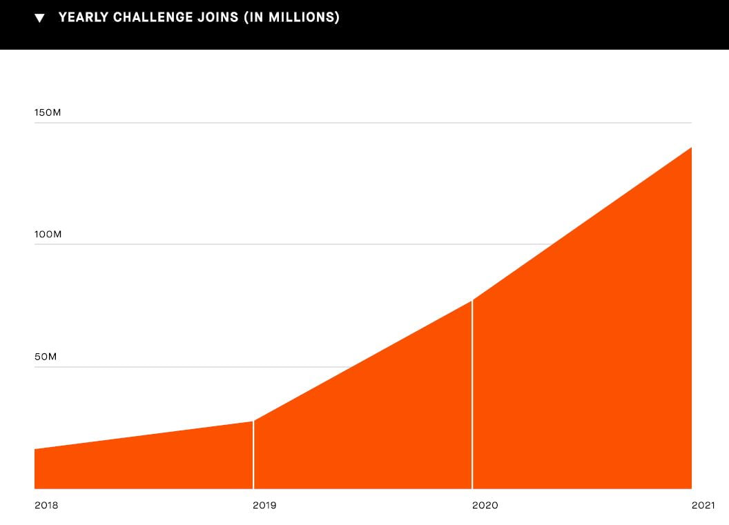
Everyone Loves A Challenge
Well, not everyone loves a challenge. But about a140 million of you do. Awesome job.

UK & USA vs The World
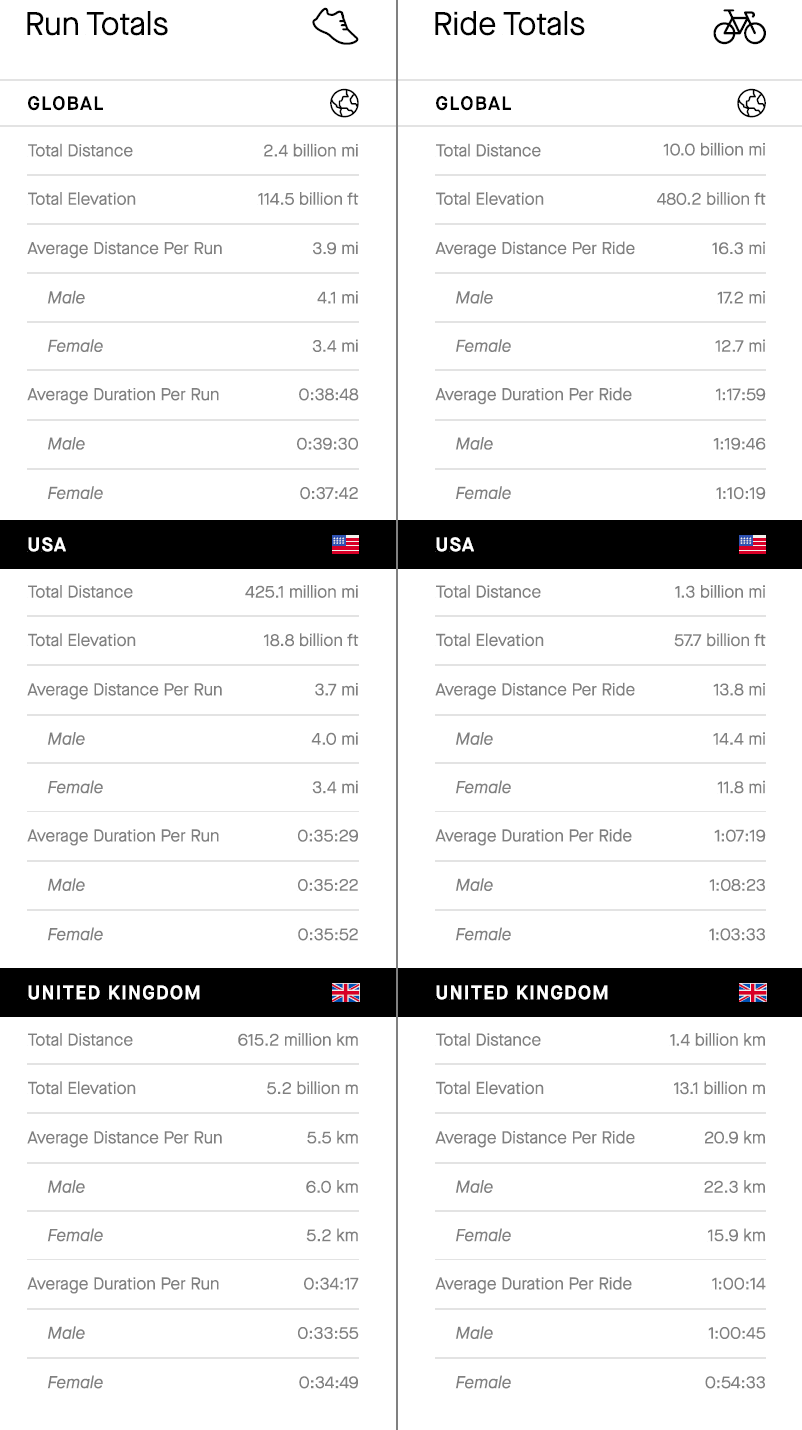
Average men ride and run further than average women, at least on Strava they do. Average men also spend more time doing it. Riding and running, that is.
At first glance at the national stats, below, it seems that Brits run and ride further than Yanks. However, in the UK we run in kilometres whereas in America you run in a completely different way…miles. Those are you who are well-versed in your 1.6093 times table will immediately be able to do the comparison but I will have to fall back to pointing out that Americans run for over 35 minutes whereas Brits don’t.
Indeed British women anomalously run for 54 seconds longer than British men…on average. British men get their own back when it comes to lycra as on the bike they cycle, on average, a whopping 6 minutes longer than their average, female counterparts – interestingly the time to swiftly order an instant coffee, cake and consume them is also about 6 minutes but I’m sure there is no link there whatsoever.
A similar average male-female pattern exists in American cycling where average American men stay out on two wheels longer than average American women, albeit only 5 minutes longer this time. Clearly, 5 minutes is insufficient for even a half-hearted coffee and cake, so American men must actually be cycling for these extra 5 minutes and that lack of cake-time explains why you are faster. Although a less generous explanation would be that you are more forgetful and forget to press the stop button on your Garmin (it will be a Garmin).
Obviously, average American cyclists cycle for longer than average British cyclists because America is bigger and you have further to go. the stats clearly validate this. Here…

Stravistic Morality
The moral of these stats is
Don’t be average.
Ever.
Interesting Average Fact: Take 20 aspects of the average American and work out each one’s average value. There will probably be no-one in America who has each and every one of those 20 average characteristics. See…you’re not average in any case.
Read More About Strava- here
Strava Vulnerability Reveals Israeli Securirty Staff Runners
new STRAVA Local Legends – Segments, Jim, but not as we know them
Sports App League Table – Winners & Losers 2018-2019 – Best Sports App
STRAVA Stats Show Surprising US vs UK Differences: starting with…America is Bigger
STRAVA Stats Show Surprising US vs UK Differences: starting with…America is Bigger
Strava Running Power – All The Details – All major watch brands now support it (after a fashion)
Suunto adds Plotaroute support for Advanced Route Creation & Easy Syncing
STRAVA Stats Show Surprising US vs UK Differences: starting with…America is Bigger
Something different? Why not check out my Apple Watch 7 review…it’s a much more awesome watch than you think and only a battery and two buttons away from destroying Garmin’s market share. Just sayin’

I’m a UK based runner and an fairly adept at mentally converting miles to kilometres… But why do you show the US data in miles and the UK in kilometres? That’s just poor presentation of data!!
it’s a strava image (composite)
Such a shame they do this. Even in the App there’s often a mismatch. Oh well.
Thanks for the article though, very interesting 🙂