Hammerhead Karoo 2 – Images & New Interface
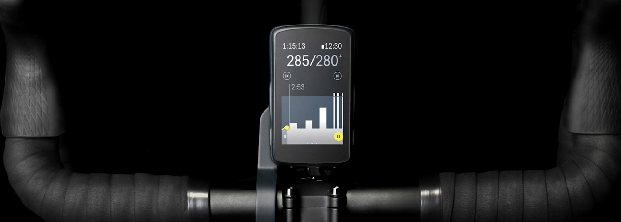
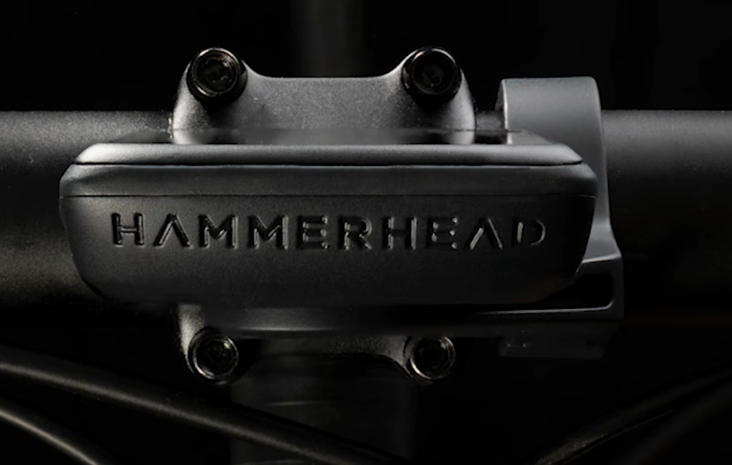
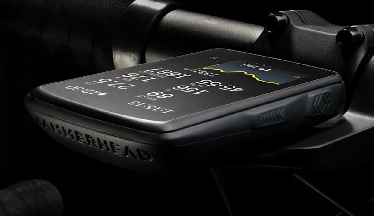
Here are a few ‘leaked’ images via GCN of the Karoo 2 which show a stylised, smaller format than the original Karoo. (GCN Video link)
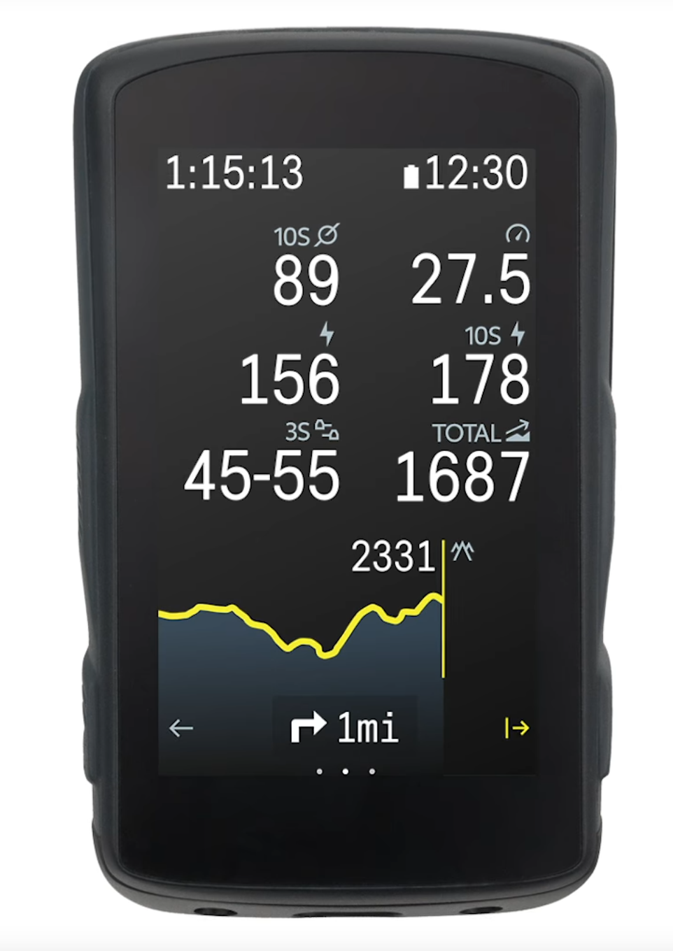
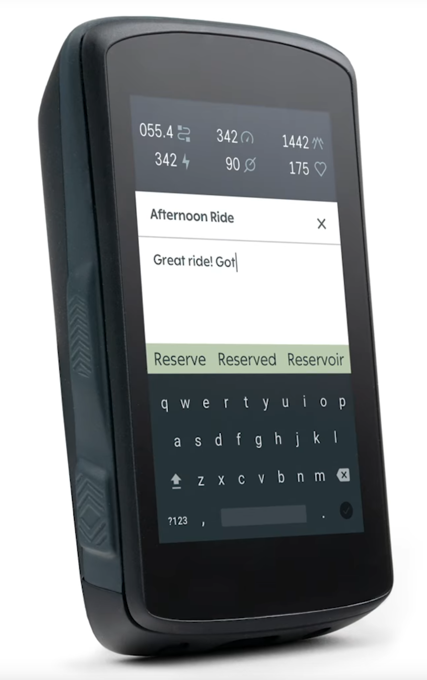
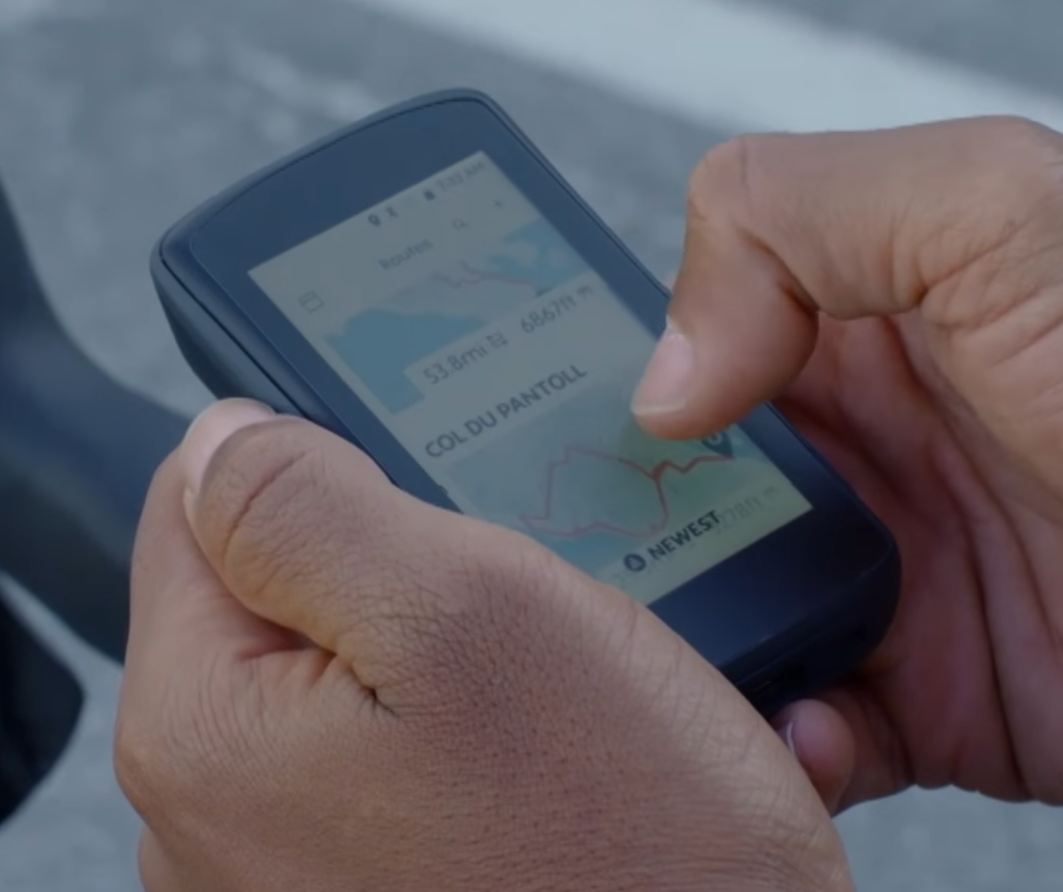
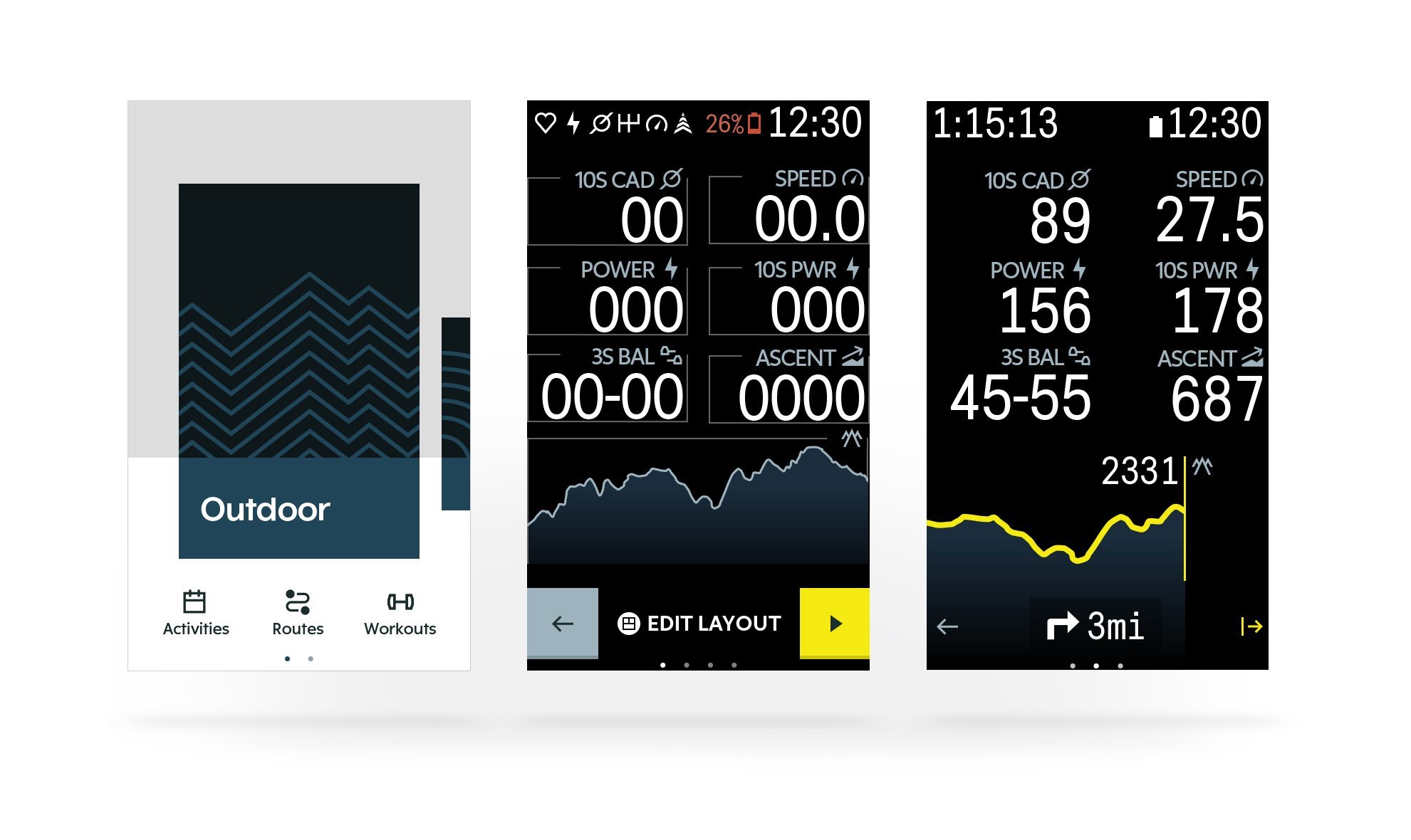
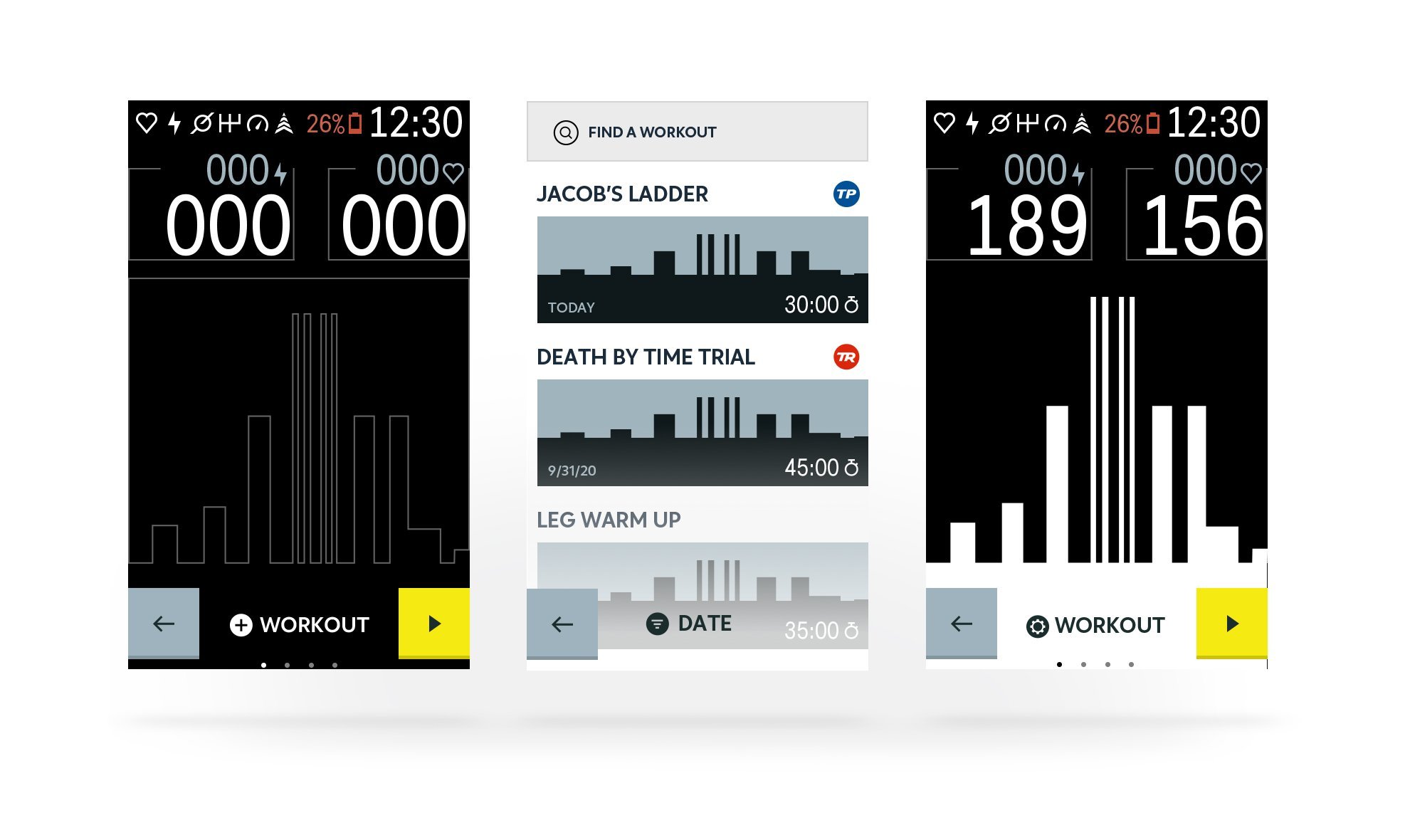
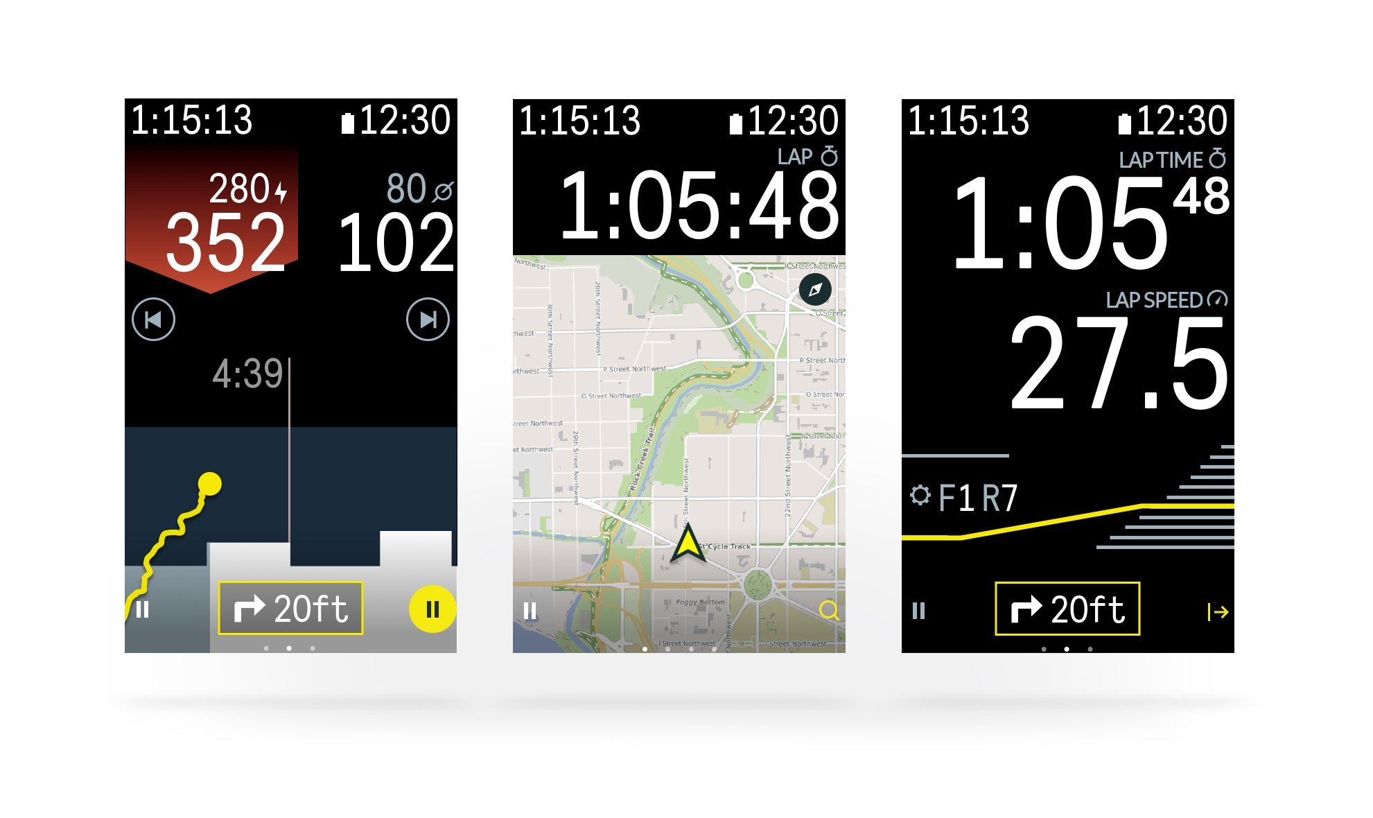
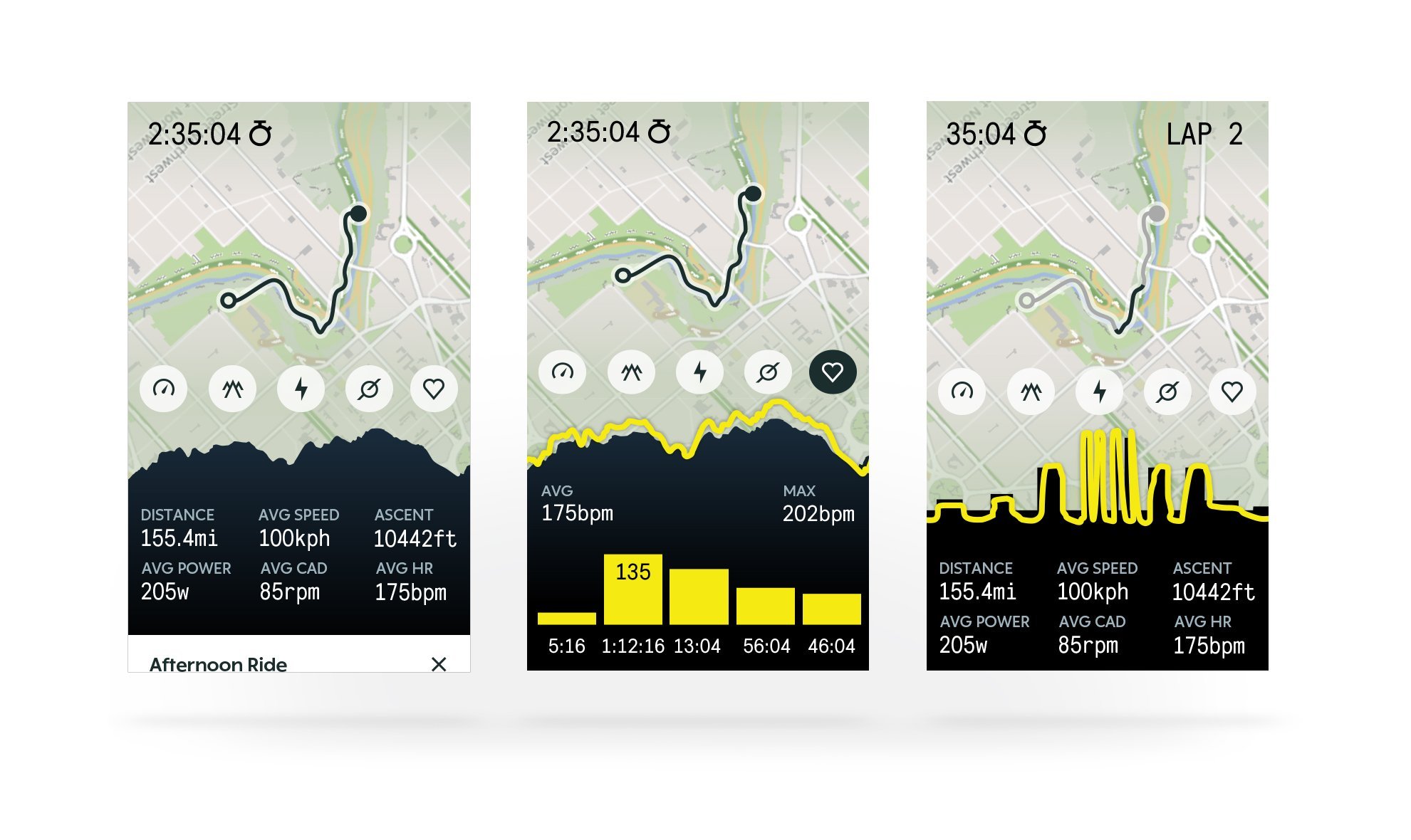
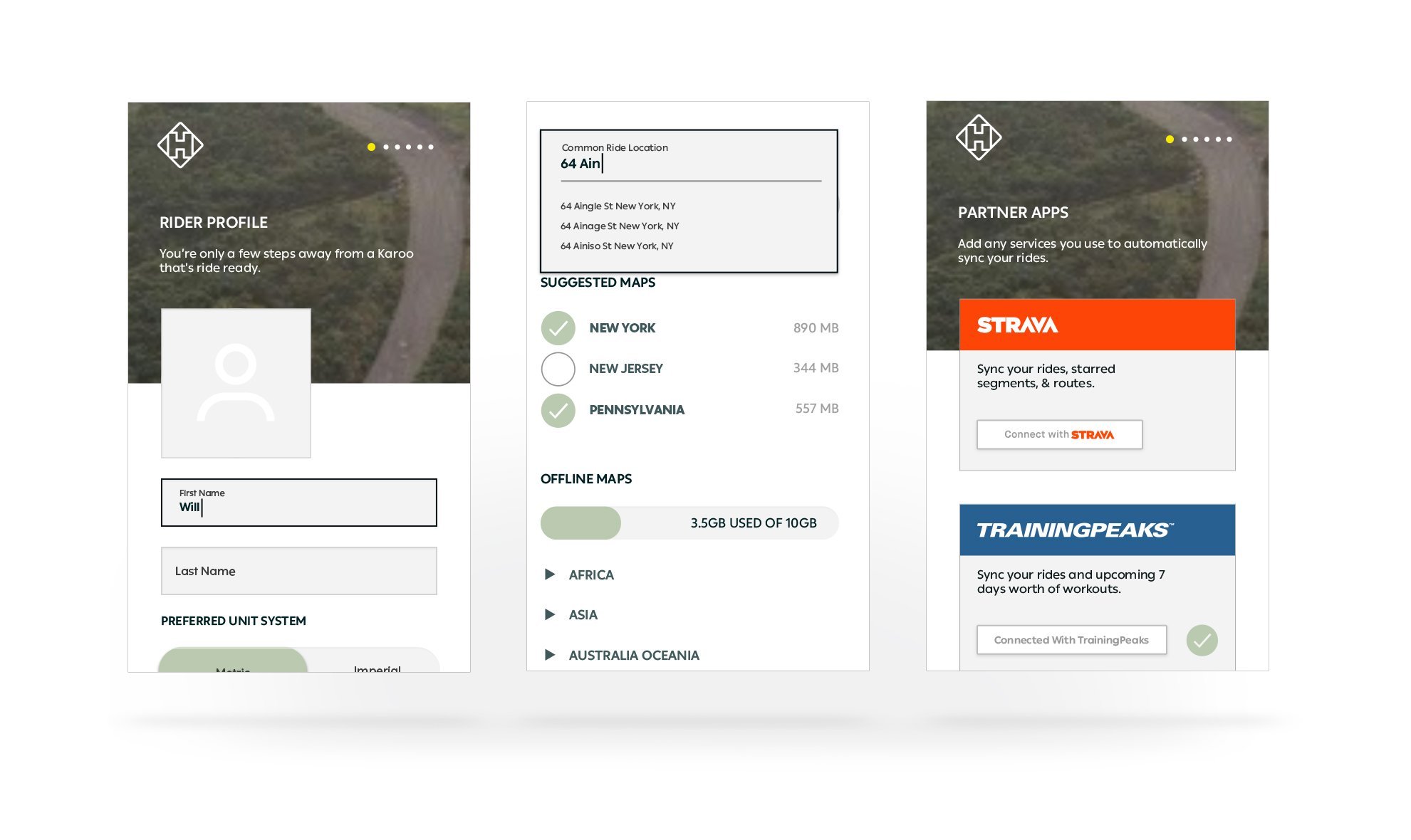
‘New Look’ Interface
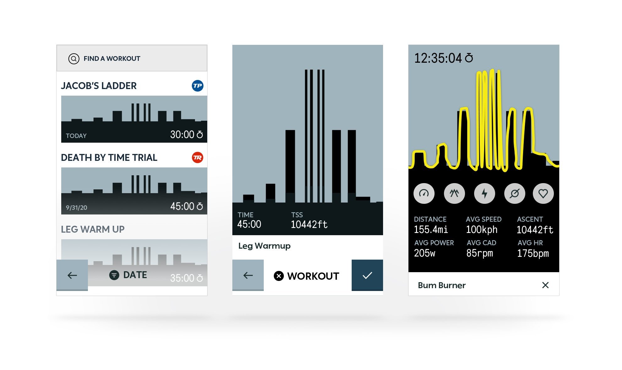
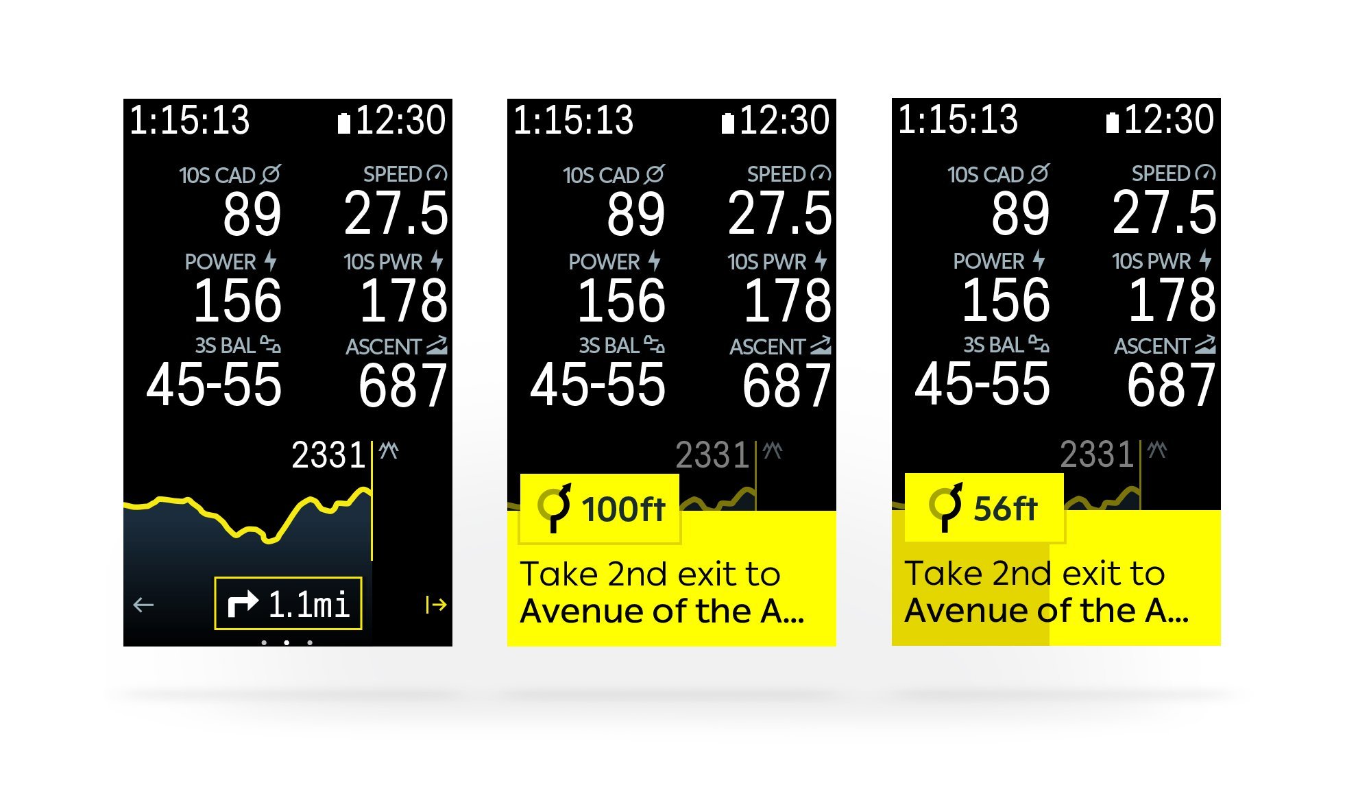
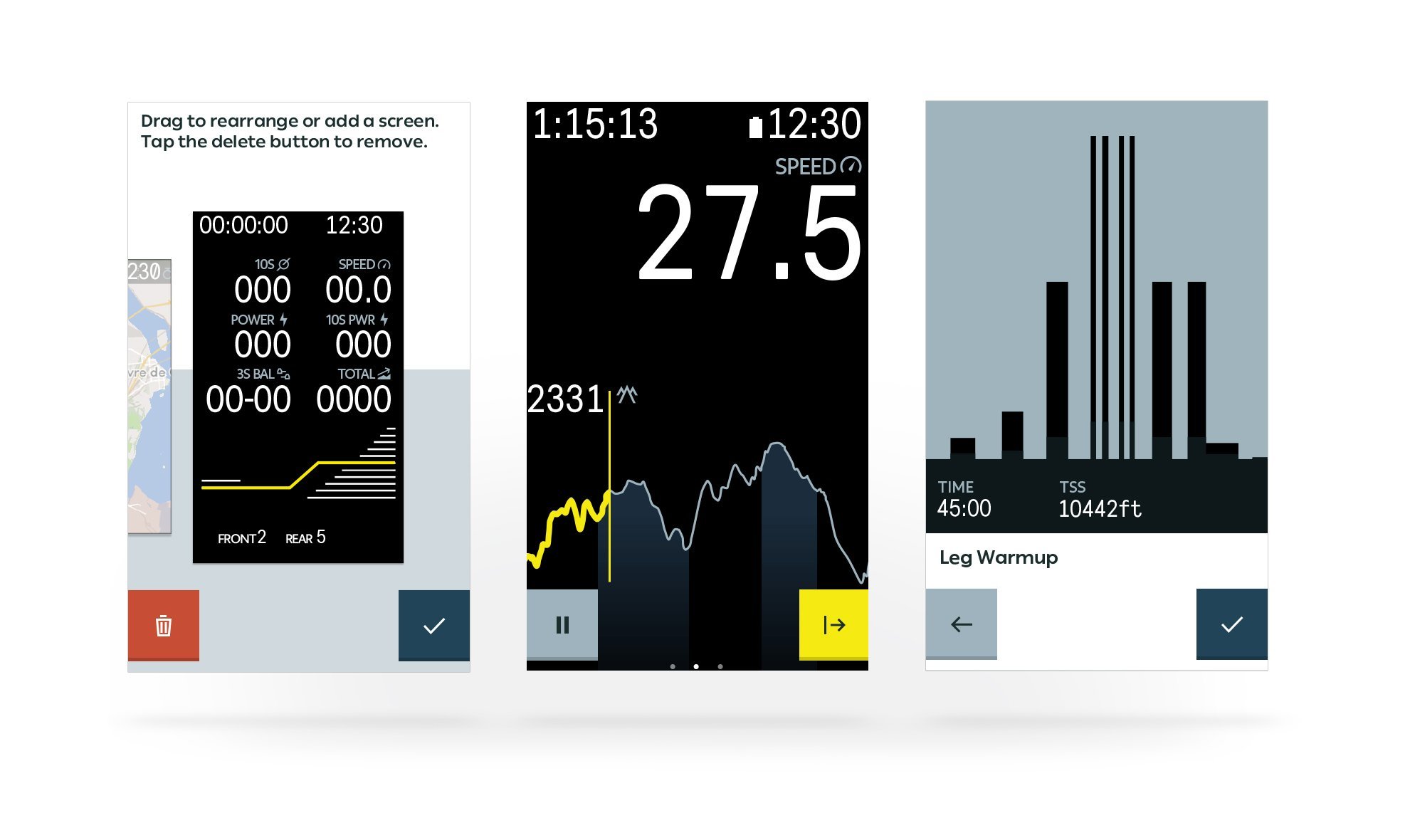
Here are some screen dumps from the new Karoo 2 interface. The ‘new’ screen looks nearly identical to the Karoo 1, in many cases, it just looks to me like the font is a bit bigger plus some minor screen flow changes and mapping tweaks. Have a look and see what you think, whatever the breadth and depth of the exact changes this is still a sweet-looking thing of biking beauty.
I’ve covered most of the important Karoo 1 firmware releases as they happened over the last couple of years, have a look below to see how some of the more material changes have progressed over time. It’s a series of impressive, incremental improvements.

New Firmware November 2019 eTap, EPS & RWGPS – Hammerhead Karoo
STRAVA Live Segments – Best Ever Implementation? Hammerhead Karoo
Last Updated on 23 January 2026 by the5krunner
My favourite kit and nutrition
- Injinji – Runners protect your toes. Avoid discomfort and minor injury. Run more. Run faster. I use them.
- Garmin 90-degree charging adapter — The small adapter that keeps your charging cables tidy. Essential for race day. I use one.
- Garmin charging puck — the fastest and most reliable way to top up your Garmin before a session. I use one.
- Ravemen FR300 — Front light that mounts directly under your Garmin or Wahoo head unit. Keeps your bars clean and your beam pointed where it matters. I use one.
- Body Glide – The blue anti-chafe stick that all swimmers and many runners use. I use it.
- Maurten — The race nutrition trusted by elite athletes. Gels and drink mixes engineered to be easy on the stomach. I use them.
- Garmin Varia RTL515 — A radar rear light that alerts you to vehicles approaching from behind. Pairs with your Edge or Garmin watch. I use this model.
- Favero Assioma Pro RS2 — The power-meter pedals most serious cyclists choose. Accurate, easy to move between bikes. I use this model.
- Garmin Forerunner 970 — A serious choice for a pro-grade triathlon watch. I use this.
- Polar H10 — My daily driver for accurate, waking HRV readings.
- Wahoo ELEMNT Roam 3 — The bike computer that has the feature Garmin lacks: usability. I use mine on most rides.
Reader-Powered Content

This content is not sponsored. It’s mostly me behind the labour of love, which is this site, and I appreciate everyone who supports it.
Support the site: Follow (free, fewer ads) · Subscribe (paid, ad-free) · Buy Me A Coffee ❤️
All articles are written by real people, fact-checked, and verified for originality. See the Editorial Policy. FTC: Affiliate Disclosure — some links pay commission. As an Amazon Associate, I earn from qualifying purchases.
tfk is the founder and author of the5krunner, an independent endurance sports technology publication. With 20 years of hands-on testing of GPS watches and wearables, and competing in triathlons at an international age-group level, tfk provides in-depth expert analysis of fitness technology for serious athletes and endurance sport competitors. ID
