Whoop Homescreen Gets a Revamp
Whoop continually updates its app. One of the more significant changes in the last few years is a move from a layout that used multiple tabs (swipe left and right) to a more dense, scrollable home page.
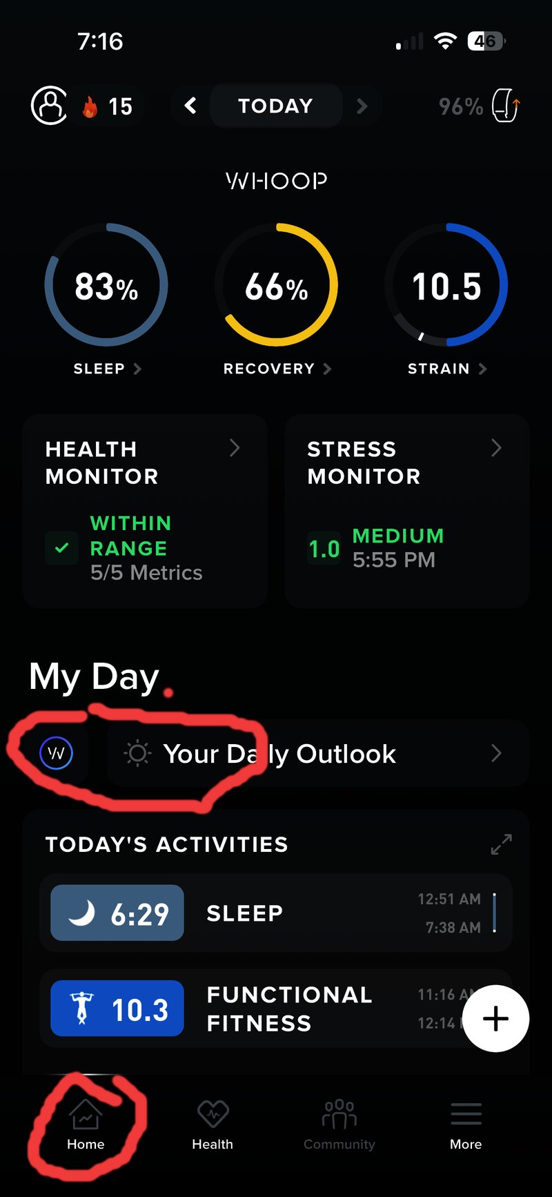
I’m in the middle of writing a detailed Whoop review (and have been for the last two months!). One of my criticisms of the Whoop app was that access to the Action button (the ‘+’ button) and the Whoop Coach button were poorly placed and easily overlooked.
Whilst the Coach is important, I don’t think it’s as often used as the Action button. It needed more prominance.
Last night, I’d just finished extolling the app’s virtues and thought I needed to add some balance and a nicely detailed critical section, which I duly completed.
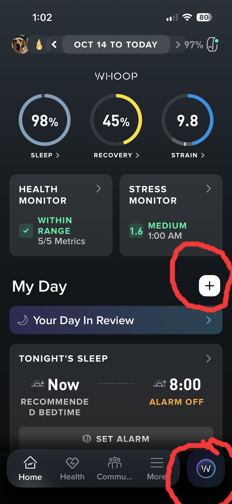
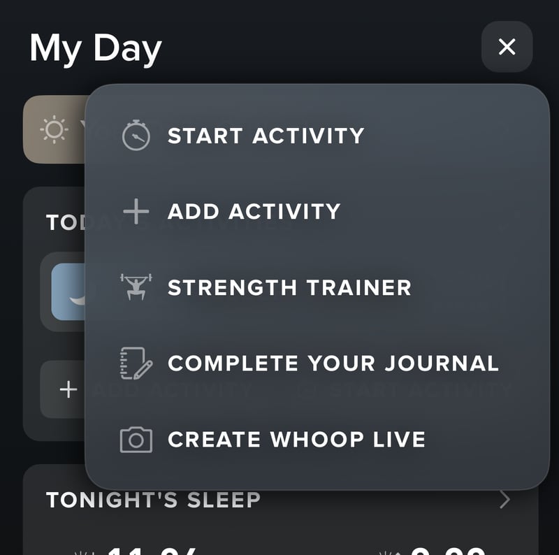
Imagine my annoyance this morning when the new app version changed the two aspects I had just criticised. The Action button is now more prominent and placed centrally, whereas the Coach button retains its importance with a new position in the right-hand corner of the bottom menu bar. Thus, when revisiting previous days, the Coach is always visible and can answer your questions.
Another recent improvement to Whoop was the addition of Coach memory. Whilst Coach always automatically used your latest data, it didn’t necessarily know your interests. It now remembers and adapts to your interactions with it.
More: Whoop Blog on Whoop Coach
Last Updated on 30 January 2026 by the5krunner
My favourite kit and nutrition
- Injinji – Runners protect your toes. Avoid discomfort and minor injury. Run more. run faster. I use them.
- Garmin 90-degree charging adapter — the small adapter that keeps your charging cables tidy. Essential for race day. I use one.
- Garmin charging puck — the fastest and most reliable way to top up your Garmin before a session. I use one.
- Ravemen FR300 — front light that mounts directly under your Garmin or Wahoo head unit. Keeps your bars clean and your beam pointed where it matters. I use one.
- Body Glide – The Blue anti-chafe stick that all swimmers and many runners use. I use it.
- Maurten — the race nutrition trusted by elite athletes. Gels and drink mix engineered to be easy on the stomach. I use them.
- Garmin Varia RTL515 — radar rear light that alerts you to vehicles approaching from behind. Pairs with your Edge or Garmin watch. I use this model.
- Favero Assioma Pro RS2 — the power meter pedals most serious cyclists end up choosing. Accurate, easy to move between bikes. I use this model.
Reader-Powered Content

This content is not sponsored. It’s mostly me behind the labour of love, which is this site, and I appreciate everyone who supports it.
Support the site: Follow (free, fewer ads) · Subscribe (paid, ad-free) · Buy Me A Coffee ❤️
All articles are written by real people, fact-checked, and verified for originality. See the Editorial Policy. FTC: Affiliate Disclosure — some links pay commission. As an Amazon Associate, I earn from qualifying purchases.
tfk is the founder and author of the5krunner, an independent endurance sports technology publication. With 20 years of hands-on testing of GPS watches and wearables, and competing in triathlons at an international age-group level, tfk provides in-depth expert analysis of fitness technology for serious athletes and endurance sport competitors. ID
