My Running Dashboard beta: running analytics built from one runner’s DNF
You finish a run, it lands on Strava, and you get a pace graph, a heart rate line and a well done from your training partner. What you do not get is an answer to the questions that matter: whether your fitness is actually moving in the right direction, whether today’s effort is a sign you are building well or heading somewhere bad, and whether the taper for your goal race three weeks out is on track. For most club runners, that gap between here is your data and here is what it means gets filled by a spreadsheet, a gut feeling, or a coach’s opinion. My Running Dashboard (MRD) is one runner’s attempt to close it using nothing but the running data you already generate.
Built from a DNF
Paul ran his first parkrun aged 43, in the snow at Highbury Fields in London in March 2013. He ran 24:59, having never run 5K before, and was hooked on the data from the start. Running continued through the years that followed, including a pandemic interruption that landed close to what he reckons was his fitness peak. In 2023, he lined up for his first marathon in five years, in Stockholm, and DNF’d. It remains his only DNF.
Certain that the data leading into it told a story, he pulled his Strava history into a spreadsheet and started tracking it properly. Late in 2025, he pointed ChatGPT at the resulting mess and got a rough dashboard mock-up back, which was enough to sell him on the idea. Early in 2026, he switched to directing Claude Code to build it properly: a fitness model, race predictions, training-load tracking, daily summaries, and debriefs.
He shared it with a couple of running mates, then a few club WhatsApp groups. Around 150 beta testers now use it, predominantly UK club runners, with a growing pocket in Sweden, where he is based.
Where it sits
Strava and Garmin Connect show you what happened. They do not tell you what it means for your fitness. Coach-mediated platforms such as TrainingPeaks assume a human is interpreting the numbers on your behalf. MRD is built for the runner who wants the interpretation without the middleman: a single dashboard that reads your training history and tells you in plain terms how fit you are, what you are likely to run, and how ready you are for what comes next. It is a solo side project rather than a funded company, so there is no subscription and nothing to pay at the beta stage, though there are plans to take it to full app status.
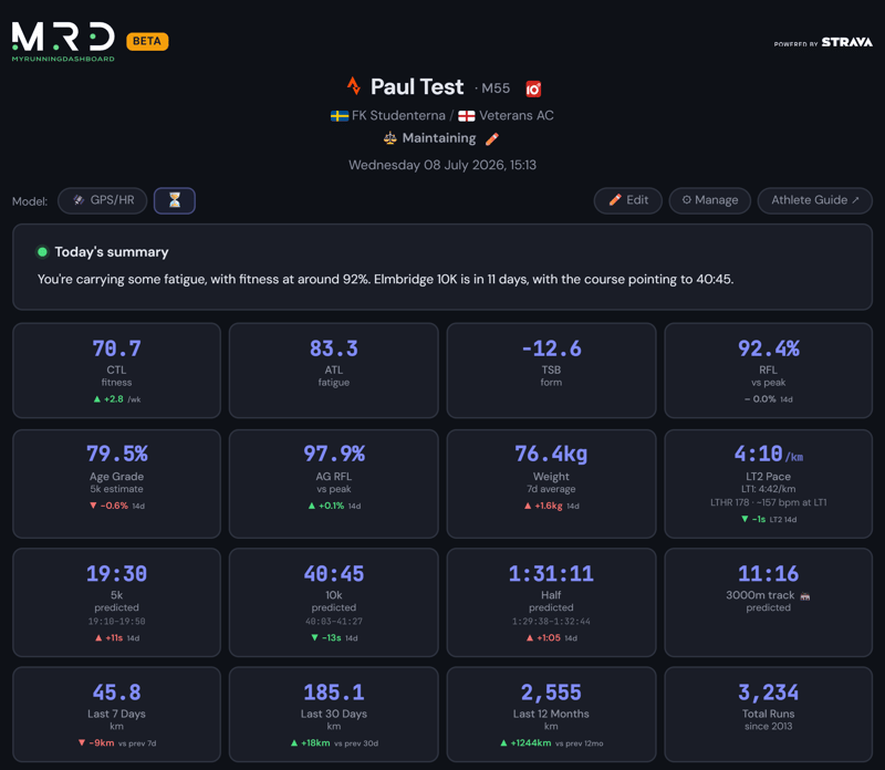
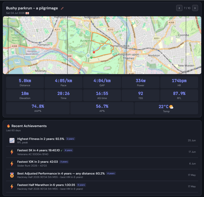
The headline features:
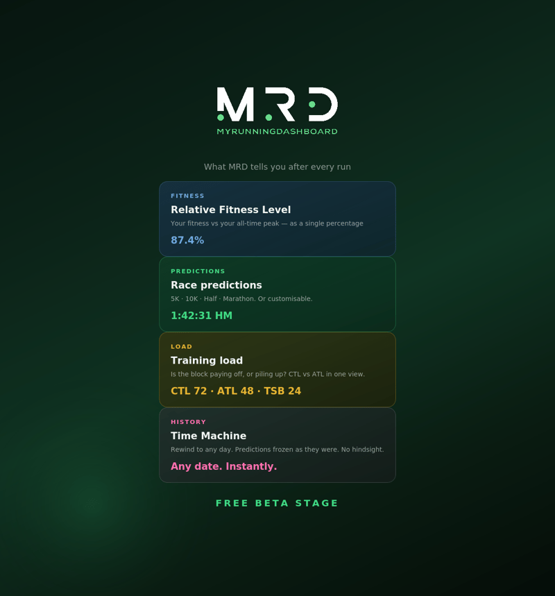
- Relative Fitness Level (RFL), a single number expressing today’s fitness as a percentage of your all-time peak
- Race predictions for 5K, 10K, half marathon, and marathon, recalculated after every run, with middle-distance coverage for runners focused there.
- Training load tracking (fitness, fatigue, freshness), so you can see whether a hard block is paying off or piling up
- Race readiness cards for any planned race: target pace, taper plan, and how prepared you actually are
- A same-day written debrief after every race, plus running PB and age-graded performance records.
- Power of 10 verification for UK athletes, with personal bests checked against officially ratified chip times rather than GPS estimates
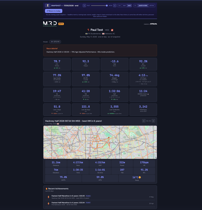
- Time Machine, which rewinds the whole dashboard, predictions included, to any day in your history.
How it works
TL;DR: Connect Strava or intervals.icu and MRD rebuilds your dashboard automatically every time you upload a run. There is no manual logging and no separate app to check.
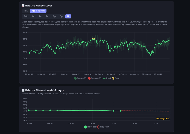
RFL, the headline number, is deliberately simple to read even though the model behind it is not. It takes your grade-adjusted pace (or power, for Stryd owners), plus your heart rate if you record it, smooths it over six weeks and expresses it as a percentage of the best fitness you have ever shown. 100% means you are in the best shape of your life. Race predictions, training load, and race readiness cards are all built on the same trend, and they update the moment a new run lands.
It is also deliberately conservative. Treadmill runs, dropped heart rate straps, and GPS lock loss get flagged and discounted rather than silently smoothed over, and a set of sanity checks stops physically impossible predictions from getting through. A half marathon prediction, for instance, can never come out faster than your 10K. Data problems appear rather than disappear.
Every piece of prose on the dashboard, including the daily fitness read, the post-race debrief, and the notification emails, is generated by a deterministic template engine rather than by a live AI call. A fixed library of phrasing variants gets filled in with numbers the pipeline has already calculated, and a validator rejects any output containing a figure that does not trace back to something the analytics actually computed. No training data, from Strava or anywhere else, is sent to a language model while the dashboard is running. The only AI involvement is offline, during development, polishing generic template wording against invented placeholder numbers.
The Time Machine
The most recent addition, and the one to try first, rewinds the entire dashboard to any day in your history. Tap the hourglass icon near the top, pick a date, pick a race, or drag the slider, and everything winds back to how it looked that day: fitness and form, race predictions, personal bests, training zones, route maps. A banner confirms the day you are viewing, with arrows to step through days one at a time and one tap to return to today.
A past prediction is frozen exactly as the model made it at the time, not recalculated with hindsight. Wind back to the morning of a past race and you get two cards in place of the usual daily summary: the read the dashboard would have given before the result came in, and the debrief afterwards, both as they stood on the day.
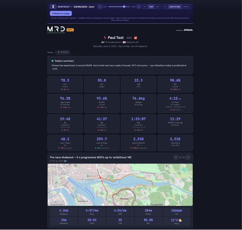
It started, fittingly, as a way to pull screenshots of old races for the project’s Instagram account, before Paul realised it was worth shipping to everyone.
The Stockholm marathon, revisited
There was no dashboard in 2023. MRD did not exist. What follows is what reprocessing the historical Strava data through today’s pipeline shows.
Race morning, 3 June 2023: CTL 78.3, TSB a healthy +23.3, a proper taper behind him. Run through the model today, that morning reads as a marathon in the low 3:30s. He went out a little faster than that.
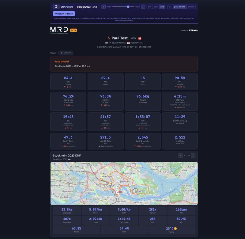
By 23.8km, in a midday start that felt like nearly 23C under full June sun, he had stopped. The per-second data explains why. Even by just past halfway, heart rate matched his 2018 London Marathon PB almost exactly (165.9bpm against 166.2bpm), yet Stockholm still produced 37 fewer watts, roughly 12% less power for the same cardiac effort. Same engine, working at least as hard, delivering measurably less.
The six weeks before the race tell the rest of it. Individual per-run efficiency had been sliding since mid-April, from around 90% down into the low-to-mid 80s by race week, while the smoothed six-week trend eased more gently, from 92.2% to 90.5% on race morning. The single-run numbers were the sharper warning.
The trigger traces to a hot half marathon on 22 April, the first proper heat of the year and a very hard day out, followed immediately by a flu bug, then a quick return to training with a 30km club session at threshold heart rate inside a week. The taper was fine. The damage was done in the weeks leading up to it. The dashboard shows both the smoothed trend and the individual per-run dots on the same chart because together they cover ground that neither view covers alone.
What it connects to
- Strava, the primary connection. Authorise once, no password, first dashboard within hours.
- Power of 10, for UK-affiliated athletes. Ratified personal bests are pulled from athletics’ official results database and checked against your auto-detected race history.
- Any GPS watch. It works from pace and elevation alone, and recognises reliable heart rate data where available (GPS/HR mode).
- Stryd power meter, for full power-based fitness and zone views (Stryd/HR mode).
- intervals.icu, for non-Strava runners, or as a bridge for Garmin-native and Stryd data where Strava’s own feed does not carry it.
- FIT file drop-in for anything (Zwift, older devices) that does not automatically arrive via Strava.
- No app to install. It is a browser-based dashboard in beta, working on desktop and phone, with a self-serve Manage page for race calendars, training plans, and privacy settings.
Who it is for, and the honest limitation
MRD is a private data centre for runners who already track everything and want to know what it means: Power of 10 obsessives, whose personal bests now get checked against their own ratified times, club WhatsApp group data nerds, and anyone training seriously for a specific date on the calendar. It works at any level because RFL is relative to your own history rather than a leaderboard against anyone else’s. It is at the beta stage and fully functional.
The one real limitation is capacity. Strava’s API rate limits the number of athletes MRD can run at once, and a request for a higher allowance has not yet been granted. Strava raises limits only for apps already approaching their ceiling, and intervals.icu spent part of 2023 in the same position before Strava relented. New sign-ups may therefore need to join a waiting list depending on demand, which is how existing testers keep their service quality. It is a capacity problem rather than a structural one, and it is honest to say it is there.
Quick answers
Does AI see my training data?
No, and that is deliberate. Every piece of dashboard prose, including race debriefs, comes from a deterministic template engine with a built-in check that blocks any number that the analytics did not calculate. No Strava-derived data is sent to a language model while the dashboard is running.
Do I need a power meter to use My Running Dashboard?
No. Pace and elevation from any GPS watch, plus heart rate if you record it, get you the full fitness model. A Stryd pod adds extra views on top, but it is never required.
Can I sign up right now?
You can apply to join the beta now, and you will be onboarded as Strava API capacity allows. There may be a wait list if demand is high.
Author: Paul Collyer from My Running Dashboard, edited by the5krunner.
If you enjoyed reading this, here is another in the Indie Spotlight series: Garmin battery alert app: five indie Connect IQ apps.
Last Updated on 12 October 2026 by tfk the5krunner
Small things I always use
- Garmin 90-degree charging adapter: Charges your Garmin from any USB-C cable. Essential when travelling. I use one.
- Body Glide: The blue anti-chafe stick swimmers and runners carry. I use it.
- Speedo earplugs: Fewer ear infections and no cold-water dizziness. I use them.
- Dryrobe Advance: My winter changing robe for open-water swims. I use one. A cheaper option is the AONYIYI changing robe.
- Maurten: Race fuel that stays easy on the stomach. I use them.
- Garmin charging puck: The quickest way to top up before a session. I use one.
- Injinji: Toe socks that stop rubbing, so you run more. I use them.
- Ultimate toe protectors: Stop black toenails on long runs. They work. I use them.
- Compressport R2 v2 calf sleeves: My calf sleeves of choice. I use them.
- Cellucor C4: My pre-workout before hard sessions.
- TPU tubes: Schwalbe Aerothan, Tubolito and Pirelli SmarTube. Light, tiny spares. I use all three.
- G8 insoles: Adjustable insoles that are good. I use them.
- Cycplus Cube: A 97g electric pump that gets a road tyre rideable in two minutes. I carry one. 5% off with code THE5KRUNNER.
Watches and sensors
- Polar H10: My daily driver for waking HRV.
- Polar Verity Sense: My backup arm-worn HR sensor.
- Nomad bedside charger: Charges my iPhone and Apple Watch overnight. I use it, and many of their bands.
- Train.Red: The best muscle oxygen sensor I’ve used.
- Tymewear: Accurate heart rate and reliable ventilatory zones. I use it to pace endurance rides over an hour.
- Garmin Forerunner 970: A pro-grade triathlon watch. I use this.
- Apple Watch Ultra 4: My daily smartwatch. No phone needed on rides.
- Garmin Fenix 9 Pro: I’ve just bought one.
On the bike
- Continental GP5000 for everyday riding, and Aero 111 on the front for special occasions.
- Helmets: Specialized S-Works Evade 3 for road riding, and Rudy Project Wing for TT-style races. I use both.
- Ravemen FR300: A front light that mounts under your Garmin or Wahoo. I use one.
- Wahoo TRACKR Radar: I use it on one bike and Varia on the other. They perform the same.
- Garmin Varia RTL515: Radar that warns you of cars from behind. I use this model.
- Wahoo ELEMNT Roam 3: The bike computer that’s easy to use. I use mine on most rides.
- Favero Assioma Pro RS2: Accurate power pedals that swap easily between bikes. I use this model.
Home and indoor training
- NPE Runn: Makes my basic treadmill smart, sending more accurate speed and distance to my watch and Zwift. I use it.
- Google Wifi: Keeps Zwift connected in my pain cave. I use it.
- Apple TV 4K: Zwift on the big screen. I use two.
- Google Nest Doorbell (wired, 2nd gen): My video doorbell, running in both Google Home and Apple Home. I use it.
Health, recovery and sleep
- FreeStyle Libre 3 Plus: Shows how my blood sugar responds to diet.
- hDrop: Measures my sweat loss in summer and indoors.
- Fourth Frontier Zone: Checks my heart under load in hard sessions.
- Oura Ring 5: My partner’s recovery tracker of choice.
- Kineon MOVE+: Red light therapy for niggles. It works.
- Eight Sleep: A cooling mattress cover my partner and I use nightly.
Reader-Powered Content

This content is not sponsored. It’s mostly me behind the labour of love, which is this site, and I appreciate everyone who supports it.
Support the site: Follow (free, fewer ads) · Subscribe (paid, ad-free) · Buy Me A Coffee ❤️
Written by real people, with AI assistance. Fact-checked and verified for originality. See the Editorial Policy. FTC: Affiliate Disclosure — some links pay commission. As an Amazon Associate, I earn from qualifying purchases.
tfk is the founder and author of the5krunner, an independent endurance sports technology publication. With 20 years of hands-on testing of GPS watches and wearables, and competing in triathlons at an international age-group level, tfk provides in-depth expert analysis of fitness technology for serious athletes and endurance sport competitors. ID

Finally, an AI-based training analysis that takes a new approach and actually adds value. Not just yet another AI chatbot that clutters your inbox with meaningless insights in text form.
agreed.
I’ve shared a few other long standing ideas i had, not sure if he will implement those.
Let’s see! Thanks chaps.