A screenless entry-level tracker should not expose weaknesses in Google’s software platform. The Fitbit Air does.
In May, Google required millions of lovers of the existing Fitbit app to switch to Google Health 5.0, which is now the app for everyone, including Fitbit Air and Google Pixel Watch 4 owners.
The app looks modern and is packed with Gemini AI awesomeness, but it feels rushed and unfinished.
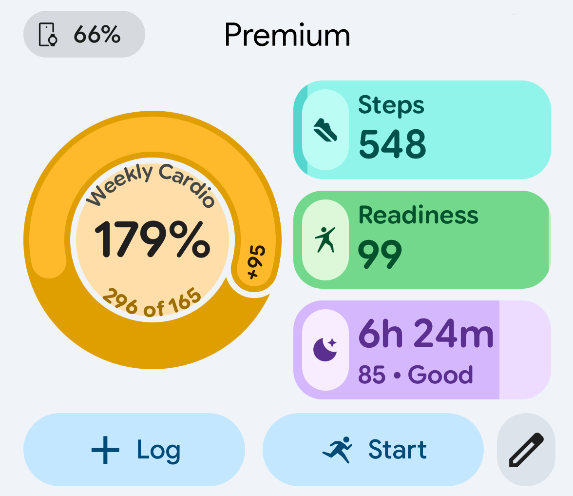
The opening screen immediately undermines confidence. Look at the words “Weekly Cardio”: six characters stray into the white ring that surrounds the progress info. The main graphics lack further polish: the circle on the left is visually imbalanced relative to the rounded rectangles on the right, and elsewhere, some charts appear blurry. Individually, these are small flaws, but together they make the software feel unrefined. Several smaller fitness apps hosted in the5krunner’s Indie App Spotlight section are made by single developers, and most look aesthetically sharper.
Next, it’s clear that Google loves Gemini, their impressive and very powerful new toy. Several screens have become Walls of Words, bombarding the senses with too much stuff. Impenetrable. Off-putting. Whatever happened to glanceability, to graphics that show just the key exceptions and insights?
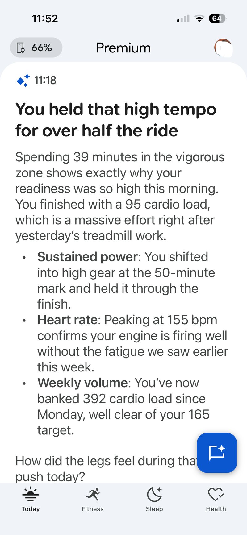
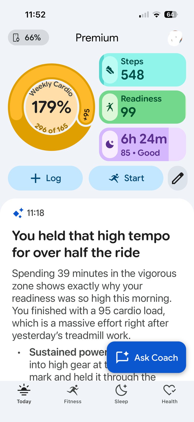
Beyond my personal irks, the layout changes have proved widely divisive.
Google reorganised the app around four tabs: Today, Fitness, Sleep and Health. It pushes automated coaching and wellness summaries to the front. Some casual users welcome the friendlier guidance and simpler dashboard. Long-time Fitbit owners often do not, as core metrics that previously required a glance can now take multiple taps to reach.
Personalisation also remains limited. Dashboard tiles cannot be rearranged, and wellness prompts occupy too much valuable screen real estate. Google’s 27 May roadmap, which promises greater dashboard control, effectively acknowledges these types of shortcomings.
Most existing Fitbit and Pixel owners did not choose this update. Fitbit Air buyers did, but existing Fitbit users were automatically moved over, with no option to switch back.
Google has responded quickly with updates for run labelling, sleep data, food logging and parts of the dashboard. That fast response suggests the company is listening. But the visual presentation issues and awkward navigation remain. All of this from an app the public has had for barely a week.
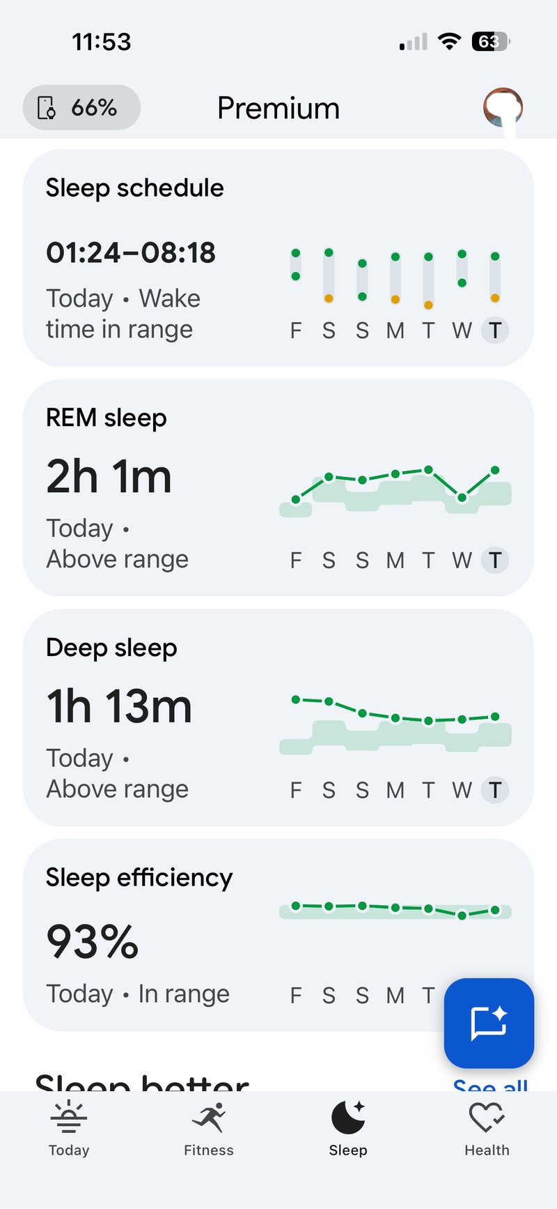
The app feels more contemporary than the old Fitbit app, and those coming from platforms like Whoop or Oura for the first time often prefer its wellness-focused approach. My sleep data over the last few weeks is presented here cleanly – I love this – 9/10!
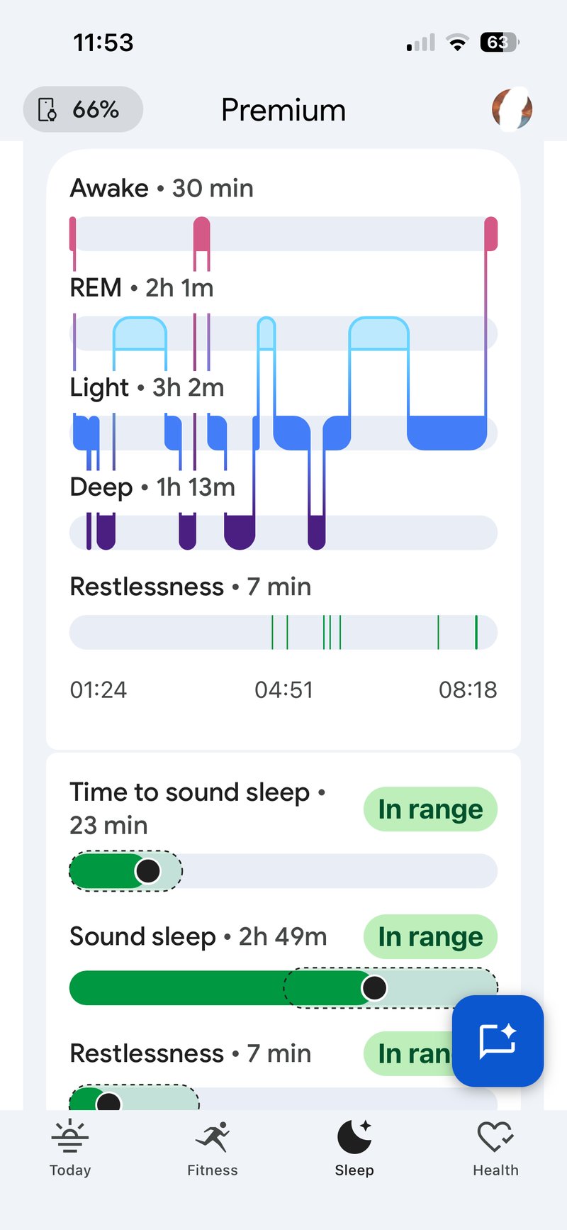
Change for change’s sake sometimes needs to be welcomed. Over the last 5 years, many health and fitness apps coalesced towards a similar design ethos, only to realise that this might look good and work well, but did little to support the brand image because of the generic design. That’s partly why Google is taking a different visual tack alongside the inevitable delights of its AI.
Google seems to have chosen to let Health prioritise advice over quick data. You can see why: reading text increases engagement and dwell time in the app. But I suspect that approach will fail in the long term and that people want frequent, scannable snippets of content in their hectic lives. AI needs to play a part, and the insights it gives now, which will only improve, are amazing. But we need them to be amazing when we want them to be, and not be permanently amazing (and annoying) every time we open the app.
More: Fitbit Air review – 28 Cons, 21 Pros – Yes, really. For the full picture of the Google Fitbit ecosystem: Google Fitbit and Wear OS hub.
Quick answers
Do I have to switch from the Fitbit app to Google Health?
Yes. The update was mandatory, rolling out between 19 and 26 May, and Google Health 5.0 is required to pair a Fitbit Air. There is no option to return to the old Fitbit app.
Can I customise the Google Health dashboard?
Only in part for now. Tiles cannot be freely rearranged and the wellness prompts take fixed space. Google’s 27 May roadmap promises greater dashboard control.
Last Updated on 3 October 2026 by tfk the5krunner
Small things I always use
- Garmin 90-degree charging adapter: Charges your Garmin from any USB-C cable. Essential when travelling. I use one.
- Body Glide: The blue anti-chafe stick swimmers and runners carry. I use it.
- Speedo earplugs: Fewer ear infections and no cold-water dizziness. I use them.
- Dryrobe Advance: My winter changing robe for open-water swims. I use one. A cheaper option is the AONYIYI changing robe.
- Maurten: Race fuel that stays easy on the stomach. I use them.
- Garmin charging puck: The quickest way to top up before a session. I use one.
- Injinji: Toe socks that stop rubbing, so you run more. I use them.
- Ultimate toe protectors: Stop black toenails on long runs. They work. I use them.
- Compressport R2 v2 calf sleeves: My calf sleeves of choice. I use them.
- Cellucor C4: My pre-workout before hard sessions.
- TPU tubes: Schwalbe Aerothan, Tubolito and Pirelli SmarTube. Light, tiny spares. I use all three.
- G8 insoles: Adjustable insoles that are good. I use them.
- Cycplus Cube: A 97g electric pump that gets a road tyre rideable in two minutes. I carry one. 5% off with code THE5KRUNNER.
Watches and sensors
- Polar H10: My daily driver for waking HRV.
- Polar Verity Sense: My backup arm-worn HR sensor.
- Nomad bedside charger: Charges my iPhone and Apple Watch overnight. I use it, and many of their bands.
- Train.Red: The best muscle oxygen sensor I’ve used.
- Tymewear: Accurate heart rate and reliable ventilatory zones. I use it to pace endurance rides over an hour.
- Garmin Forerunner 970: A pro-grade triathlon watch. I use this.
- Apple Watch Ultra 4: My daily smartwatch. No phone needed on rides.
- Garmin Fenix 9 Pro: I’ve just bought one.
On the bike
- Continental GP5000 for everyday riding, and Aero 111 on the front for special occasions.
- Helmets: Specialized S-Works Evade 3 for road riding, and Rudy Project Wing for TT-style races. I use both.
- Ravemen FR300: A front light that mounts under your Garmin or Wahoo. I use one.
- Wahoo TRACKR Radar: I use it on one bike and Varia on the other. They perform the same.
- Garmin Varia RTL515: Radar that warns you of cars from behind. I use this model.
- Wahoo ELEMNT Roam 3: The bike computer that’s easy to use. I use mine on most rides.
- Favero Assioma Pro RS2: Accurate power pedals that swap easily between bikes. I use this model.
Home and indoor training
- NPE Runn: Makes my basic treadmill smart, sending more accurate speed and distance to my watch and Zwift. I use it.
- Google Wifi: Keeps Zwift connected in my pain cave. I use it.
- Apple TV 4K: Zwift on the big screen. I use two.
- Google Nest Doorbell (wired, 2nd gen): My video doorbell, running in both Google Home and Apple Home. I use it.
Health, recovery and sleep
- FreeStyle Libre 3 Plus: Shows how my blood sugar responds to diet.
- hDrop: Measures my sweat loss in summer and indoors.
- Fourth Frontier Zone: Checks my heart under load in hard sessions.
- Oura Ring 5: My partner’s recovery tracker of choice.
- Kineon MOVE+: Red light therapy for niggles. It works.
- Eight Sleep: A cooling mattress cover my partner and I use nightly.
Reader-Powered Content

This content is not sponsored. It’s mostly me behind the labour of love, which is this site, and I appreciate everyone who supports it.
Support the site: Follow (free, fewer ads) · Subscribe (paid, ad-free) · Buy Me A Coffee ❤️
Written by real people, with AI assistance. Fact-checked and verified for originality. See the Editorial Policy. FTC: Affiliate Disclosure — some links pay commission. As an Amazon Associate, I earn from qualifying purchases.
tfk is the founder and author of the5krunner, an independent endurance sports technology publication. With 20 years of hands-on testing of GPS watches and wearables, and competing in triathlons at an international age-group level, tfk provides in-depth expert analysis of fitness technology for serious athletes and endurance sport competitors. ID

upcoming roadmap and improvements
https://support.google.com/googlehealth/thread/437068226/sharing-upcoming-roadmap-and-improvements?hl=en&sjid=11504049947884459355-NC
thank you, I did see that and thought I’d linked to it. maybe not!!
anyway. either way none of those address the points I’m making, tho some do skirt the subjects.
It is impressive that Google responded so quickly with that volume of fixes
Having the AI hype me up by summarizing my workout is insane. Nobody asked for this🥲.
I’m not super impressed. I’m 46 years old and am in fairly good shape. And it constantly uses words like low effort, etc. I think the coach is kind of an asshole.
ha ah! i started out by giving the AI a good telling to. good-for-age and all that. and in fact that this amazing effort i had just done was in fact pretty easy and that it had got the zones wrong (based on my age or whatever). to be fair after that it got better until it seemed to reset its knowledge of me back to zero and we had to start again. at that point i gave up on waht had been a series of very interesting convos into medical details.